
UFS

Brand Update

UFS has been “all about the deal” since 1945, offering an eclectic mix of products that’s hard to find anywhere else. From furniture, appliances and flooring to home goods, overstock finds and a fully-stocked alcohol section, the UFS brings an unusually diverse assortment of goods under one roof.

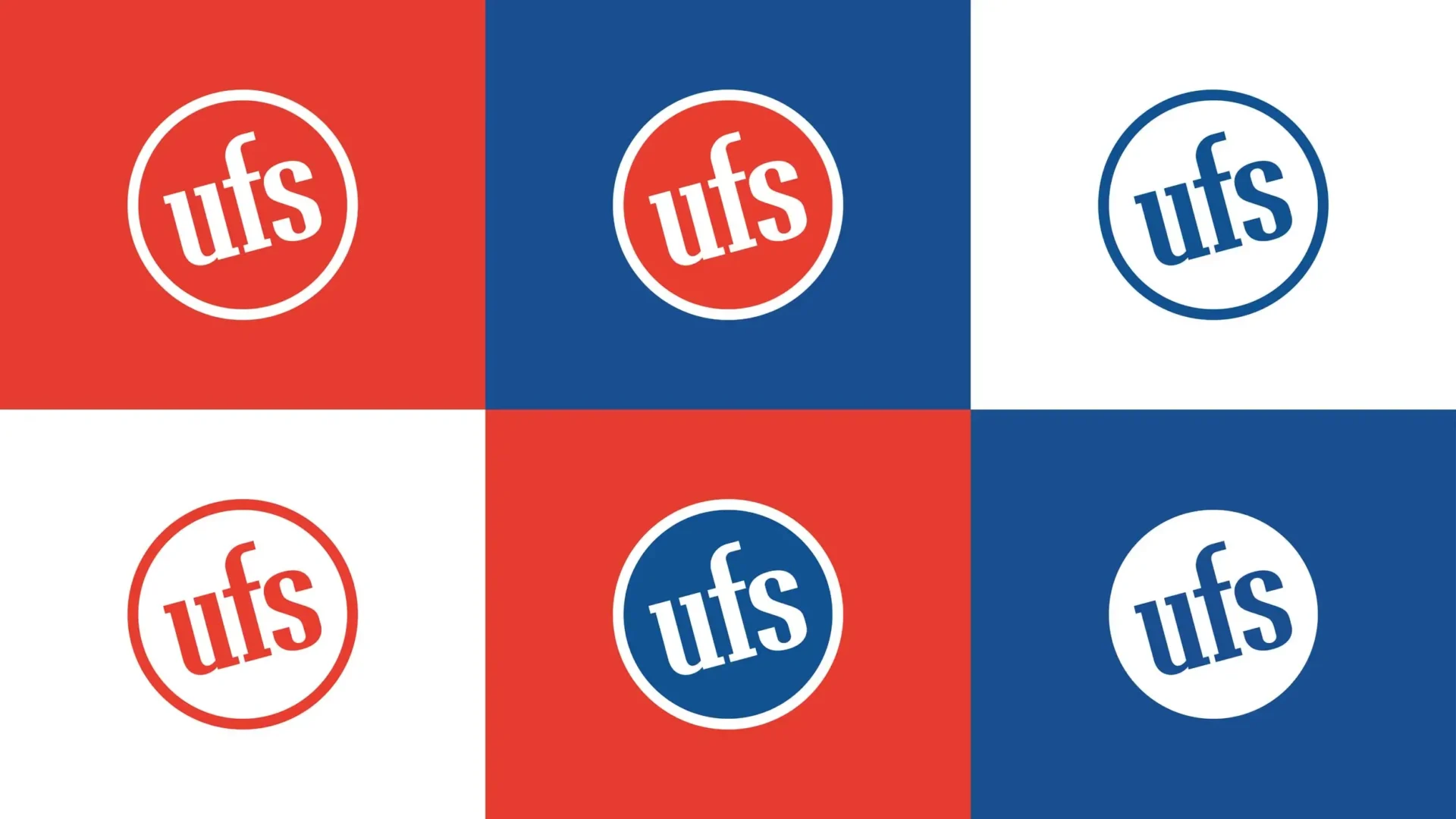
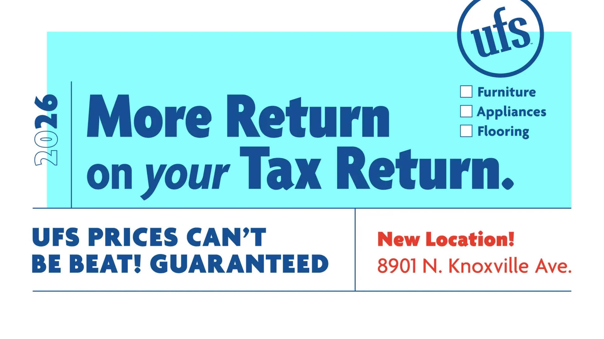
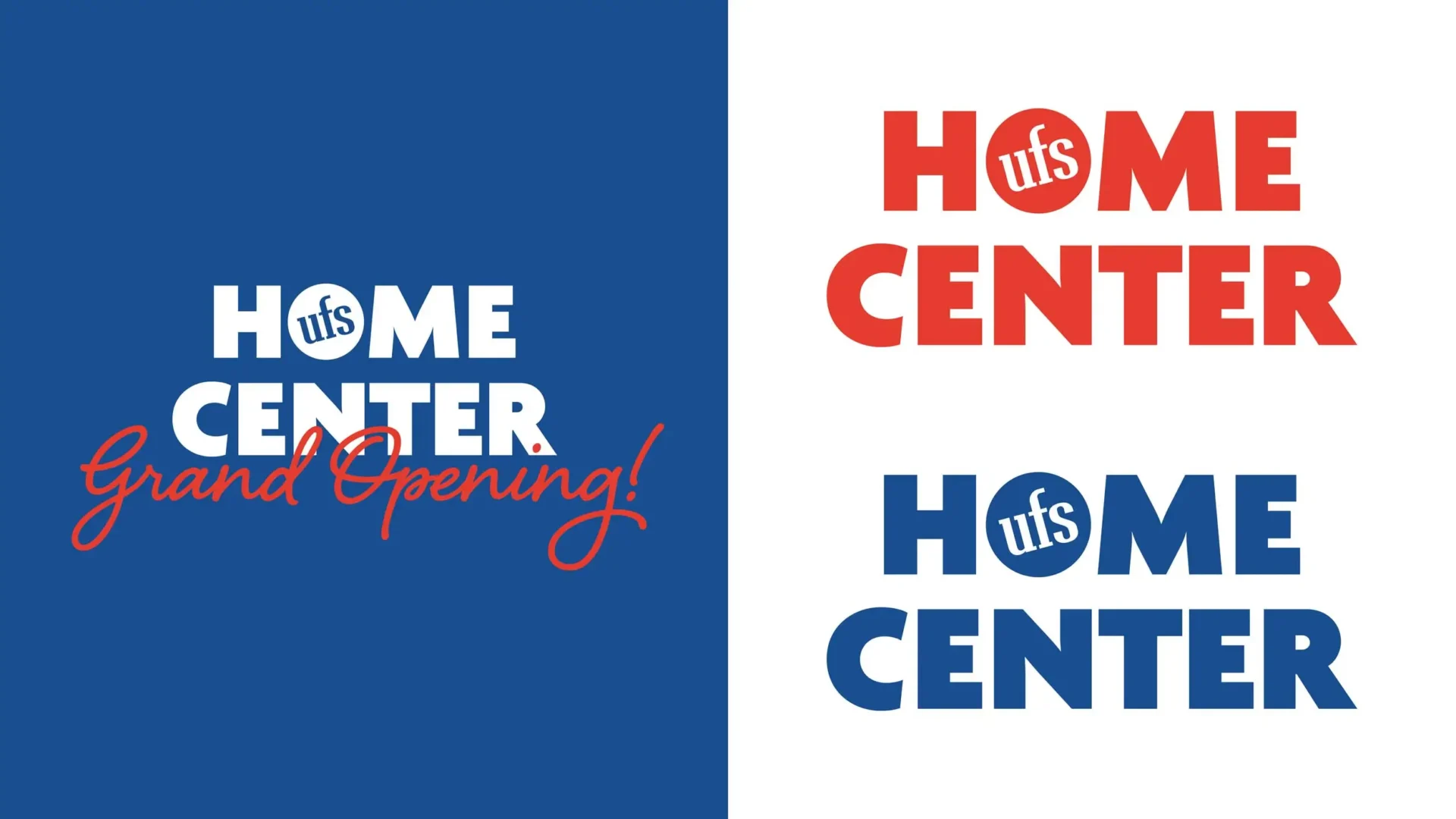
To help reinvigorate their marketing efforts we updated their brand package including re-drawing their “UFS” type and logo, choosing new brand typefaces, and applying a more consistent use of their brand colors, all the while being careful to honor the decades of equity the logo had already garnered.
Filed Under:
Branding Brand Update Graphic Design Logo Umbrella Brand

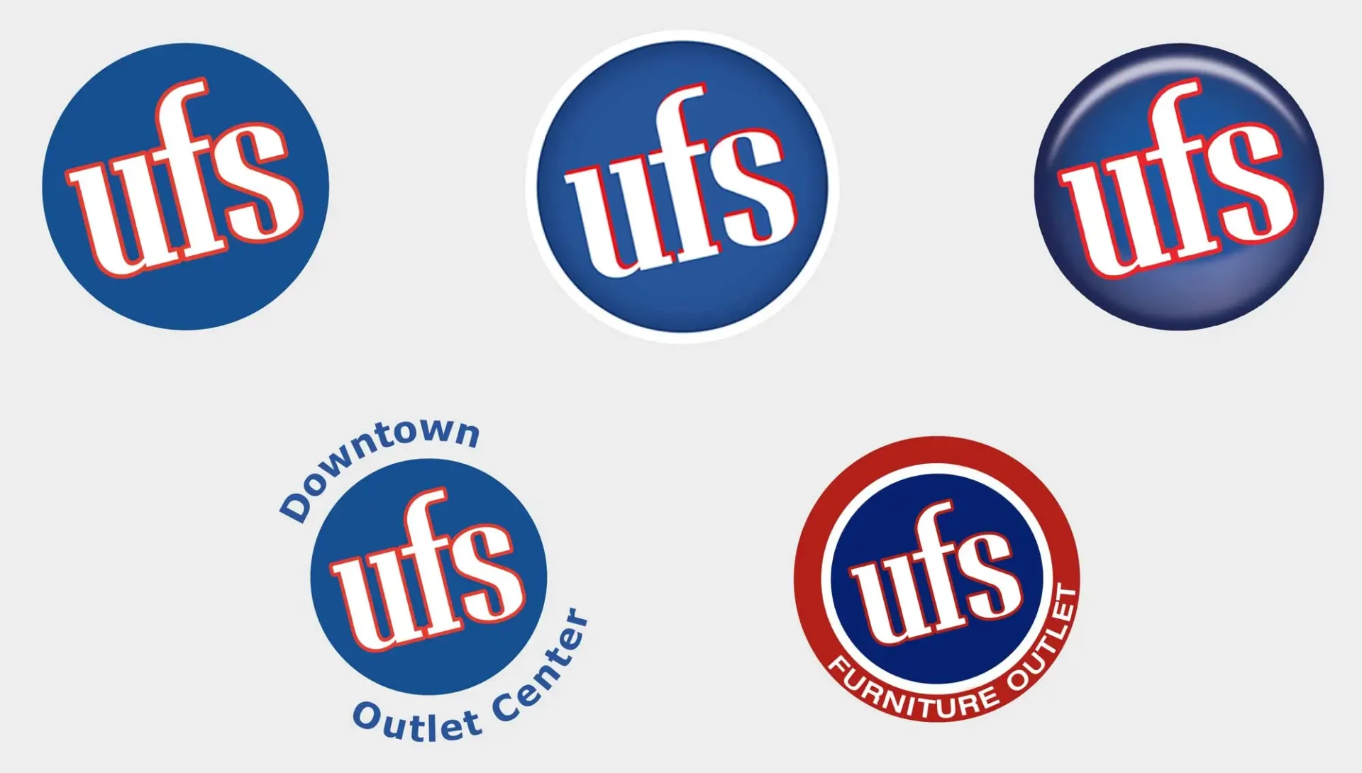
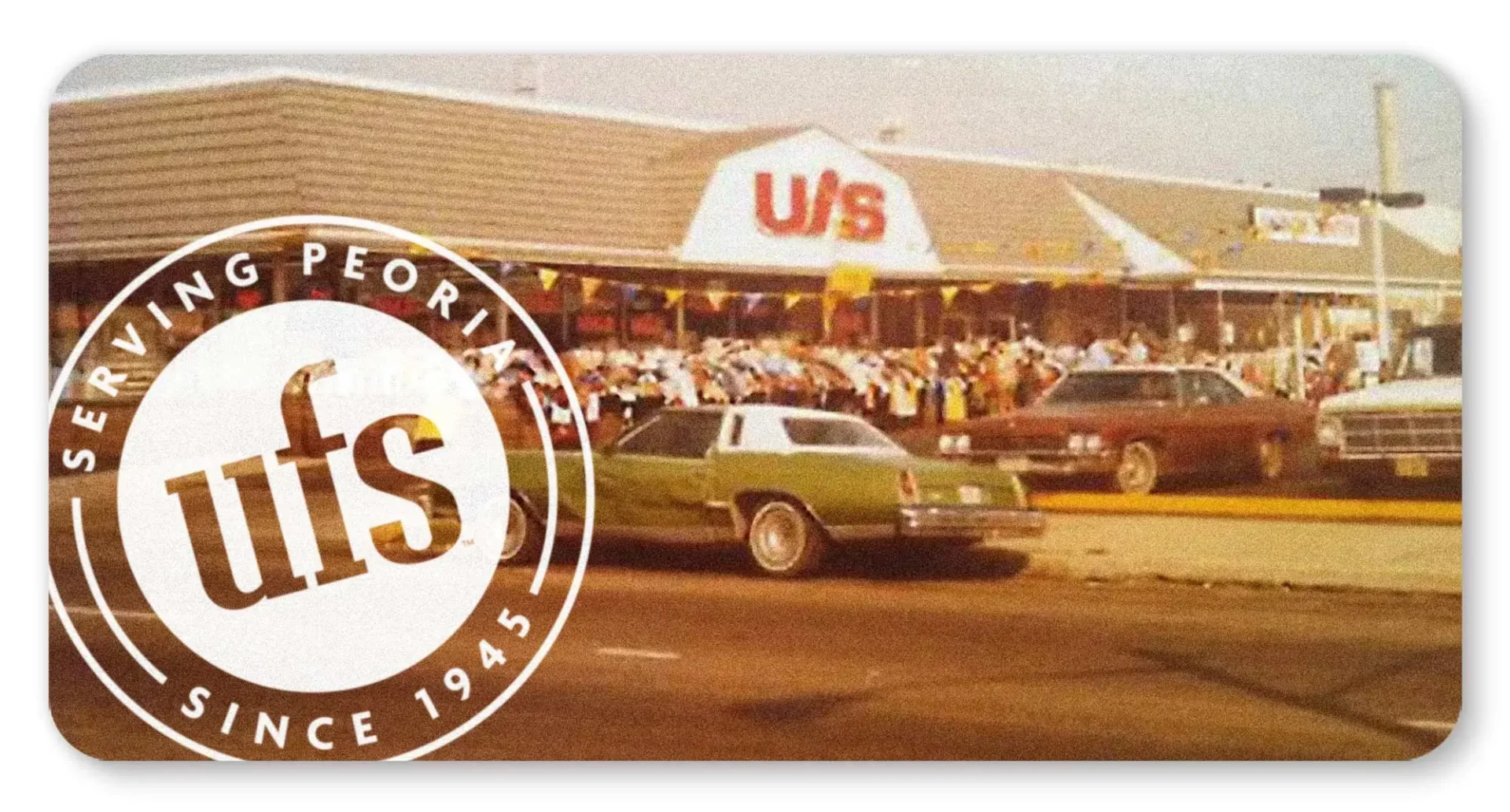
Prior MW’s involvement in the brand, uses of the UFS logo were inconsistent.

Improving Existing Equity

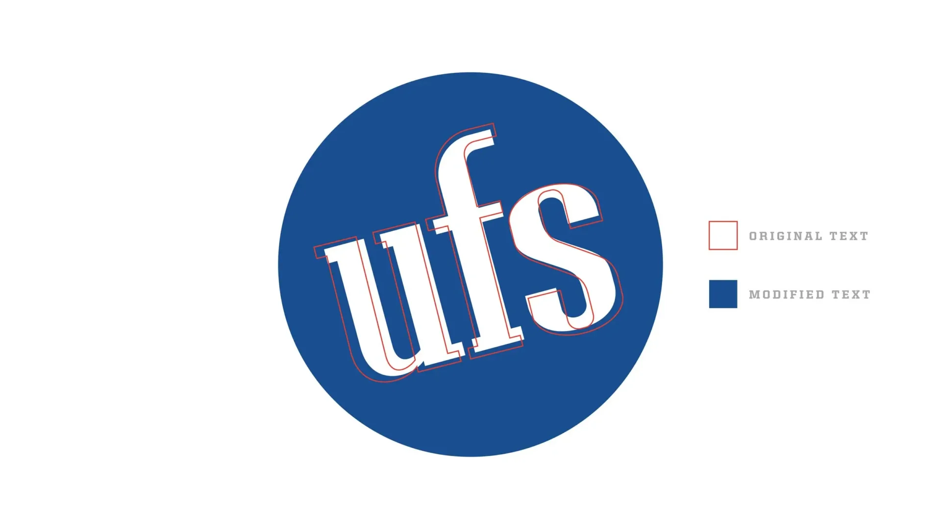
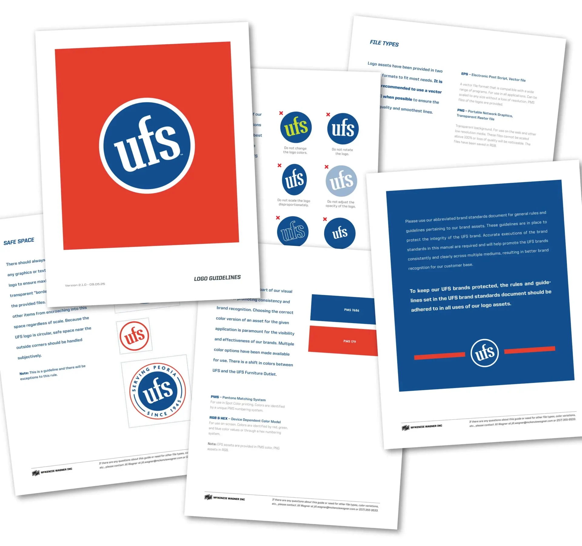
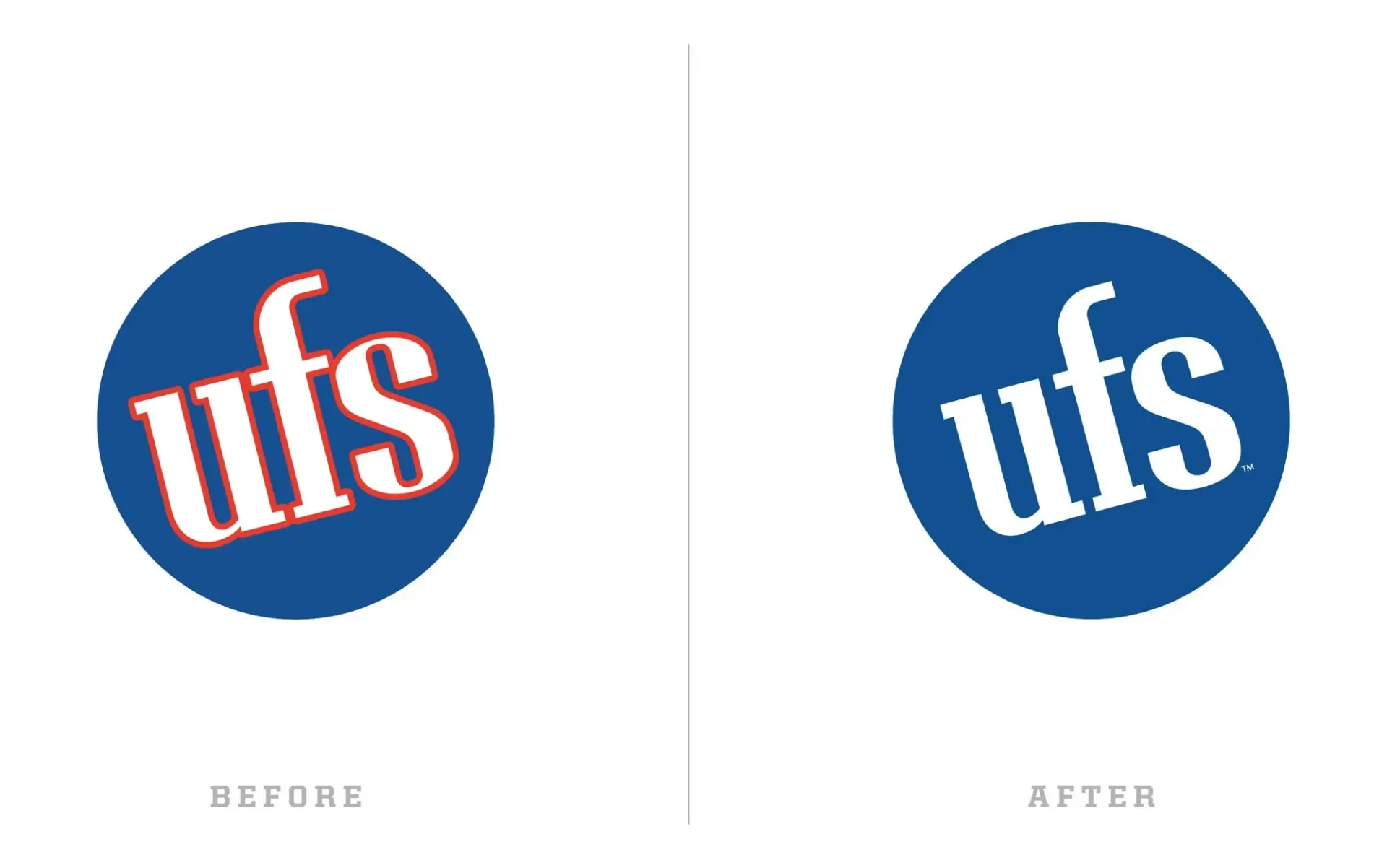
The UFS logo had tons of local and regional familiarity that we didn’t want to throw away, however some updates were necessary for contemporary usage as the mark struggled at small sizes. We re-drew the existing lettering to lessen the contrast of each letter so that the whole thing could reduce much smaller than before and still hold up. We also removed the extra stroke around the lettering to improve legibility of the letters and clean-up the logo as a whole. Finally, we added a set of simple brand standards to ensure proper use of the new assets moving forward.

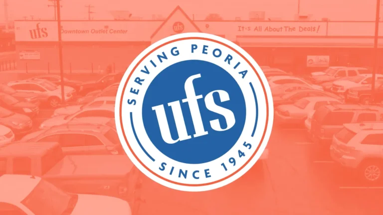
An institution for over 80 years.

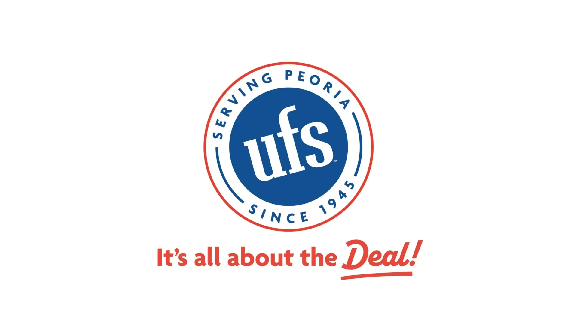
UFS has been a staple of the Peoria community for longer than most of us have been around. That’s a feat worth boasting about. We created this secondary logo for use in their advertising to help leverage this amazing accomplishment, helping to remind their customer-base that UFS is a local business that has been “serving” Peoria for decades.

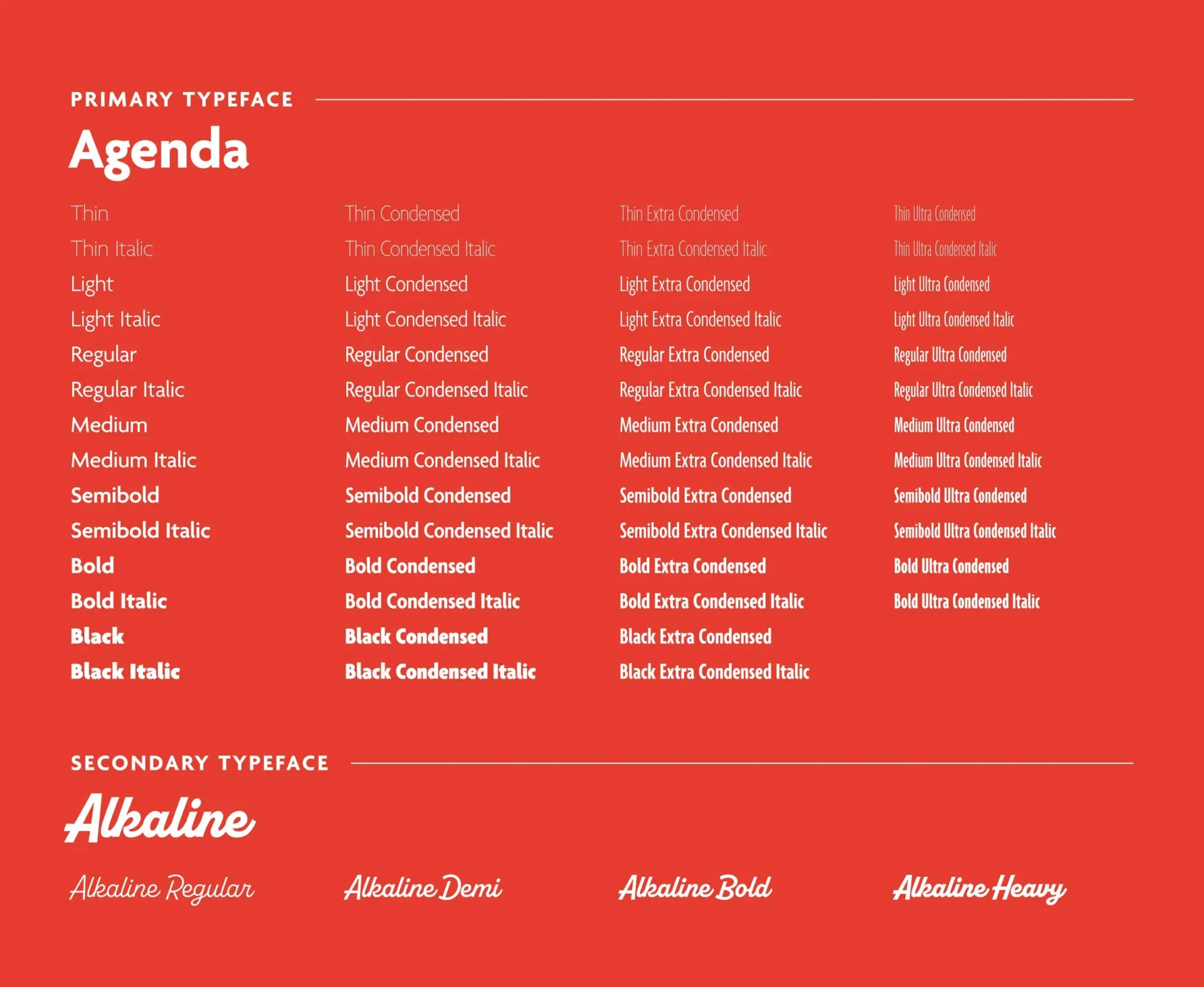
In addition to updating the logo package, we also added new typefaces to complete our overhaul of the UFS brand identity.

Our primary typeface, Agenda, is approachable and friendly. At the same time, it’s also an absolute workhorse of a font family with a wide variety of widths, allowing us to be on-brand but flexible in digital and print ads when text length can vary a great deal.

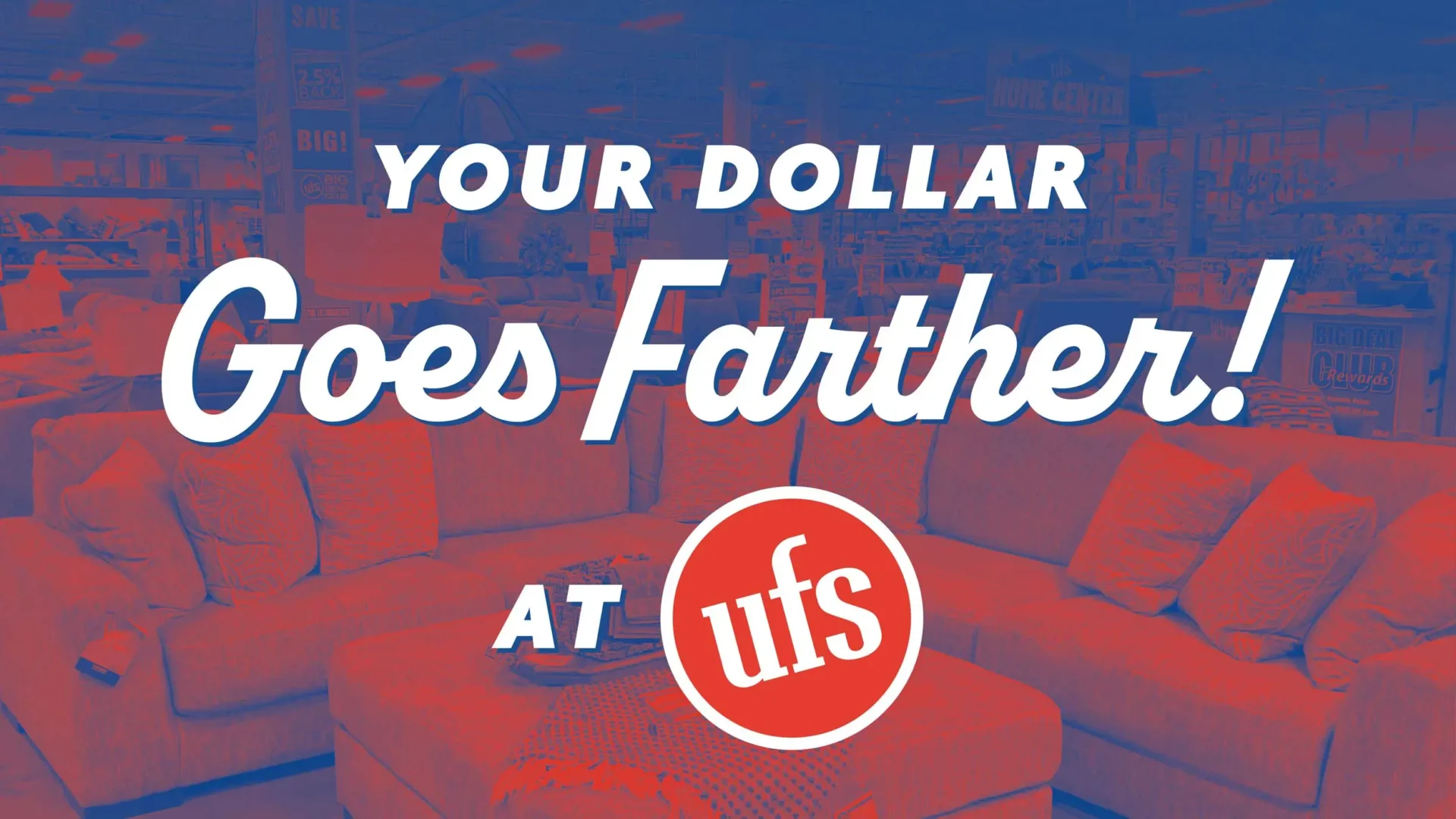
Alkaline is vintage-inspired script with loads of personality. This is used alongside Agenda to create visual contrast and rhythm to our text treatments.

Promotional Logos

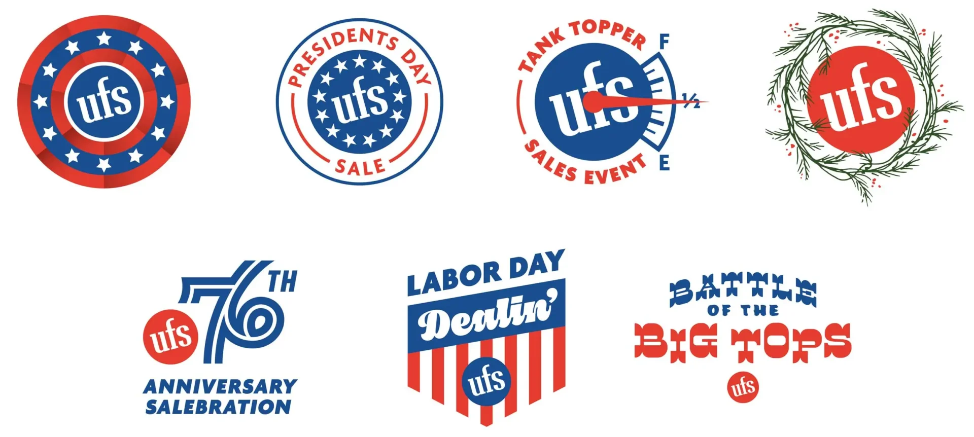
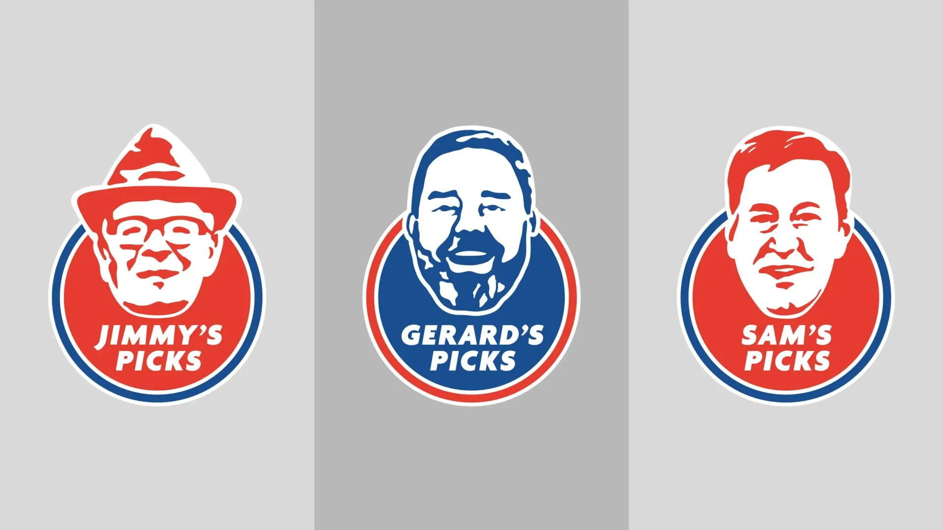
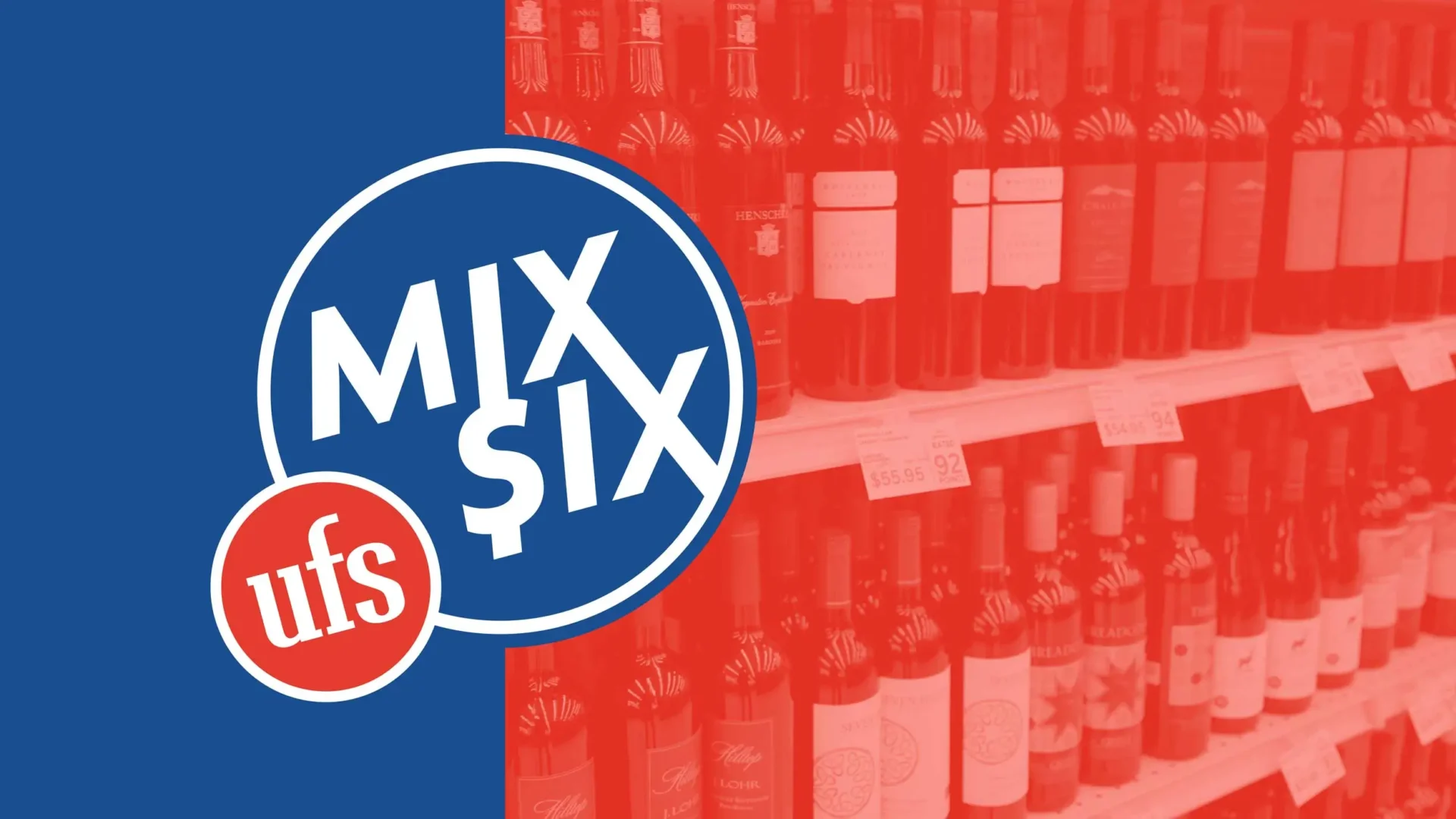
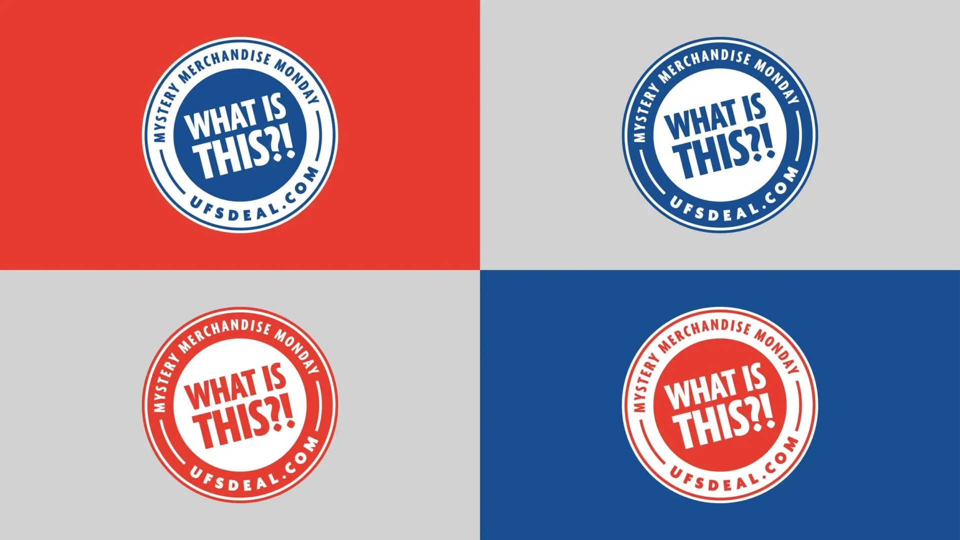
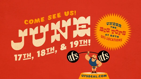
From Presidents’ Day and Labor Day sales to anniversary celebrations and holiday events, MW developed a series of logos that give each sale its own identity while maintaining a consistent connection to the UFS brand. Bold typography, familiar colors, and playful concepts help turn everyday ho-hum sales into branded annual events that capture attention and reinforce the excitement of finding a great deal.