Arthur Area Economic Development
Branding
Filed Under
-
Branding
Scope of Project
- Logo
- Graphic Design
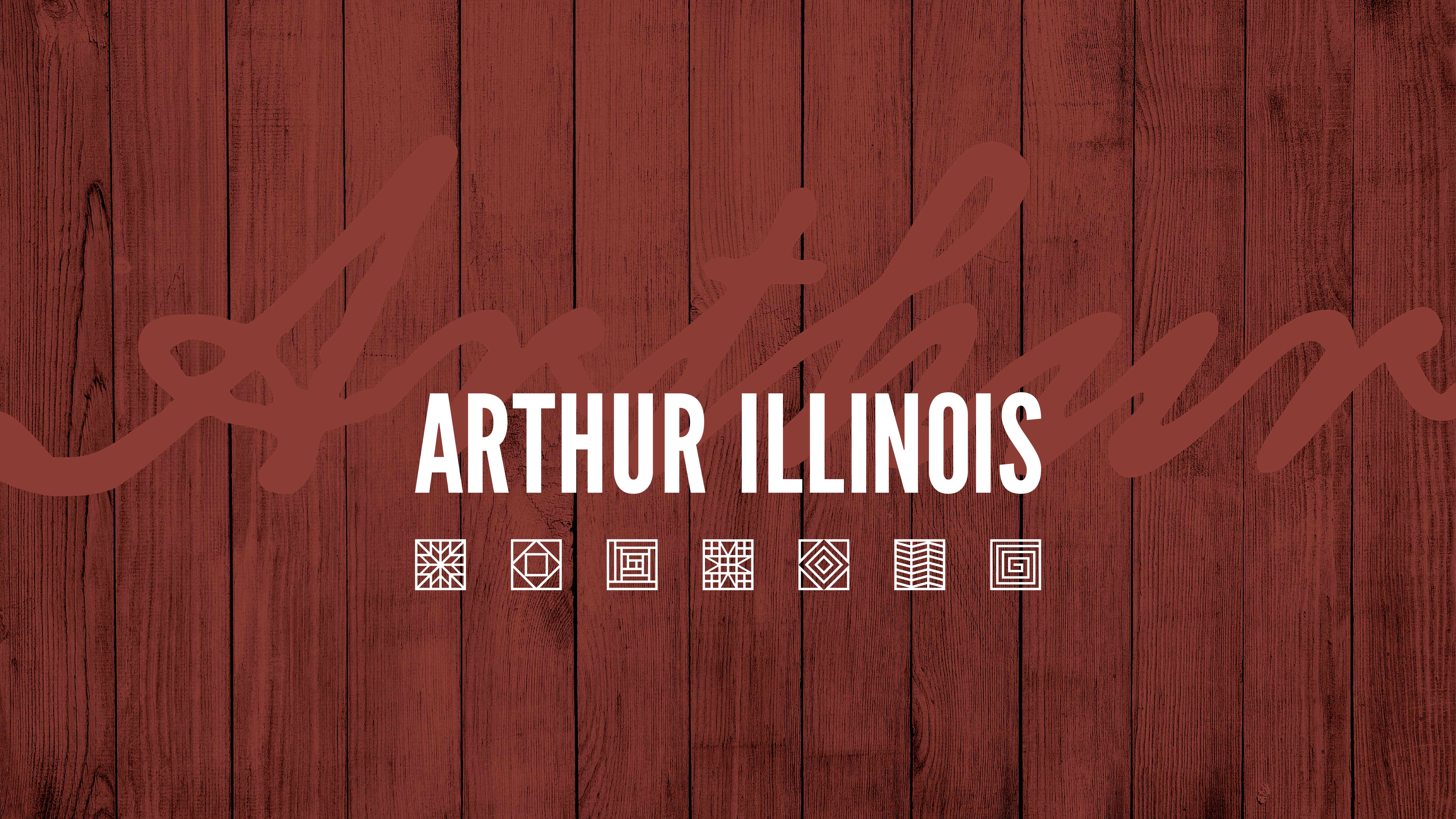
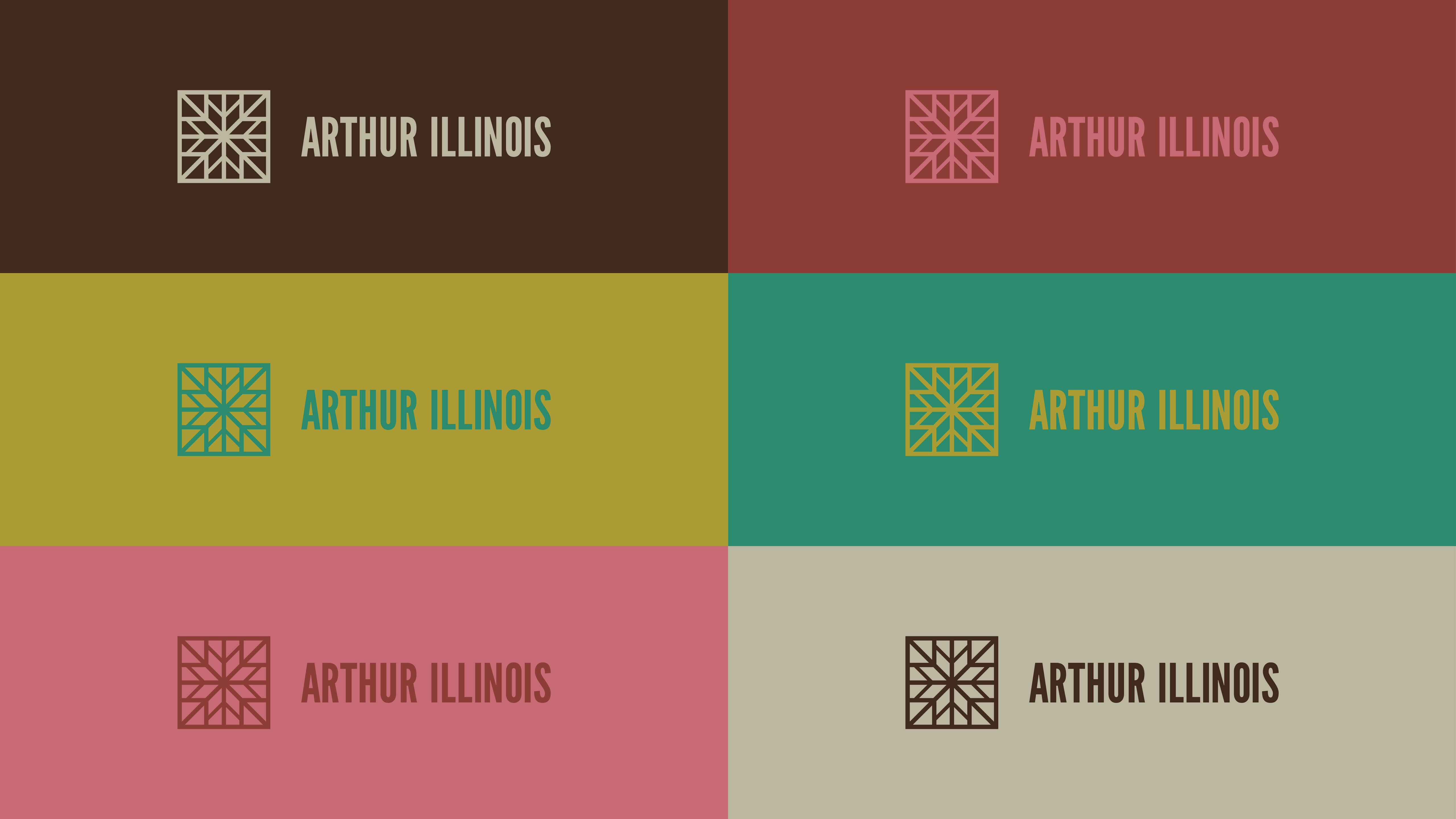
The Arthur area is known for its quality, craftsmanship, and Amish community. Moving beyond the typical horse & buggy logo we wanted something that represented the community as a whole, but still had close Amish ties. We settled on the quilting square.
To us, the quilt symbolized artisan, tradition, community, culture, craftsmanship, and most of all warmth.
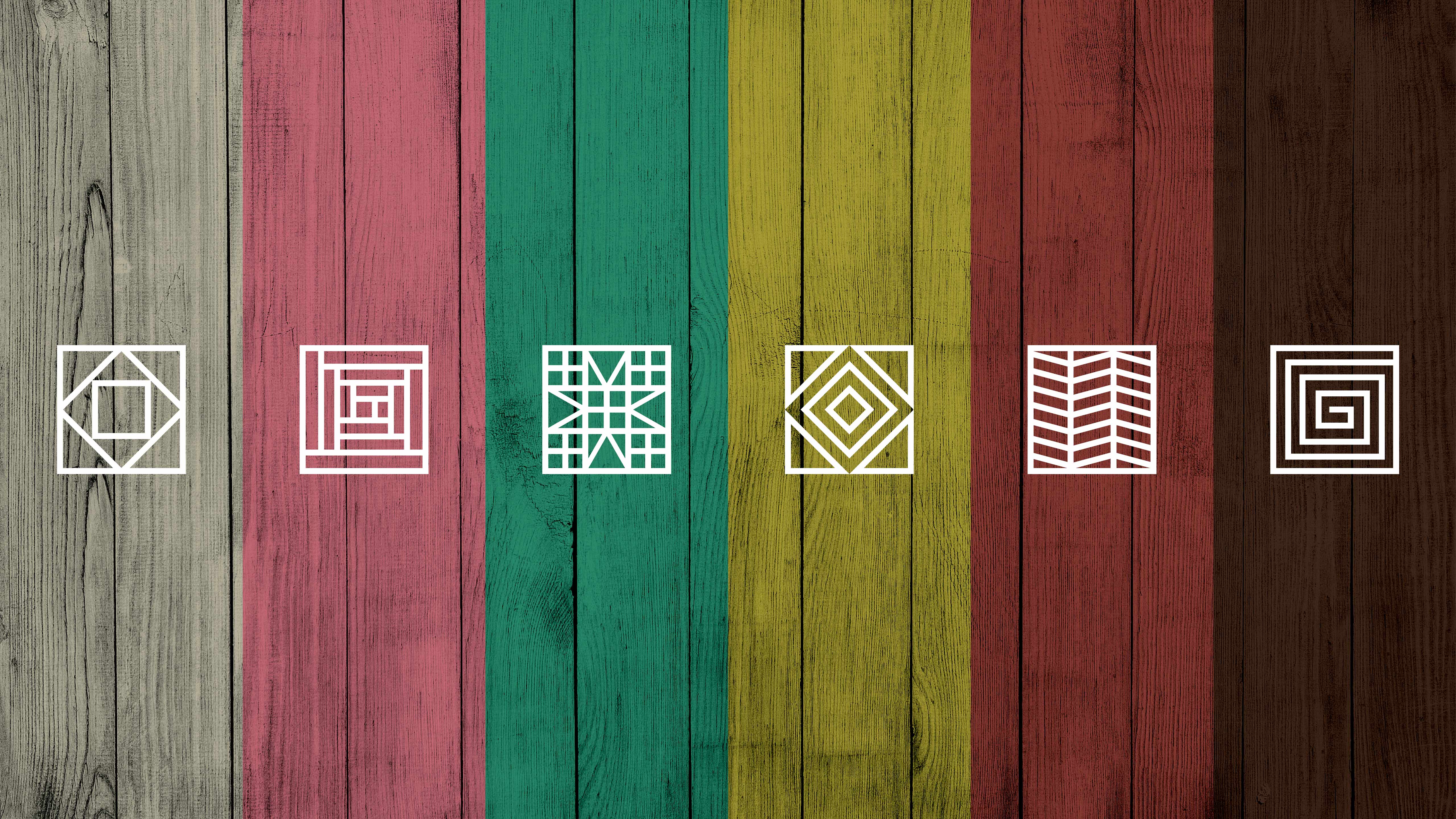
Because there’s so much variety in quilting, we designed interchangeable patterns into the brand, hoping that over time they would grow to represent different aspects of the Arthur experience to visitors and residents alike.


Arthur Area Economic Development
Branding
—Arthur Area Economic Development
Branding
Filed Under
-
Branding
Scope of Project
- Logo
- Graphic Design
The Arthur area is known for its quality, craftsmanship, and Amish community. Moving beyond the typical horse & buggy logo we wanted something that represented the community as a whole, but still had close Amish ties. We settled on the quilting square.
To us, the quilt symbolized artisan, tradition, community, culture, craftsmanship, and most of all warmth.
Because there’s so much variety in quilting, we designed interchangeable patterns into the brand, hoping that over time they would grow to represent different aspects of the Arthur experience to visitors and residents alike.

