Amish Country of Illinois
Branding
Filed Under
-
Branding, Advertising & Marketing, Print
Scope of Project
- Copy Writing
- Advertising & Marketing
- Graphic Design
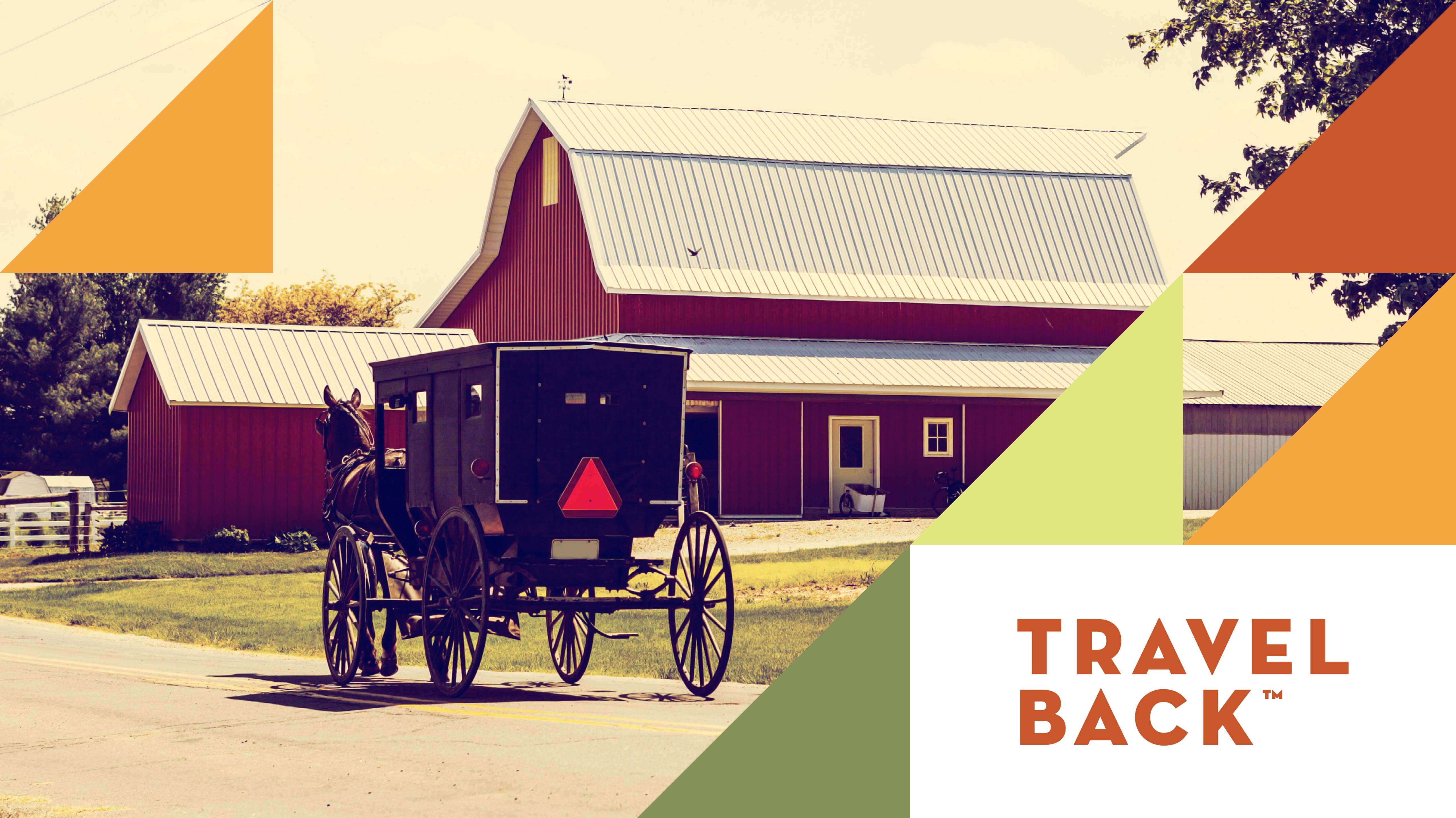
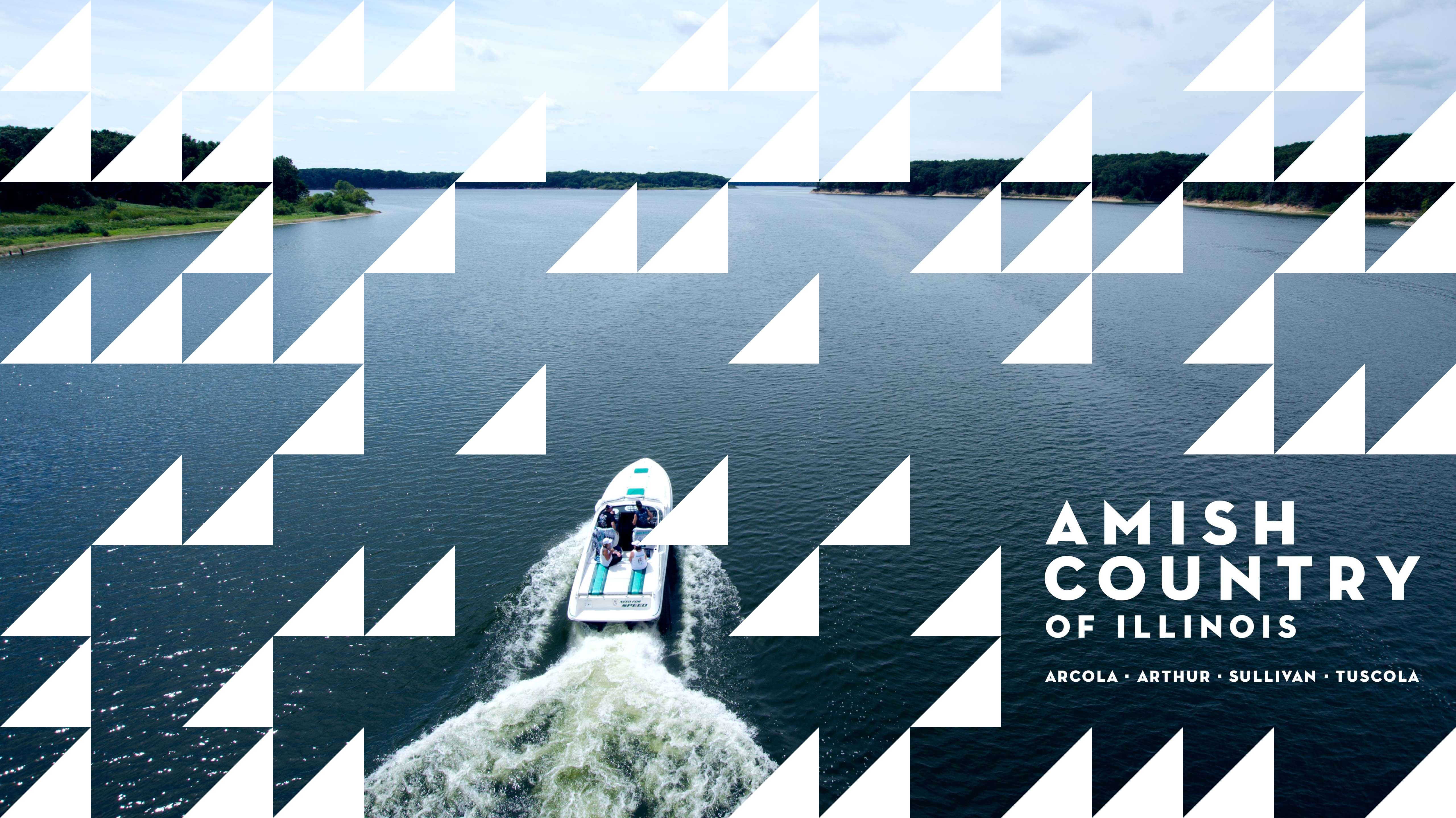
The communities of Arthur, Arcola, Tuscola and Sullivan are an unexpected combination of rural heritage and contemporary amenities. Collectively, they realized visitors were actively looking for more genuine experiences and that what they have to offer is appealing in both quantity and quality. They were interested in promoting their unique destination as one and approached us to brand their partnership, helping them to leverage their collective power.
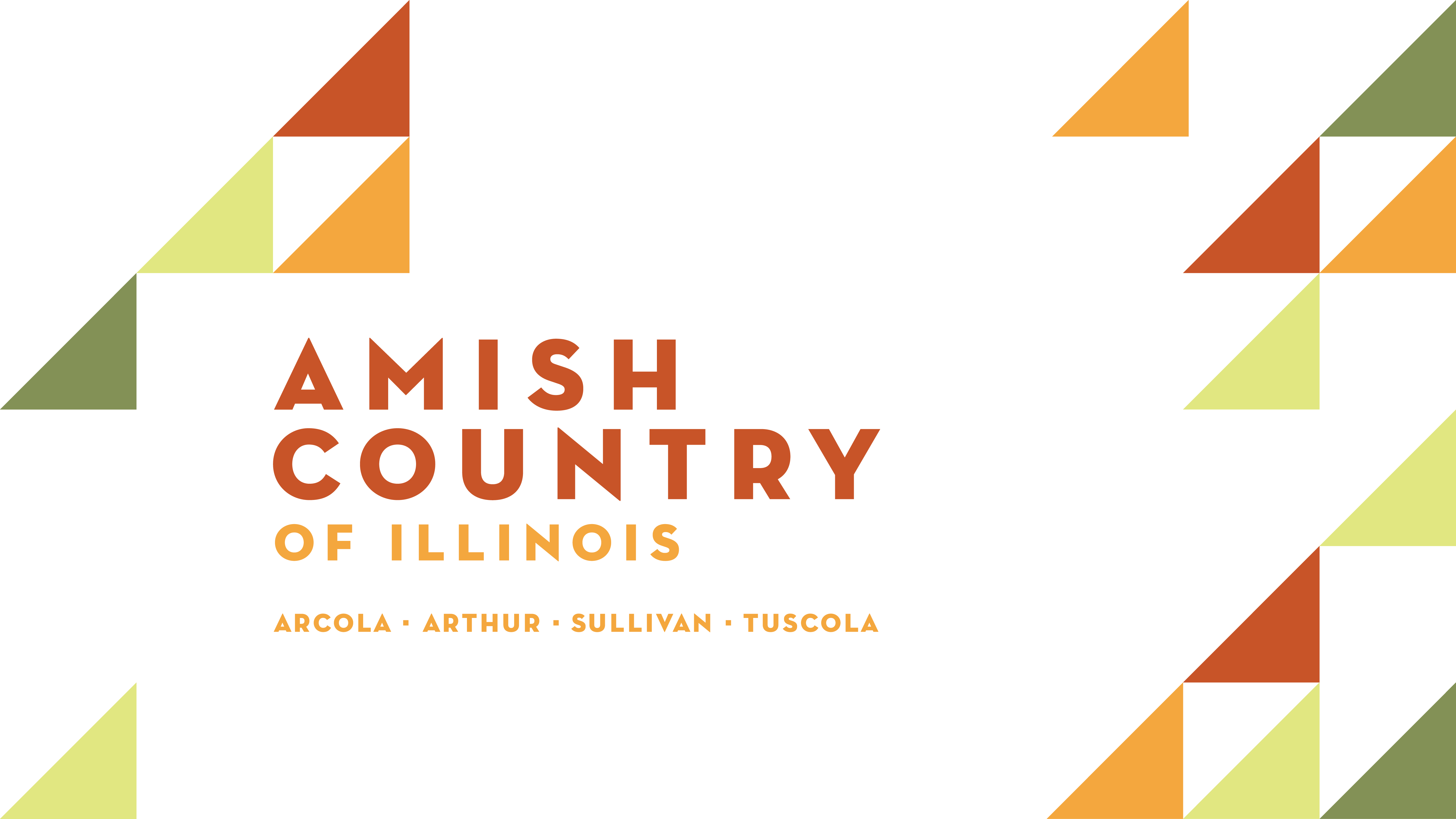
Rooted in their history, the logo is an interpretation of the geographic locations of the four Amish Country of Illinois towns relative to one another. Additional inspiration comes from motifs such as quilting and patchwork, barns, fields, growth and the natural colors of the landscape. The typography, set in Neutraface, compliments the geometric drawing of the icon as well as reinforces the ideas of simplicity, compassion and nostalgia. Using shapes and patterns rooted in tradition and collective history we’re creating a brand whose sum is greater than its parts.


Amish Country of Illinois
Branding
—Amish Country of Illinois
Branding
Filed Under
-
Branding, Advertising & Marketing, Print
Scope of Project
- Copy Writing
- Advertising & Marketing
- Graphic Design
The communities of Arthur, Arcola, Tuscola and Sullivan are an unexpected combination of rural heritage and contemporary amenities. Collectively, they realized visitors were actively looking for more genuine experiences and that what they have to offer is appealing in both quantity and quality. They were interested in promoting their unique destination as one and approached us to brand their partnership, helping them to leverage their collective power.

Rooted in their history, the logo is an interpretation of the geographic locations of the four Amish Country of Illinois towns relative to one another. Additional inspiration comes from motifs such as quilting and patchwork, barns, fields, growth and the natural colors of the landscape. The typography, set in Neutraface, compliments the geometric drawing of the icon as well as reinforces the ideas of simplicity, compassion and nostalgia. Using shapes and patterns rooted in tradition and collective history we’re creating a brand whose sum is greater than its parts.


