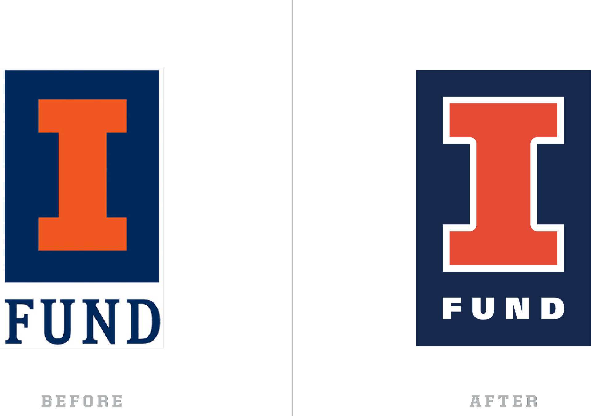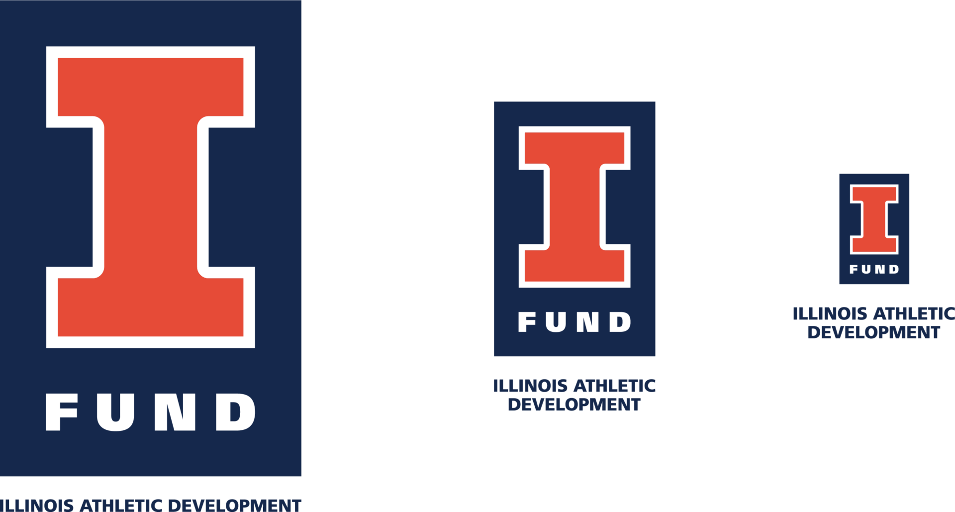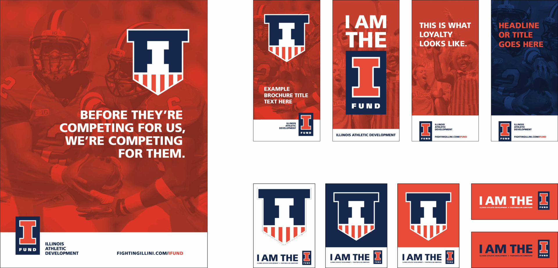

In an effort to refresh and strengthen the brand of the Illinois Athletic Development office, we updated their mark. The new logo has been crafted to help unify the I Fund brand and it’s messaging going forward. This logo incorporates elements of the Nike rebrand and is consistent with those efforts in both color and typography while maintaining the equity in the mark that represented the Athletic Development office for decades. The new logo has much greater flexibility for any range of applications, including motion. We created multiple versions for scale, orientation, and color variation.
To launch the rebrand we developed a scoreboard video which played during football and basketball games.