
The High School of Saint Thomas-More

Athletics Rebrand

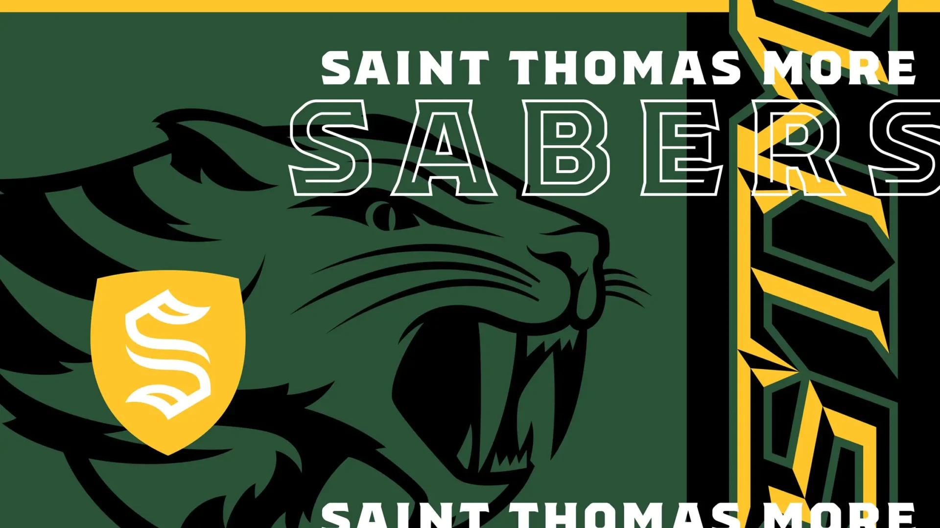
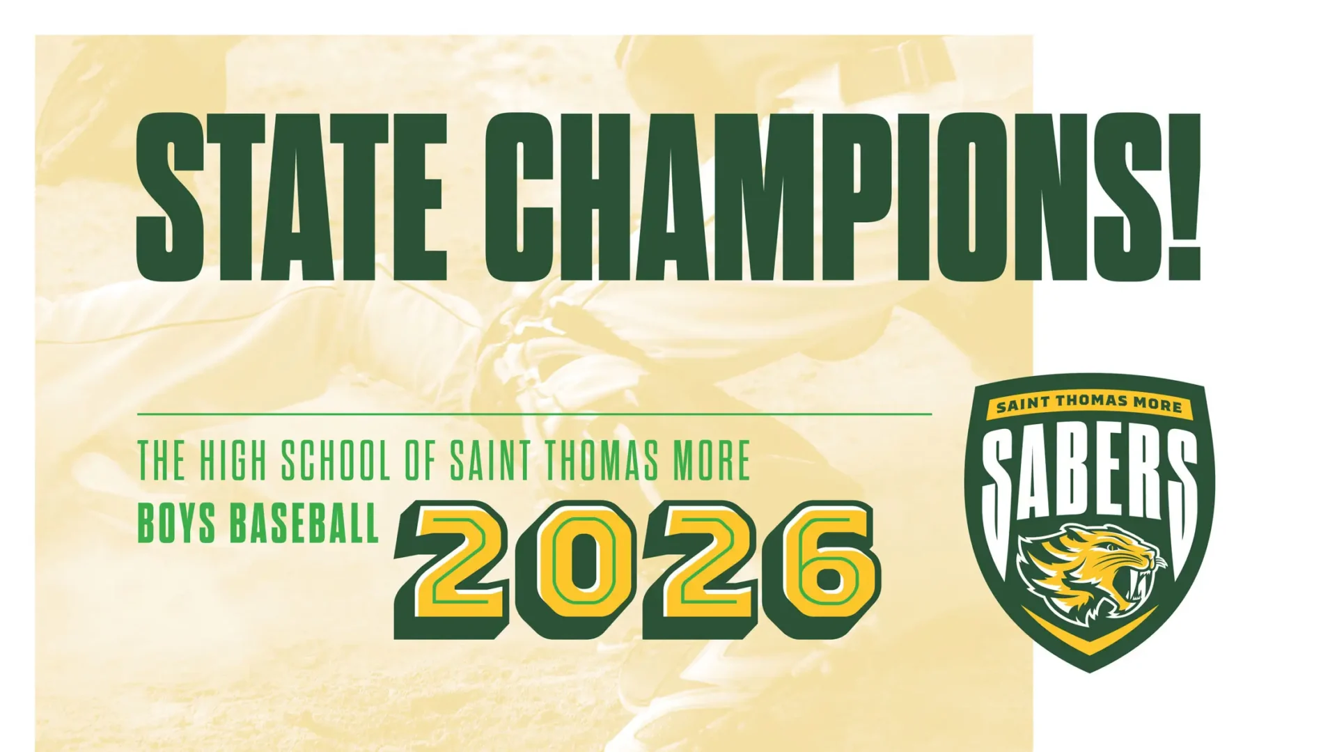
The High School of Saint Thomas More [STM] is a private, Catholic high school in Champaign. Home to the Sabers, STM approached us looking for a refresh to their existing Athletics branding.

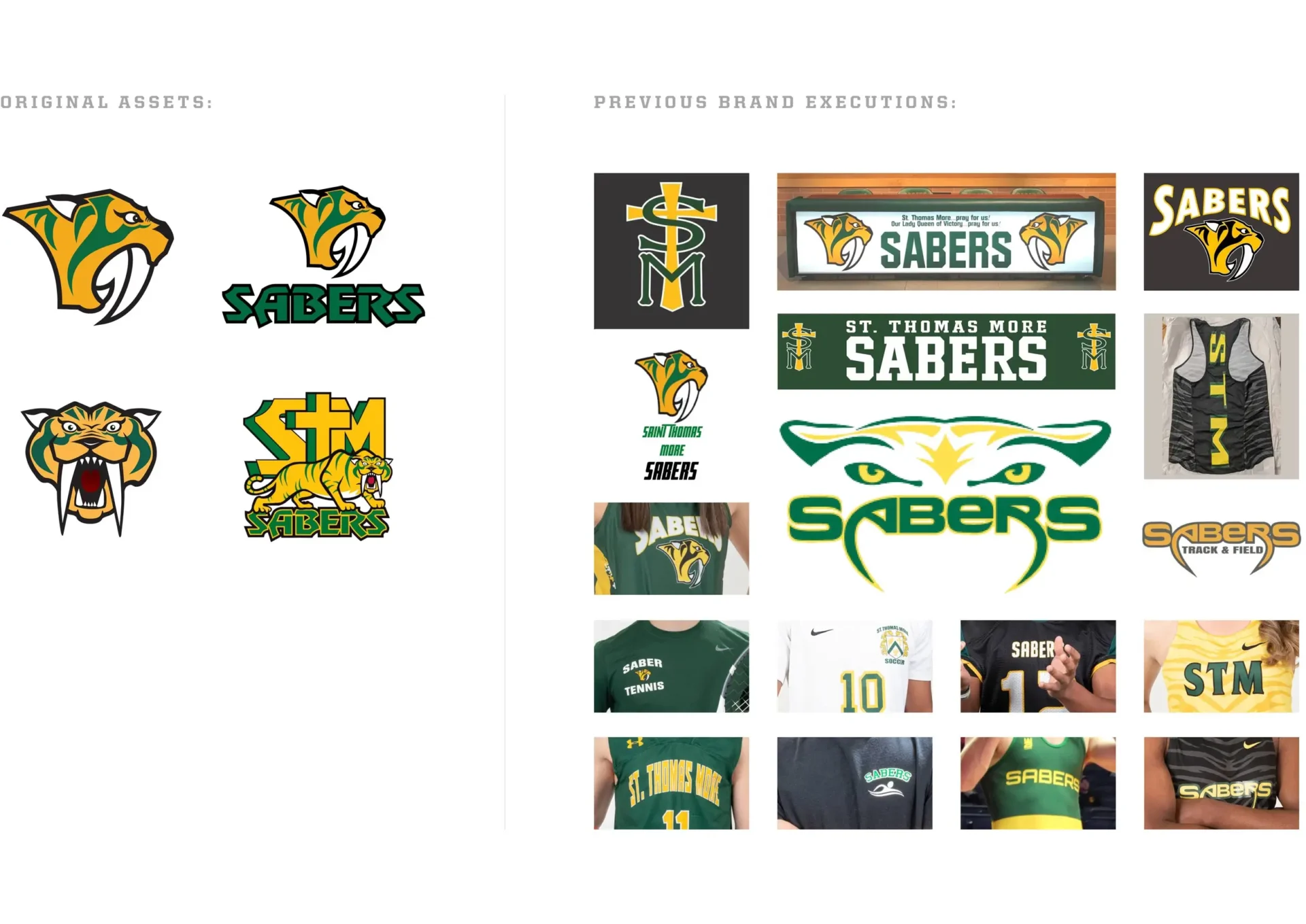
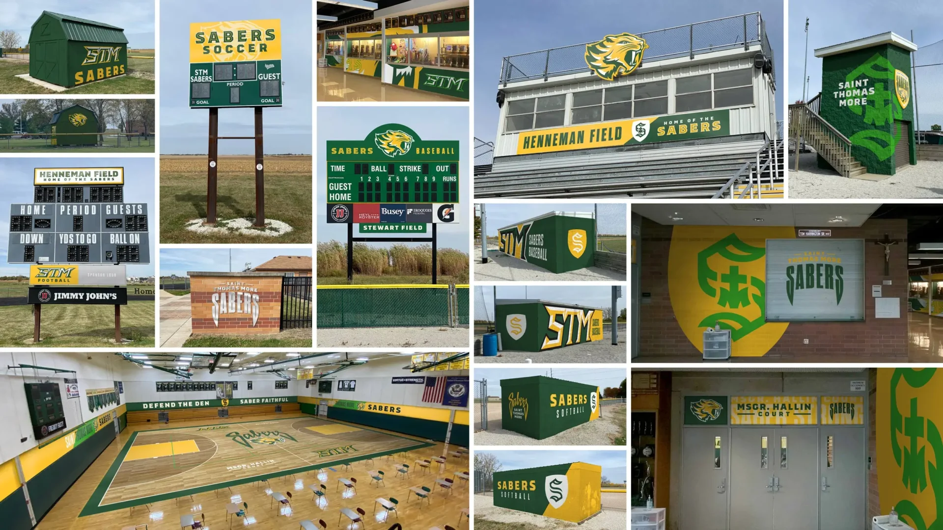
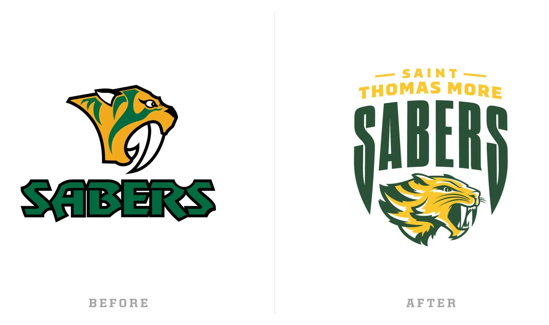
We completed a full review of existing athletics branding materials, including jerseys, environmental graphics, and equipment — anything the Sabers logo was already on. The conclusion of this audit was the recommendation to create new, more contemporary assets, including the Sabertooth cat, that were able to extend further than the current brand. We wanted to give the school more tools with work with so they didn’t feel compelled to create new things for every execution of the brand.

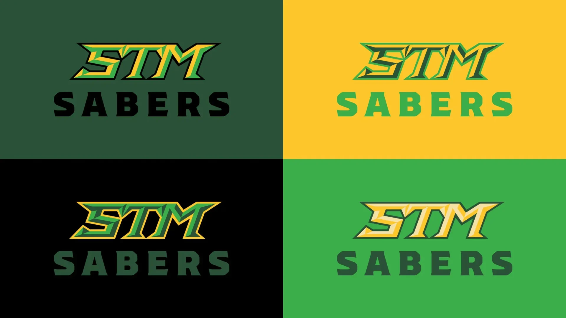
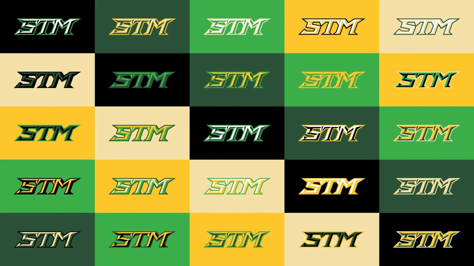
To that end, the new identity has been designed, not as a singular logo, but as a system of assets used in concert with one another, creating a visual identity system. While there is a primary logo lockup for the brand, a variety of logo assets, including different color options, have been provided. The freedom for variation in the application of our brand will keep it fresh and prevent brand fatigue that happens when schools have to rely on the same logo for everything.

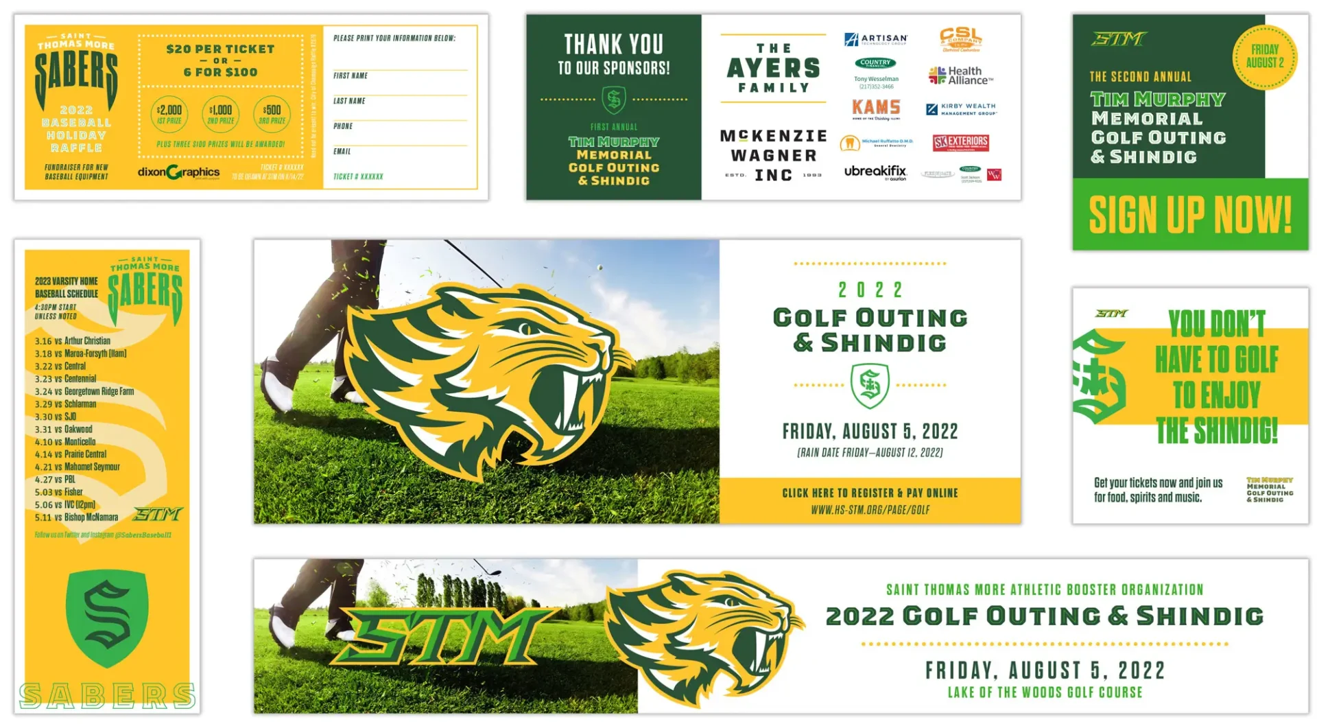
Additionally, having multiple brand assets available allows for customization on jerseys, apparel and other materials while still living within the visual program created for Saint Thomas More Athletics. The diversity of assets allows for individuality, but because it still works within our brand system we retain consistency across all applications.
Filed Under:
Branding Brand Standards Brand Update Graphic Design Logo Rebrand Environmental Graphics

The existing Sabers brand was fractured. There was no established system for teams to choose assets from when creating apparel or other team materials. While there were a few logo variations in the original brand package, the Sabertooth cat head was the only consistent element used. Typography and brand styles varied with each execution. Without a visual identity system in place, these exercises ultimately led to disconnected perspectives of the brand, weakening its impact.

We recognize the power in the sense of ownership and connectedness students and coaches get when they have the ability to design and customize their apparel and jerseys. The visual identity system we created supplies STM with a cache of assets that all work with one another toward their common goals. These logo assets empower students, coaches, and faculty to retain their sense of individuality with the ability to use different assets and color variations, yet at the same time, safe-guarding the STM brand from being fractured to ensure its maximum impact.

Our branding effort employs a strict visual culture to all STM materials in order to help tell a unified story across all sports, while still allowing each sport’s unique qualities to shine through. This creates better engagement with STM fans and helps sell their program to prospective students and parents. All of this helps grow the school as a whole.


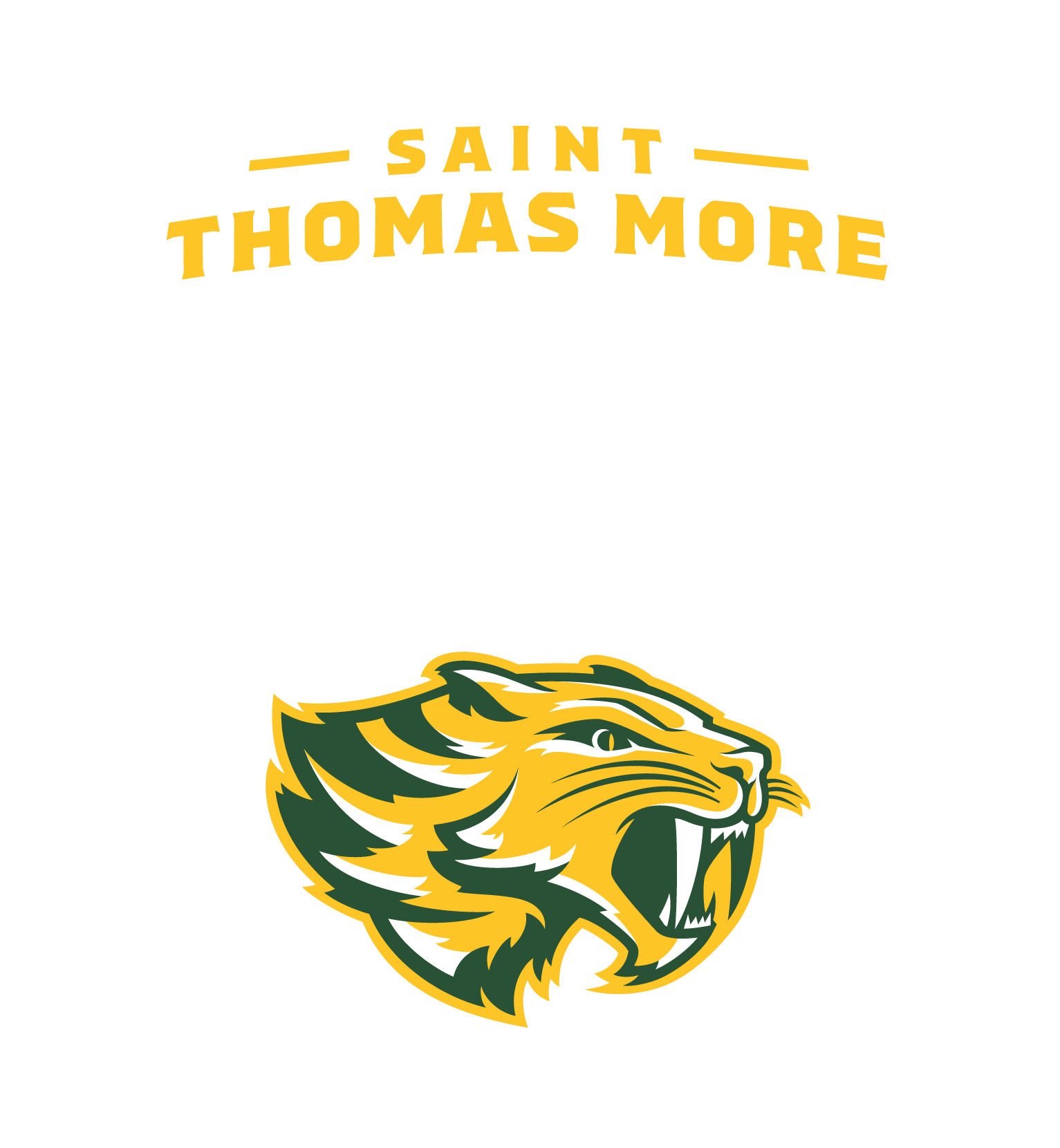
Primary Logo

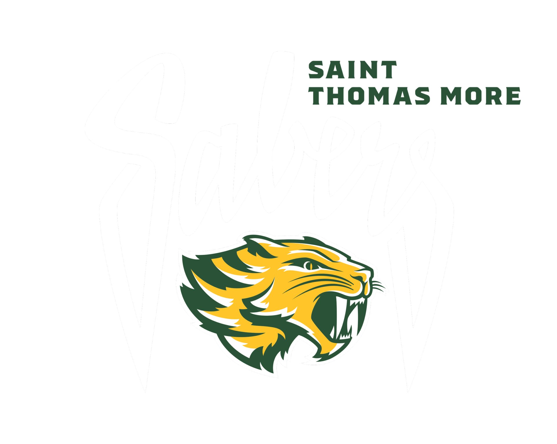
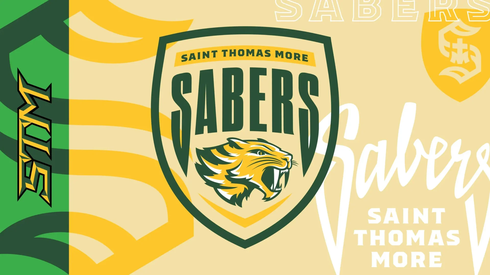
This is the main STM logo, which features the full name and the Saber mascot. This is to be used in instances where the Sabers brand has only one chance to be seen (e.g. when giving the logo to news media or IHSA, when the logo appears with other school logos, etc.).


Secondary Logos

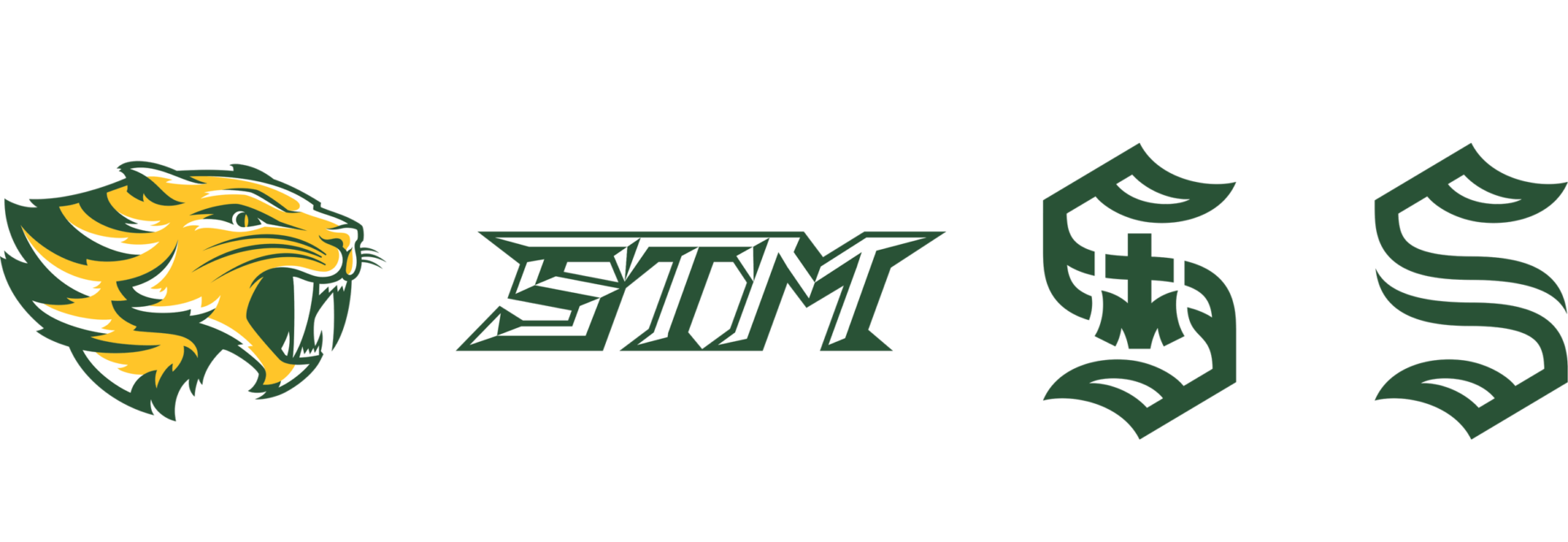
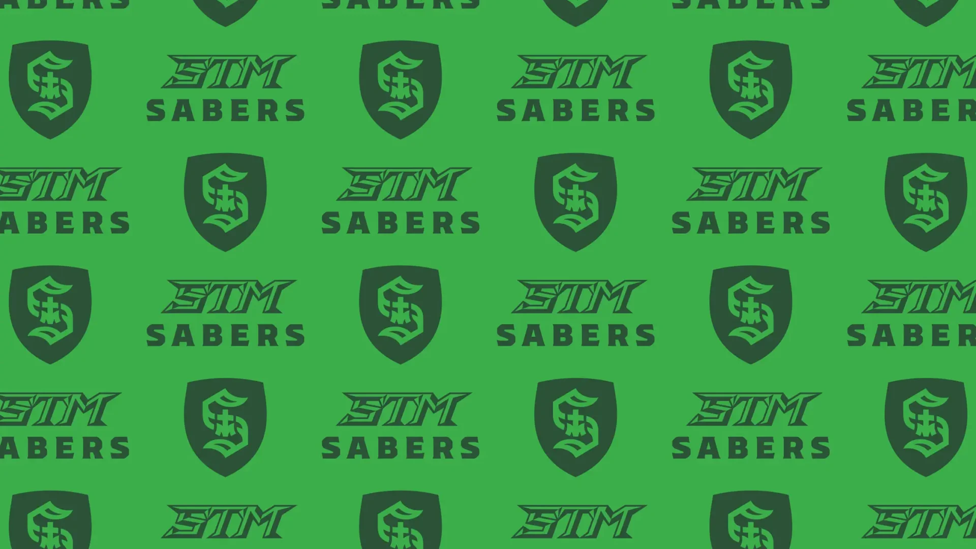
The secondary assets introduce the two ‘S’ monograms as well as the ‘STM’ initials logo. The secondary logos are used to represent STM when the full name is not necessary or when variety in the assets is desired or needed (e.g. when needing multiple or different logos for jerseys, apparel, signage, programs, etc.).


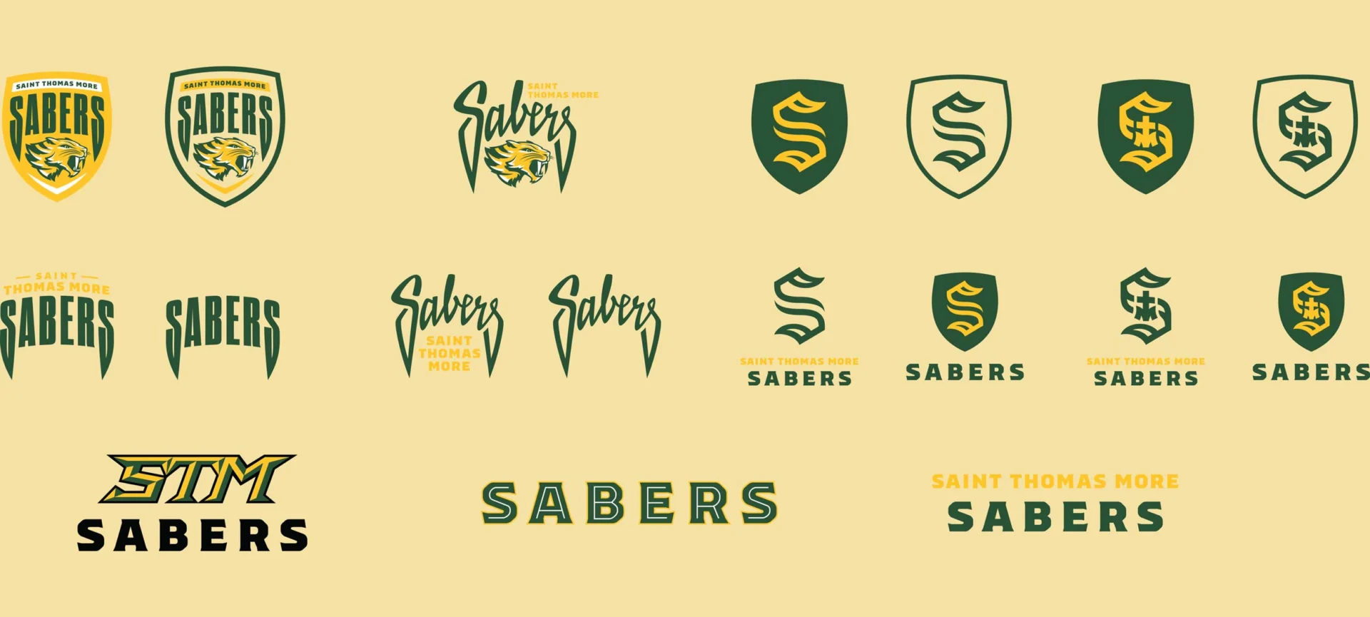
Tertiary Logos

Tertiary logos can be used whenever appropriate. These are mainly variations or different lockups of the primary and secondary assets with text added, with the addition of the Sabers ‘script’ we created. Along with the secondary logos, these help provide variety in the STM materials so the primary logo is not over-used.


Brand Standards

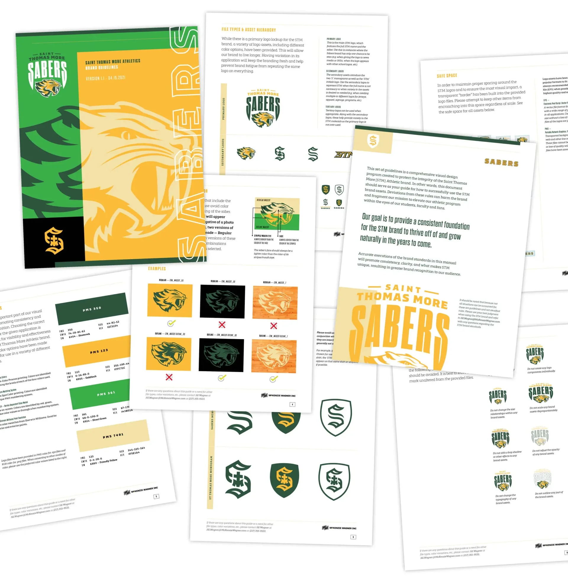
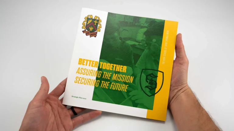
McKenzie Wagner created a comprehensive, but easy-to-use brand guide document for students, teachers, and coaches to reference when creating new materials with the new athletic brand. This set of rules establishes a solid baseline for our new identity and helps ensure proper usage across a variety of applications.


In addition to new logo assets, we also tweaked the color palette by adding two new colors: a bright, fresh green and a light tan. These new color additions will further help with brand variation on jerseys, banners, signage, and more. We want to inject more youthfulness and energy into the STM athletics brand and adding brighter colors to the color palette is a great way to do that. The bright green and tan have been designed to work seamlessly with the dark green and yellow that already identify STM athletics. These new color additions will make the athletics brand more contemporary and exciting for STM students, coaches, faculty, and fans, giving them more variety in the color of materials that can be selected for use, while still remaining true to the baseline we have established as the STM athletics brand.

The Monogram — ‘S’ vs ‘STM’

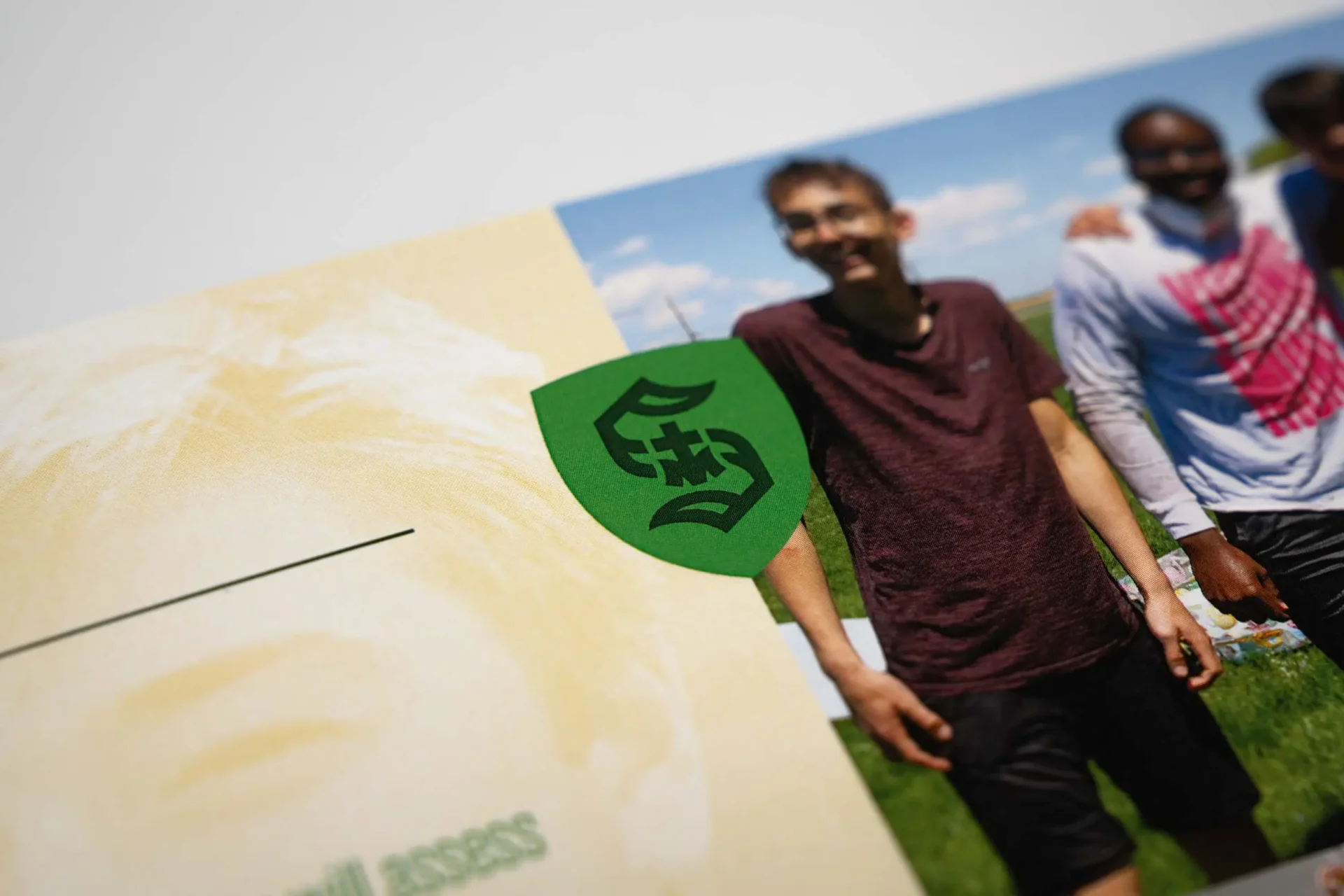
In order to help the new athletics brand blend with the academics side of the institution more readily, the new identity includes two versions of an ‘S’ monogram: one version is only a capital ‘S’ for Sabers intended for use only with athletics, while the second version includes the ‘T’ and ‘M’ for Saint Thomas More and can be used with academics materials as well. Both drawings are virtually the same, with the only change being the middle portion of the letter. This makes these two logos interchangeable, giving us the flexibility to use either version when desired for athletics and the ‘STM’ version for academics.


STM Initials

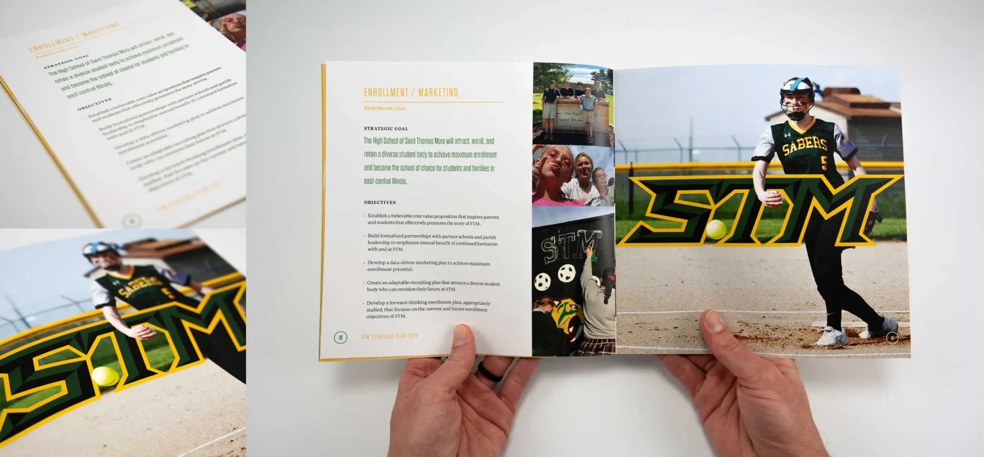
Within the school and local community, the High School of Saint Thomas-More is colloquially referred to as ‘STM.’ We knew it was vital for there to be a logo asset that utilized this acronym, so we created this angular ‘STM’ logo for this exact purpose. This is a dramatic, aggressive graphic that helps reflect the intensity of sports.

We know that different sports require different perspectives on how to be successful. Some need full-force aggression while others favor agility and speed. We built the STM brand to be flexible enough to work with any sport — not just football and basketball, so that their new branding felt just at home on a football helmet as a golf polo.