
UA Local 149

Branding

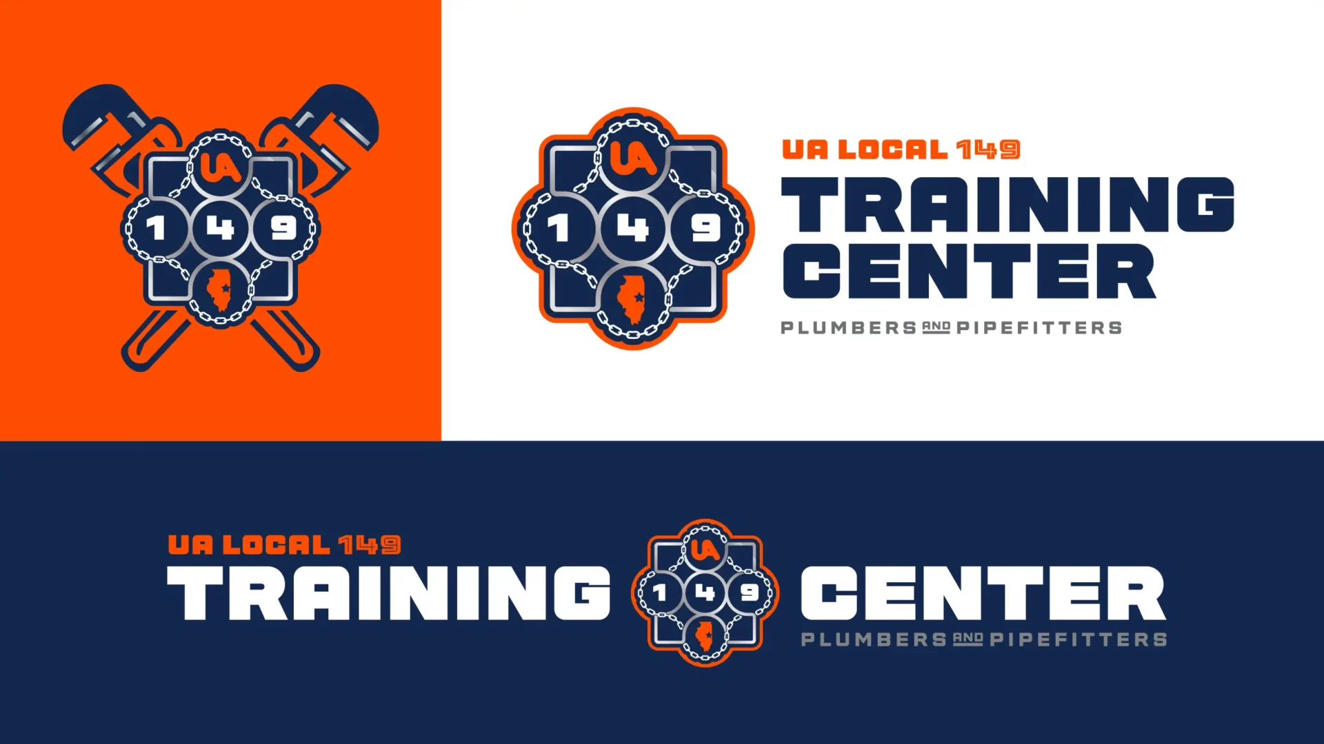
For years, UA Local 149’s Training Center operated under the union’s logo, borrowed rather than built for the job. It worked, but it wasn’t built for a training facility competing for attention and applicants. UA Local 149 needed a standalone identity that looked as professional as the training happening inside its walls and one that provided them the flexibility to be visible consistently across a wide range of applications.
Filed Under:
Branding Logo Graphic Design Vehicle Graphics

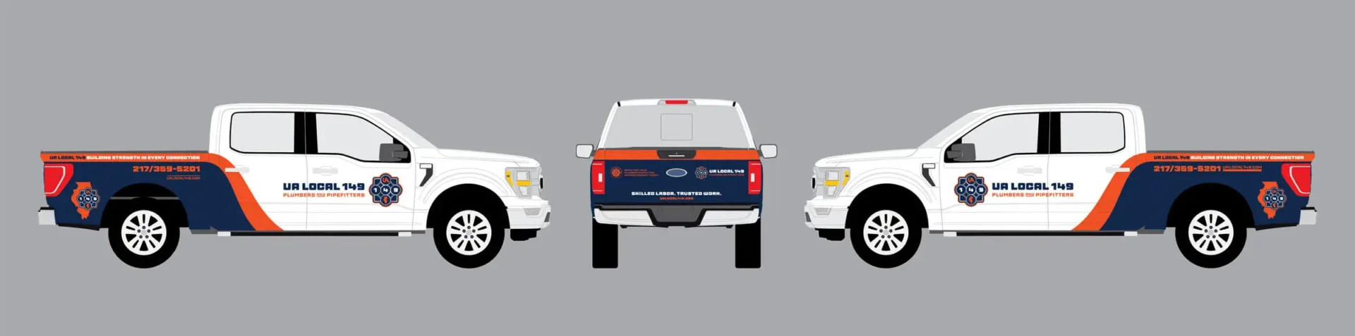
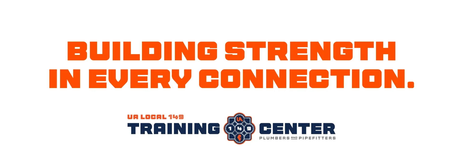
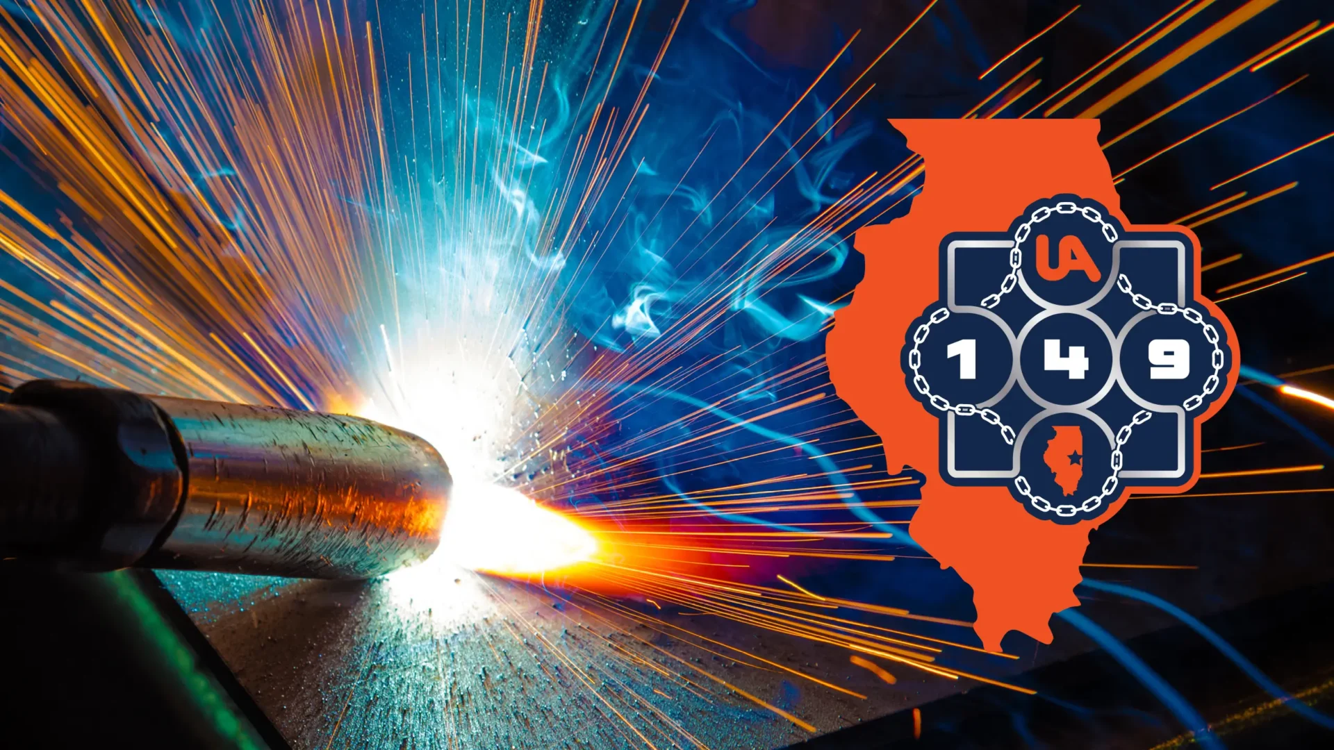
We built an easy-to-use identity kit from the ground up: a primary horizontal lockup, a state-shaped version that roots the brand in Illinois, and a seal treatment for formal use, paired with supporting icons, including a state icon and a crossbone-wrenches mark, so the brand could seamlessly jump between context and deliverables without losing consistency.

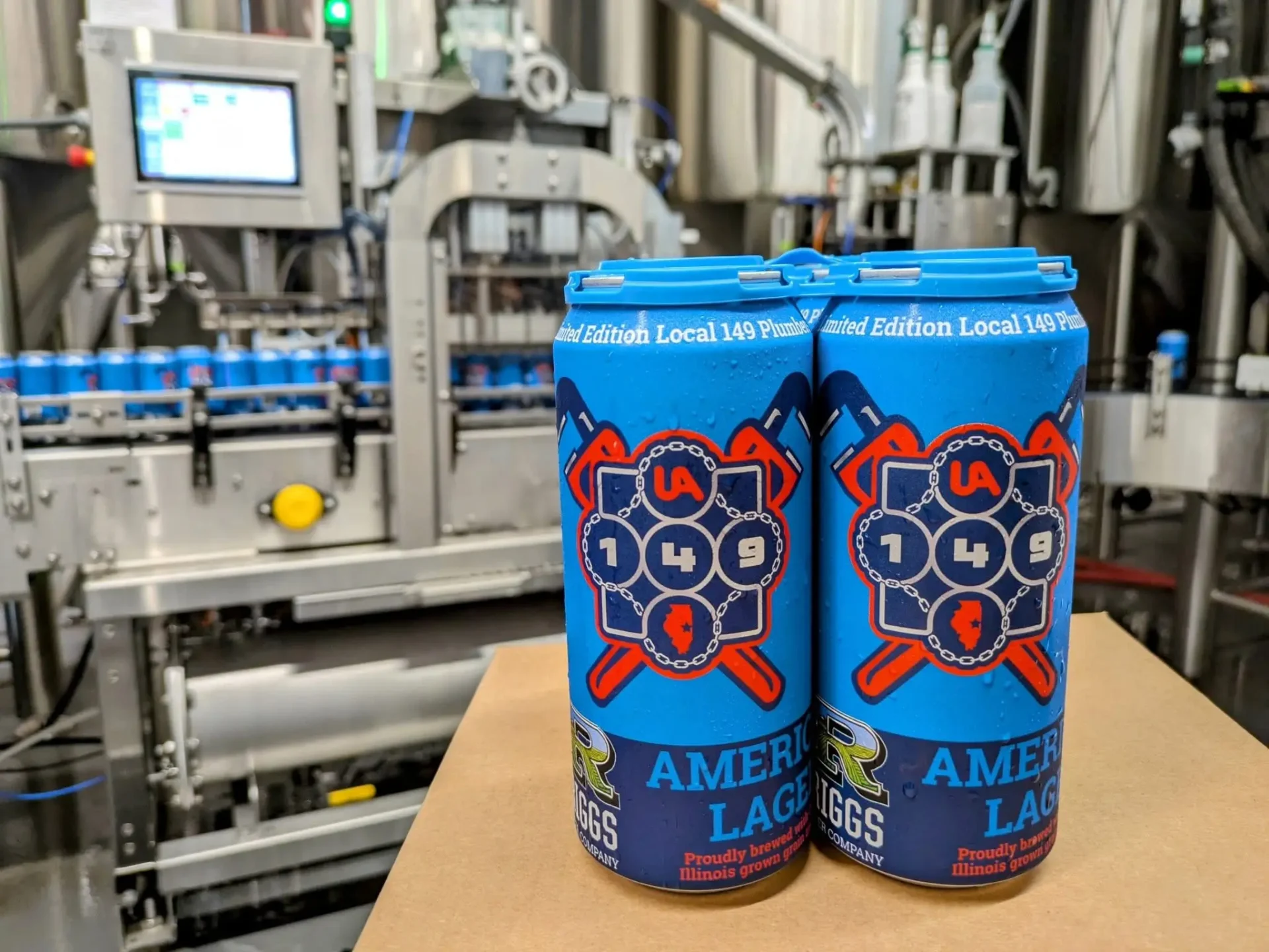
MW did not produce the label for this can.

A fun find.

The identity has shown up in some unexpected places — including this custom Riggs Beer can, though the packaging design itself isn’t ours.