Syndicate-Made
Branding & Packaging
Filed Under
-
Branding, Advertising & Marketing, Print
Scope of Project
- Advertising & Marketing
- Logo
- New Identity
- Graphic Design
- Umbrella Brand
- Packaging
- Copy Writing
In 2018, MW was tasked with creating a new craft brewery and beer brand serving Chicago and the Midwest, including branding, naming and visual identity strategies, packaging design, product concepts, messaging, and more.
For generations, Chicago has had a profound relationship with beer. To many, its more than just a drink, it is a direct cultural tie to their community. These beer drinkers have embraced craft beer brands and identify with their rebellious spirit of going up against the big guys.
This was a dream project for McKenzie Wagner because of the all-encompassing nature of the work. Branding, packaging, naming, copywriting, product development, messaging, attitude, and booze — a match made in Hefeweizen. The market-research was pretty fun too.


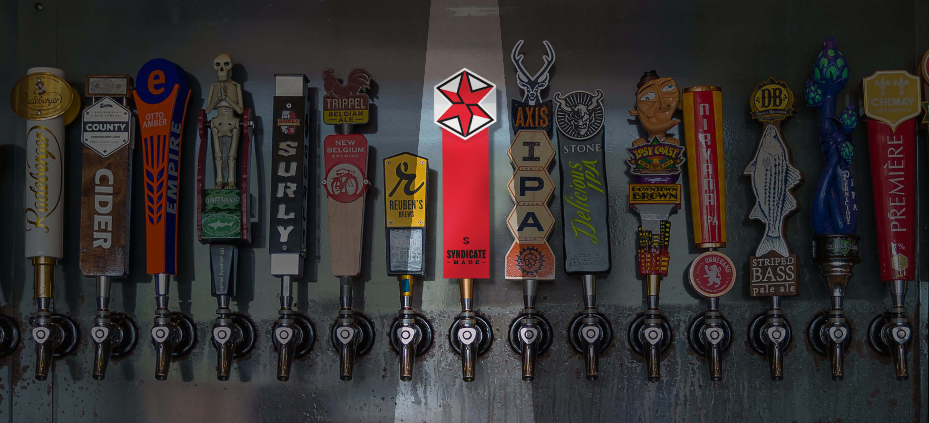
The quest to create a memorable brand experience with our audience was always our main priority, especially considering the over-saturation of the craft beer market in Chicago and the Midwest. Over 100 new breweries were opened in Chicago alone from 2013 to 2018. For this new venture, there was a commanding need to stand out in a vast sea of competitors.
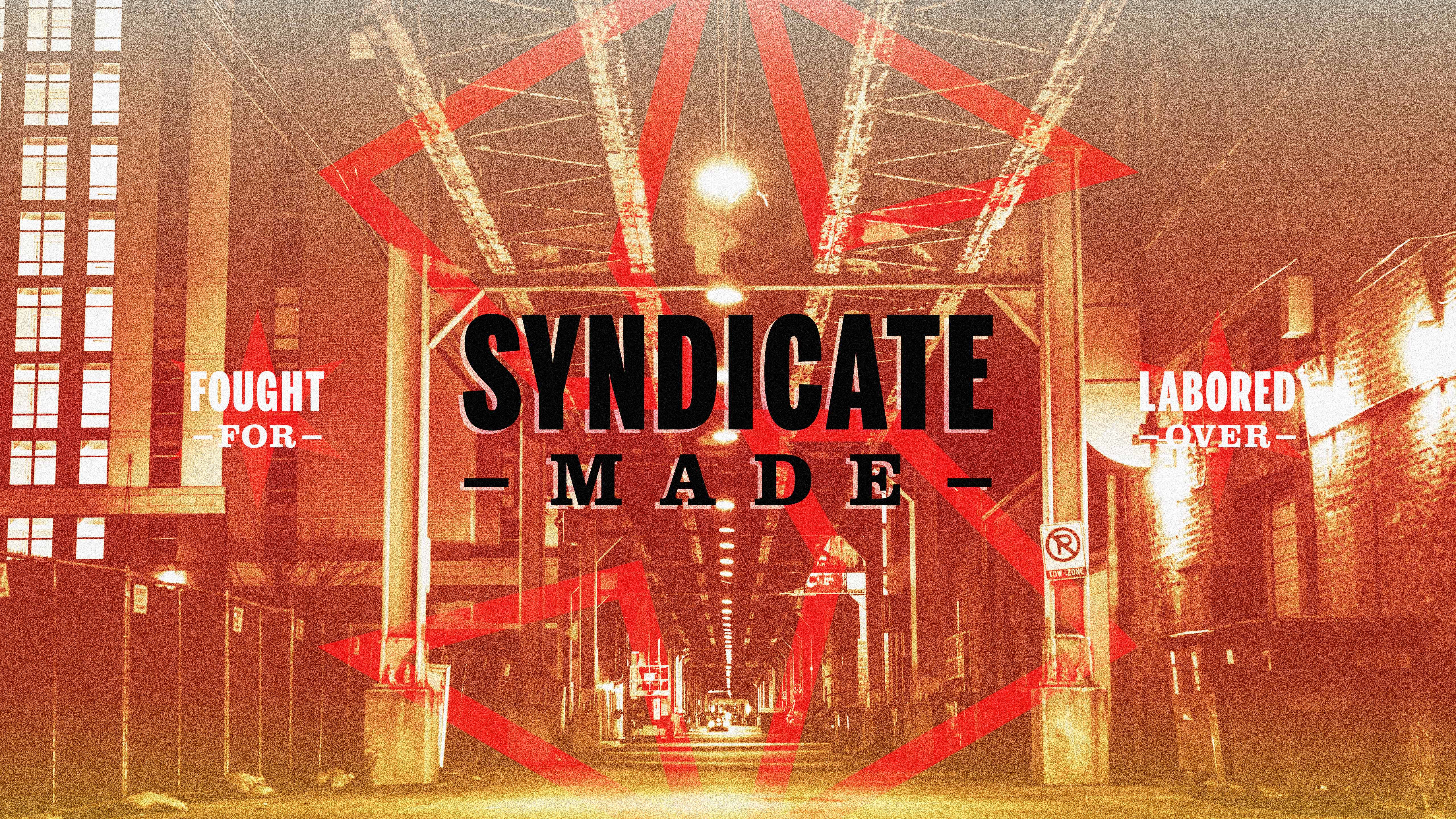
With a large focus on the Chicago market, the client initially requested mob and prohibition-era themes to be present in the brewery and product branding. In an effort to walk the line between wants and needs, we broadened the scope of “Chicago” themes we were to pull from. Instead of focusing on mobsters and bootleggers, we focused on the attitude and character they share with current Midwesterners. In doing this, we added long-term flexibility to the branding by giving it room to grow rather than be stuck in a specific niche or gimmick.
This meant less mobsters and bootleggers and more broad-shoulders and hard work — things that would be better embraced by the residents of Chicago and the greater Midwest.
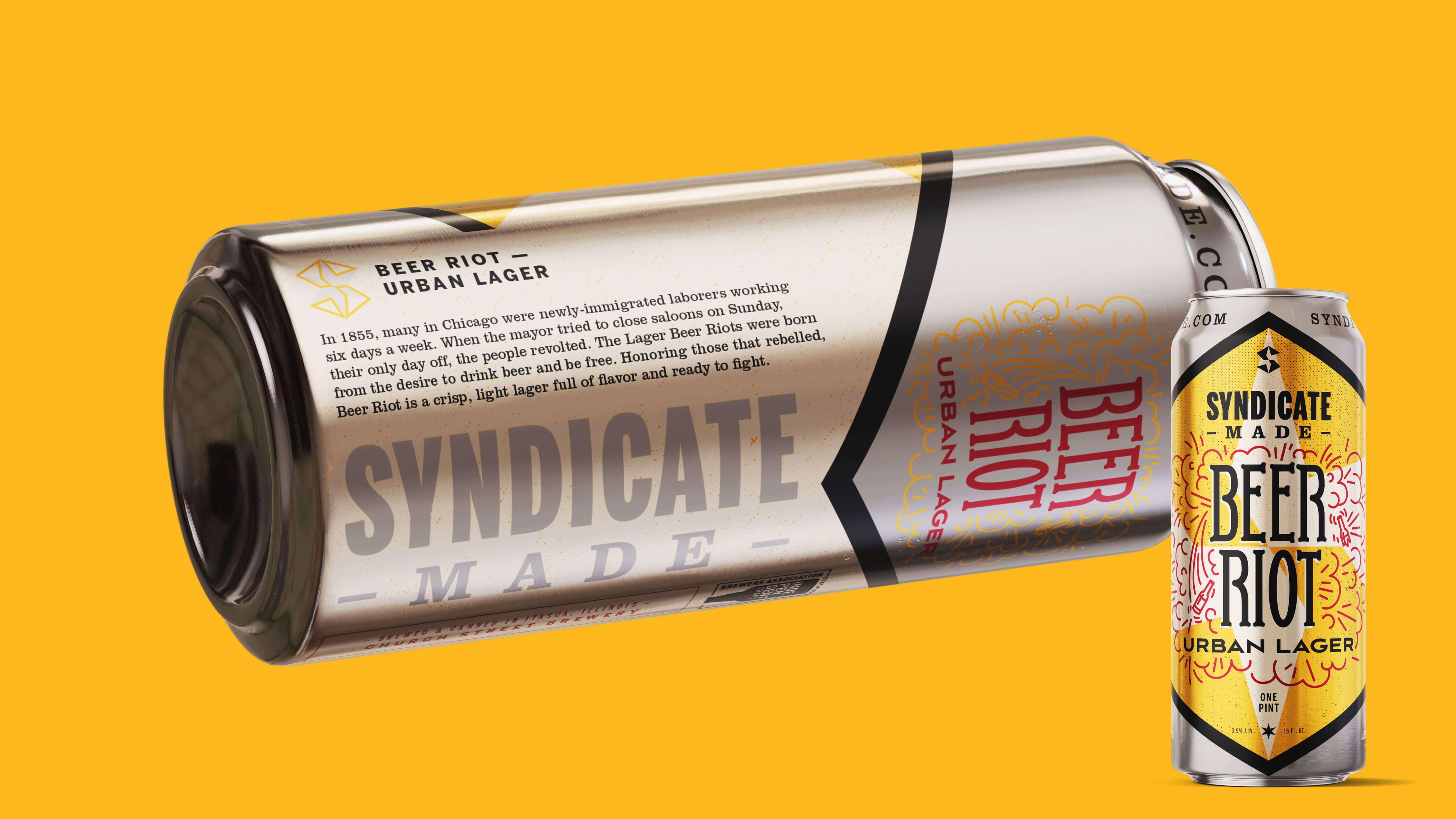
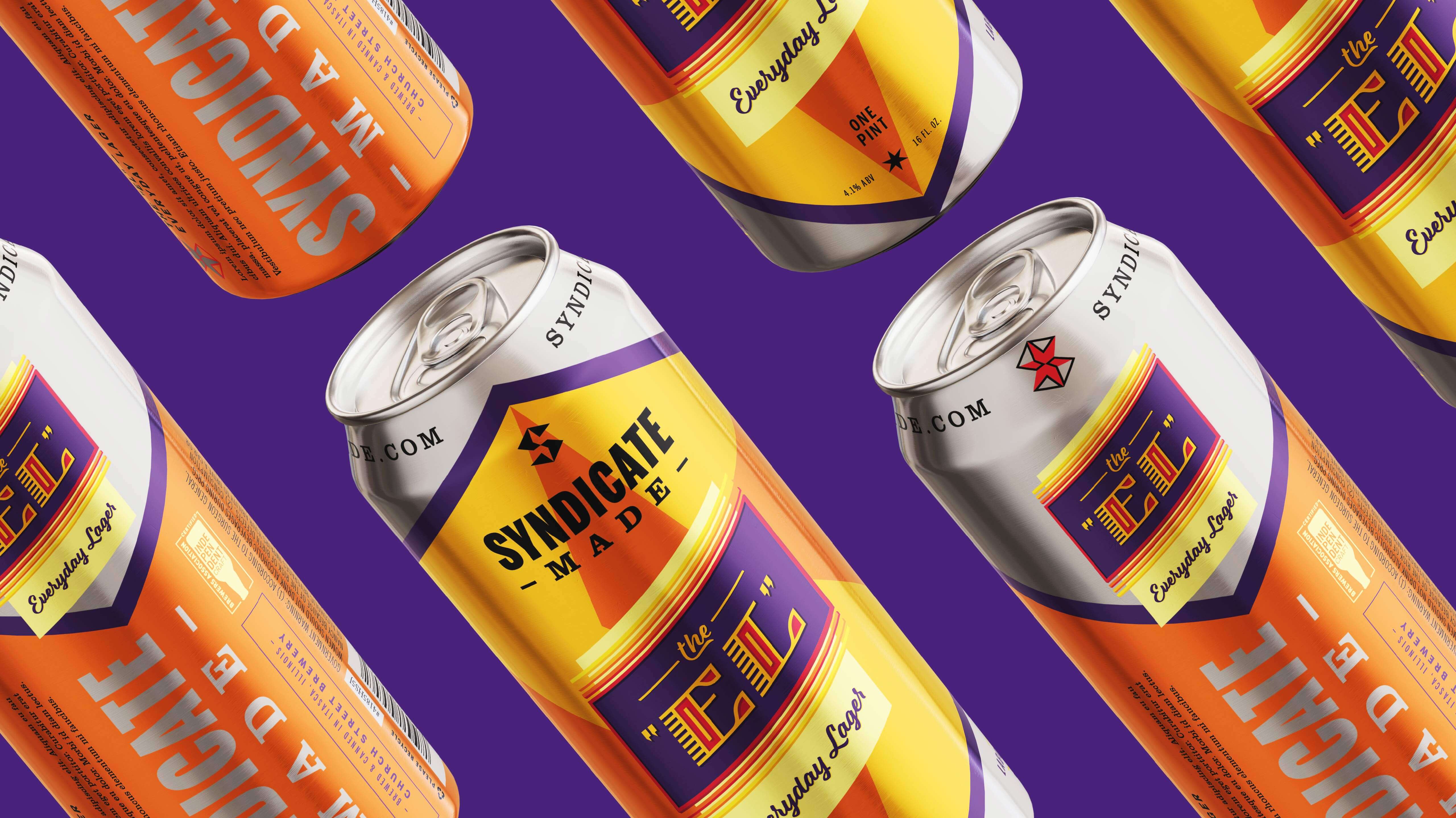
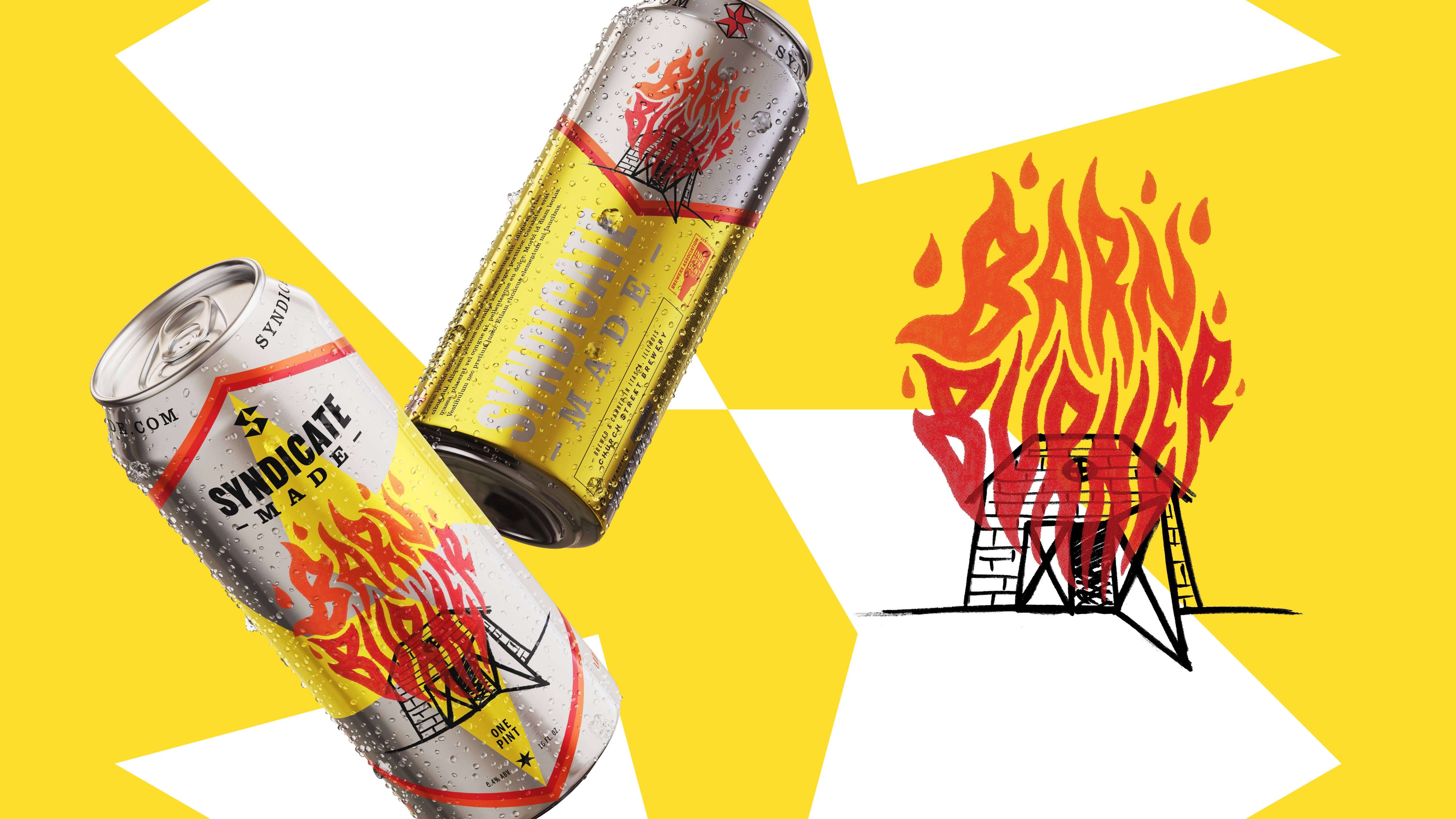
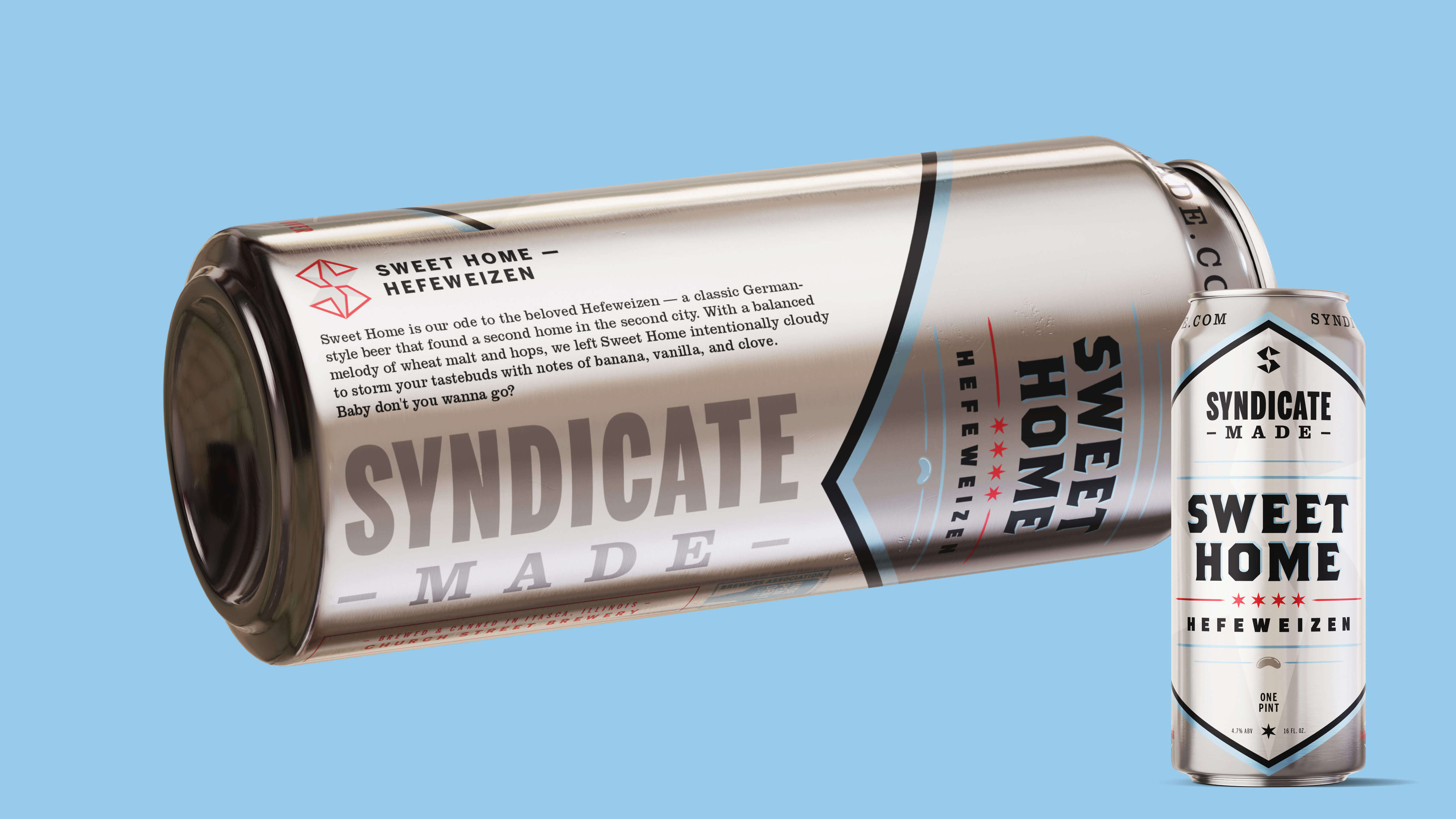
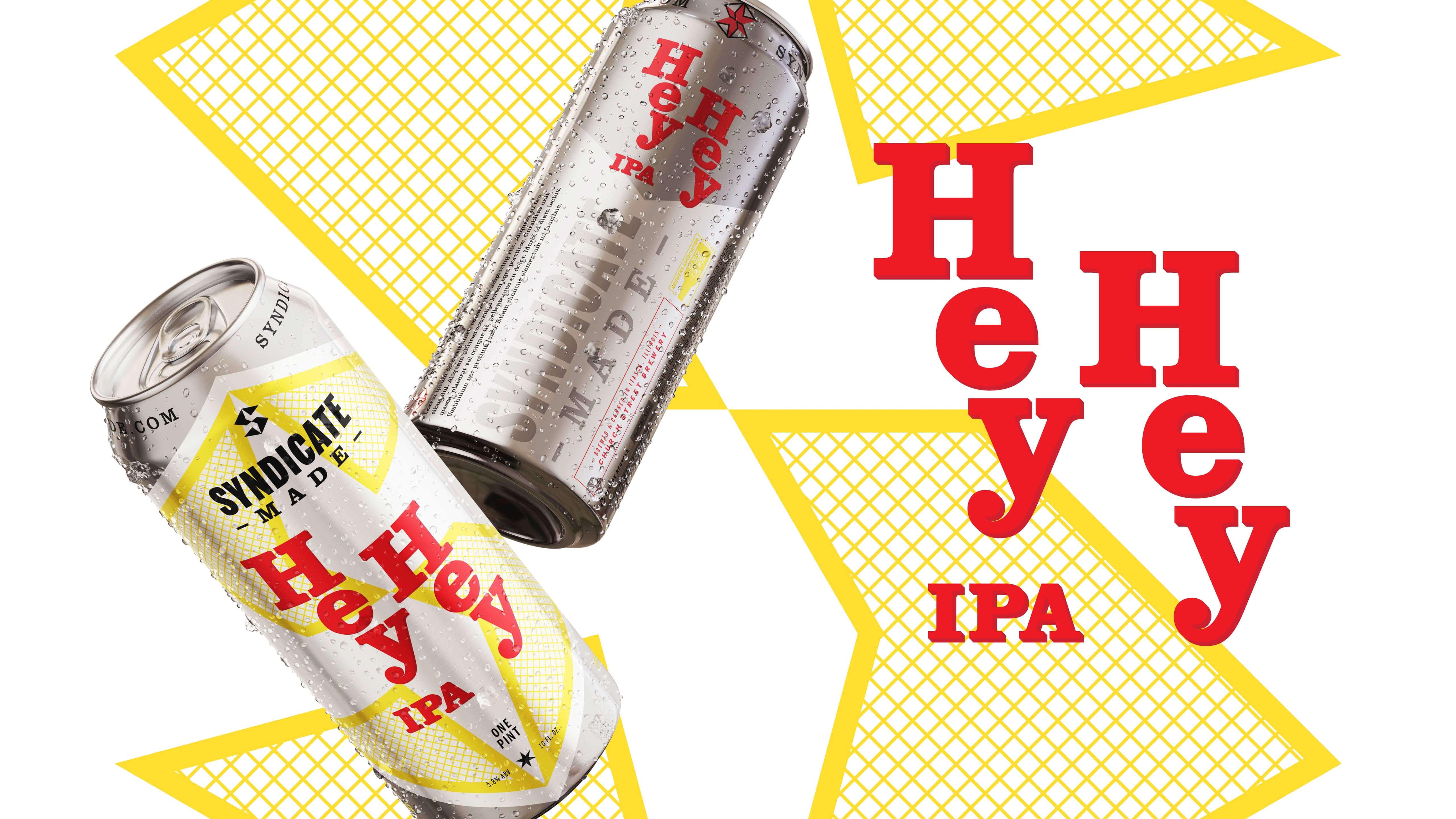
There is always a fight for shelf space in retail.
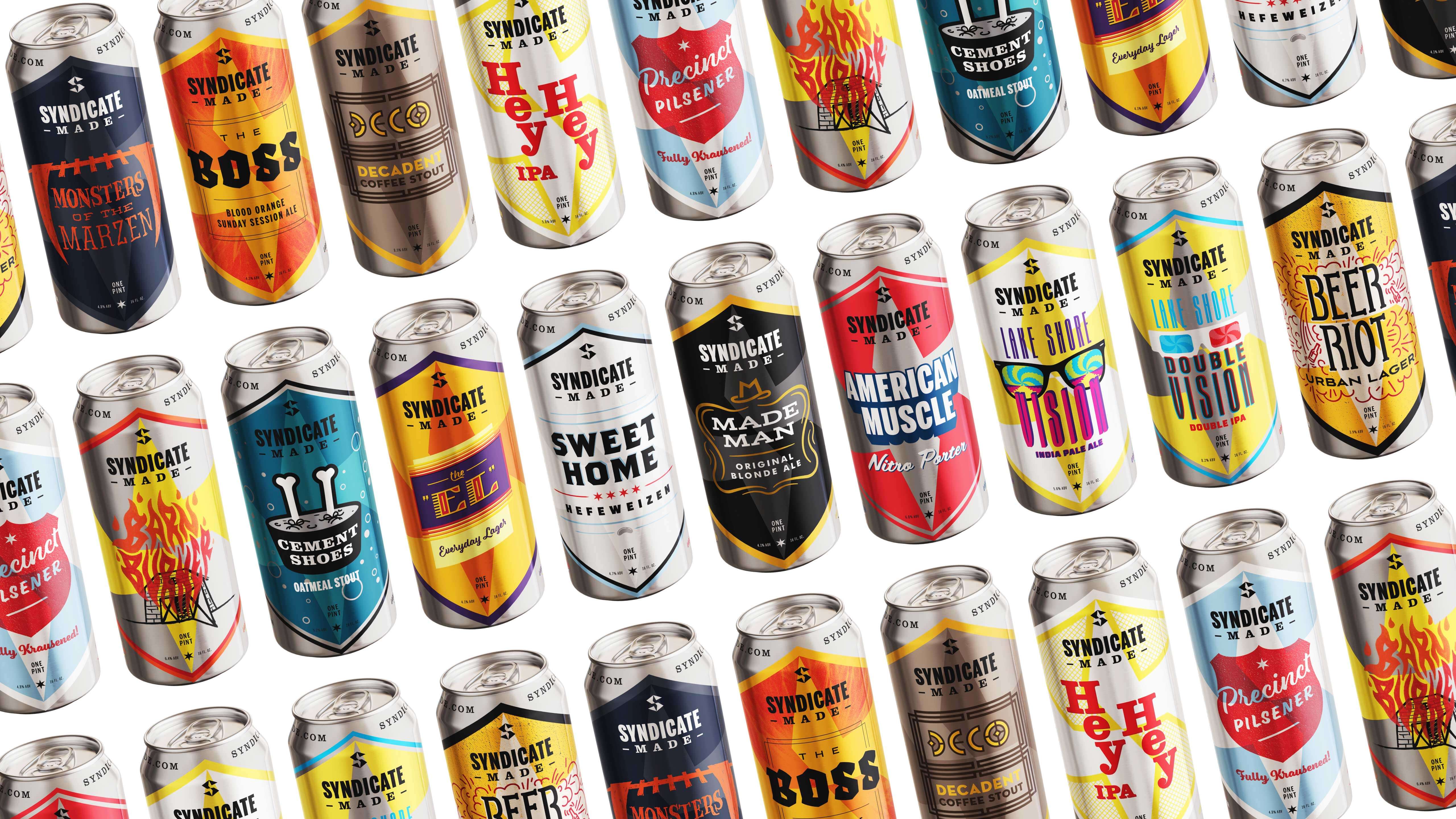
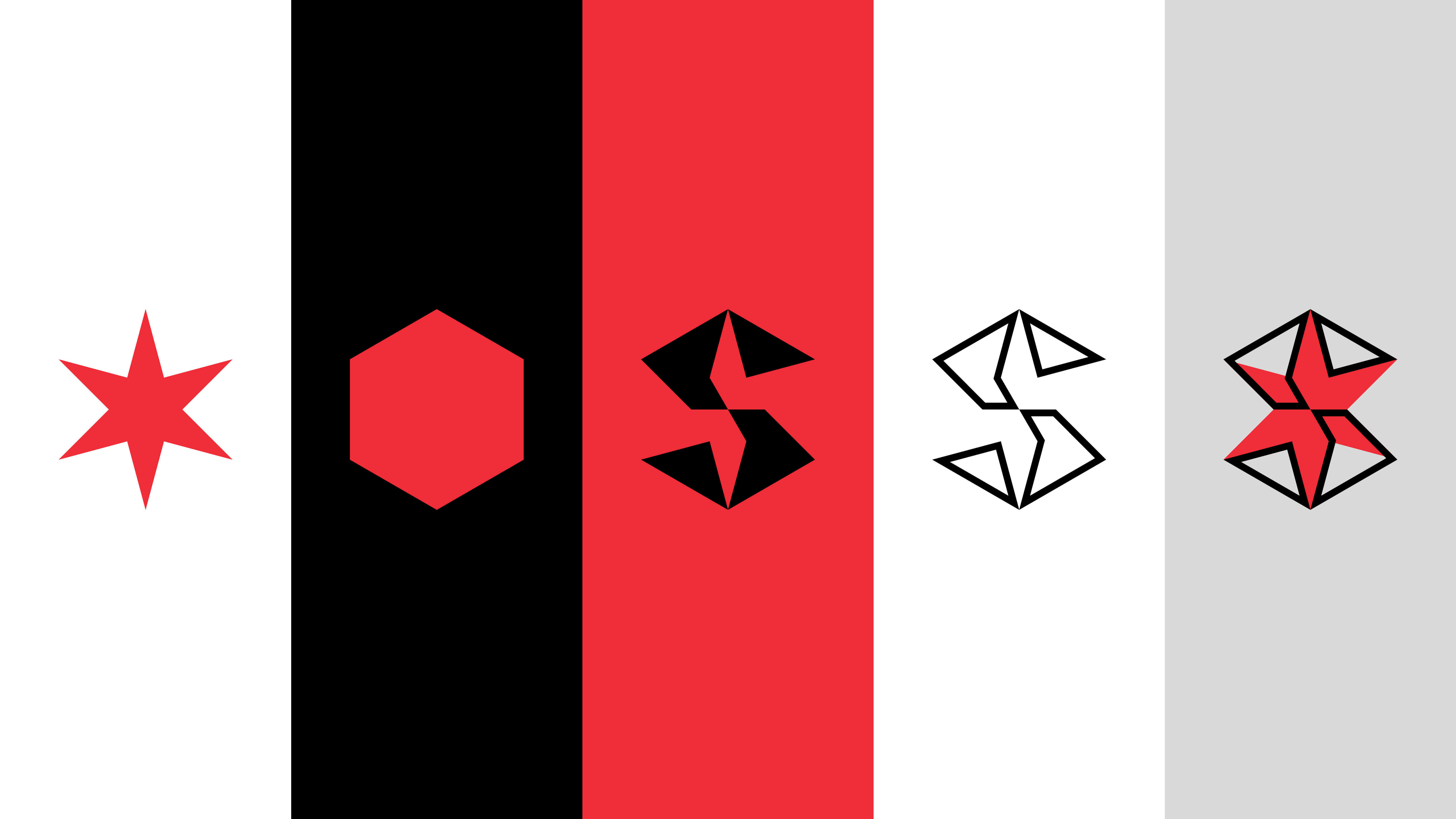
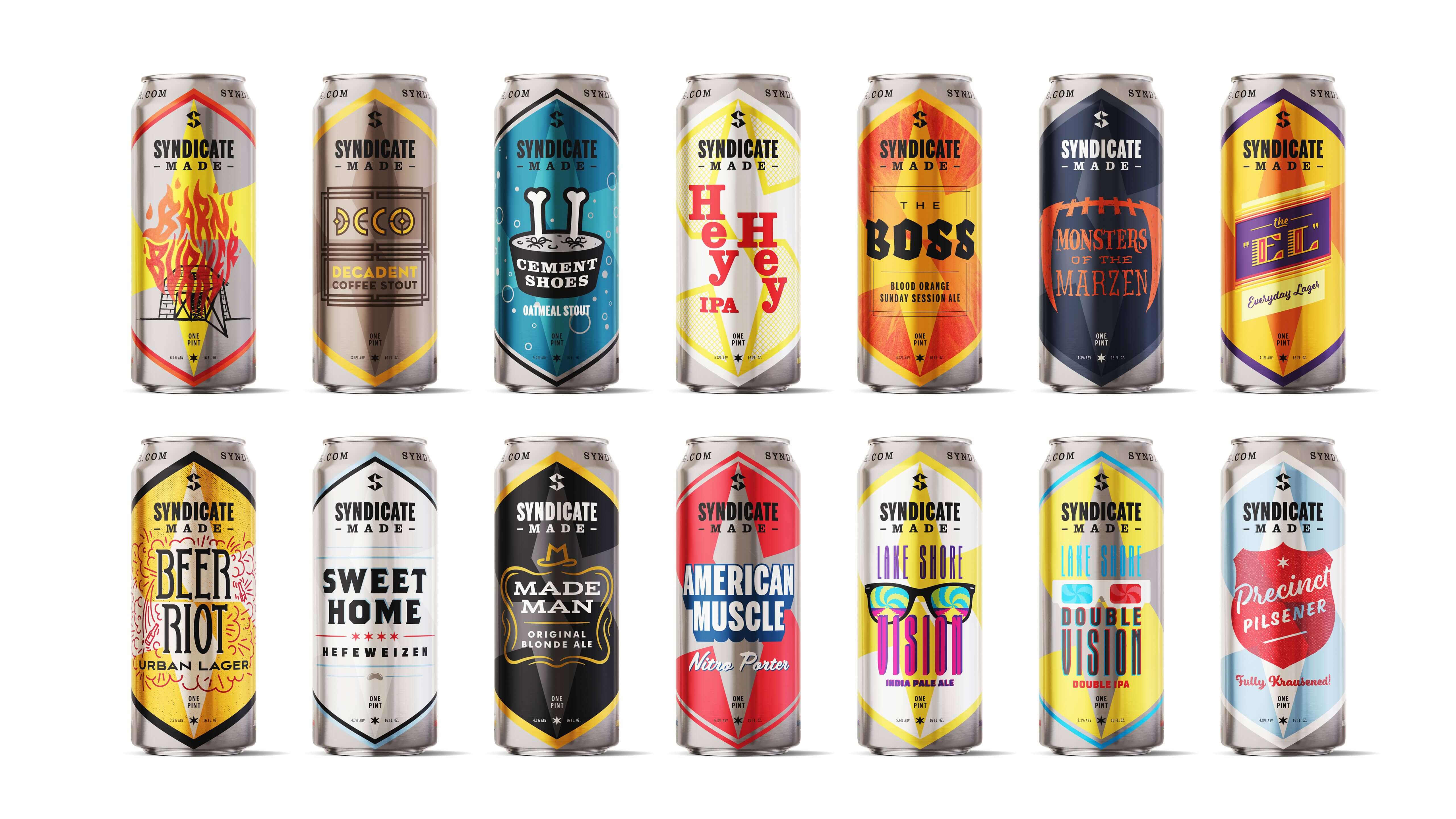
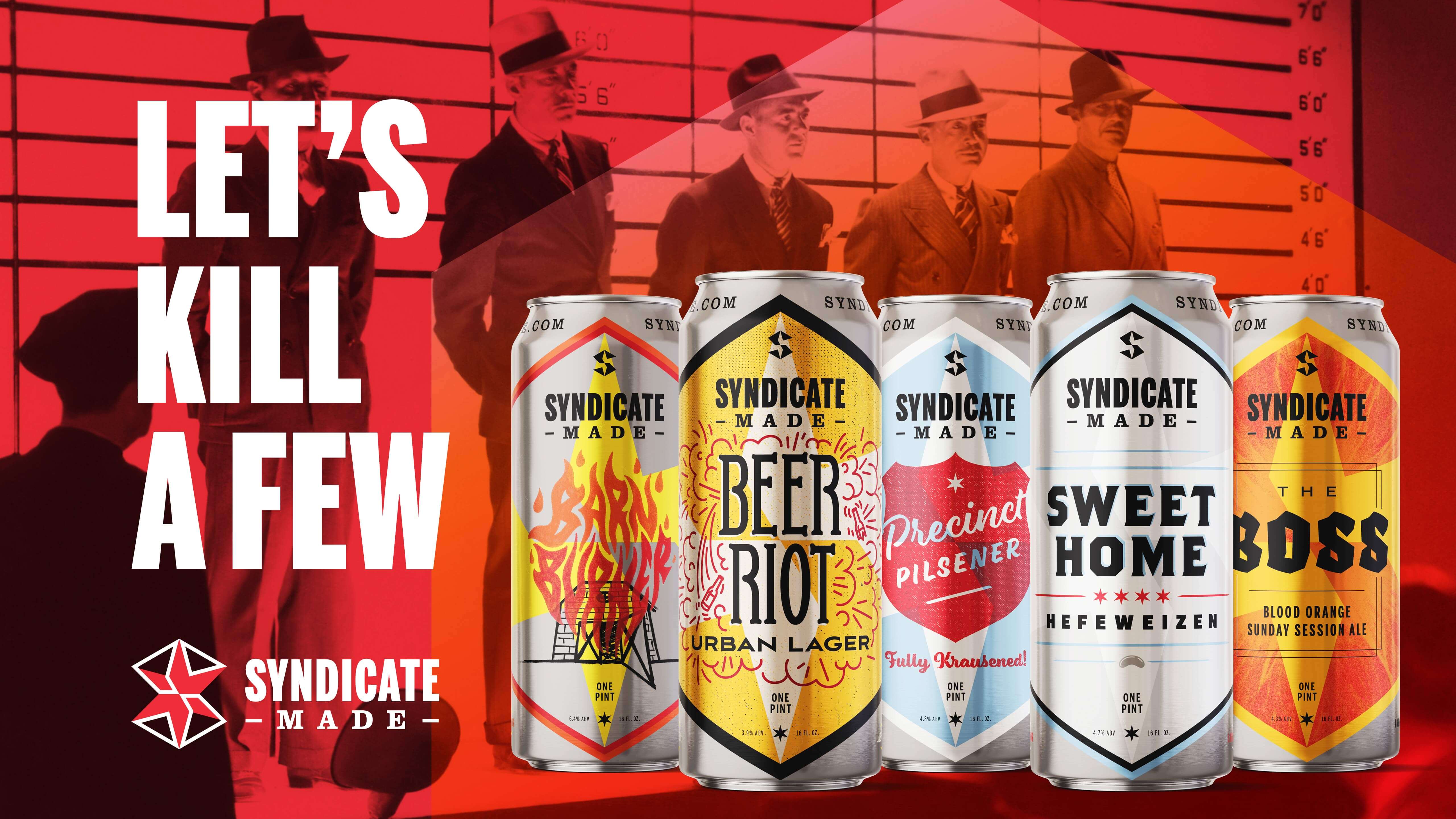
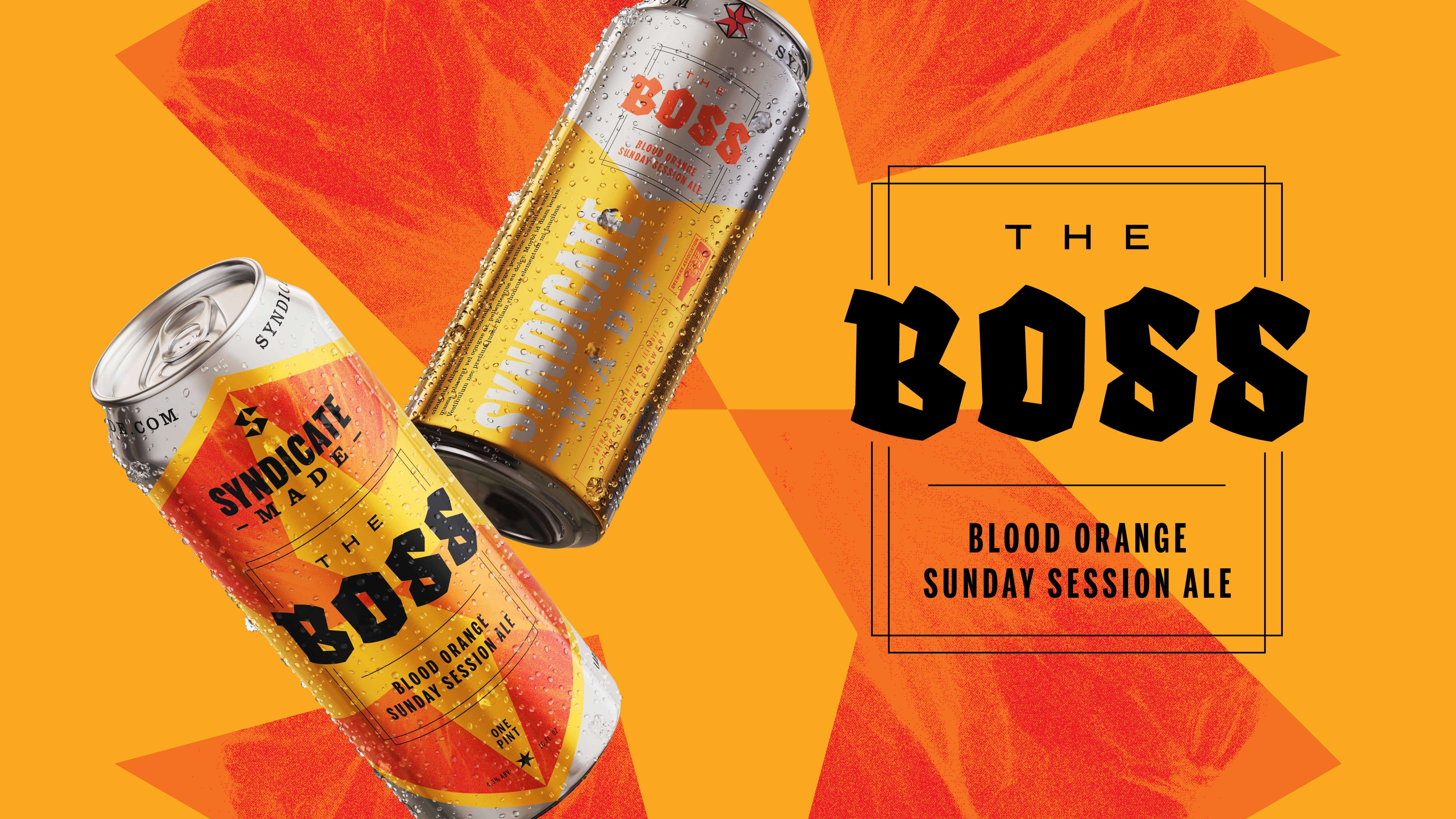
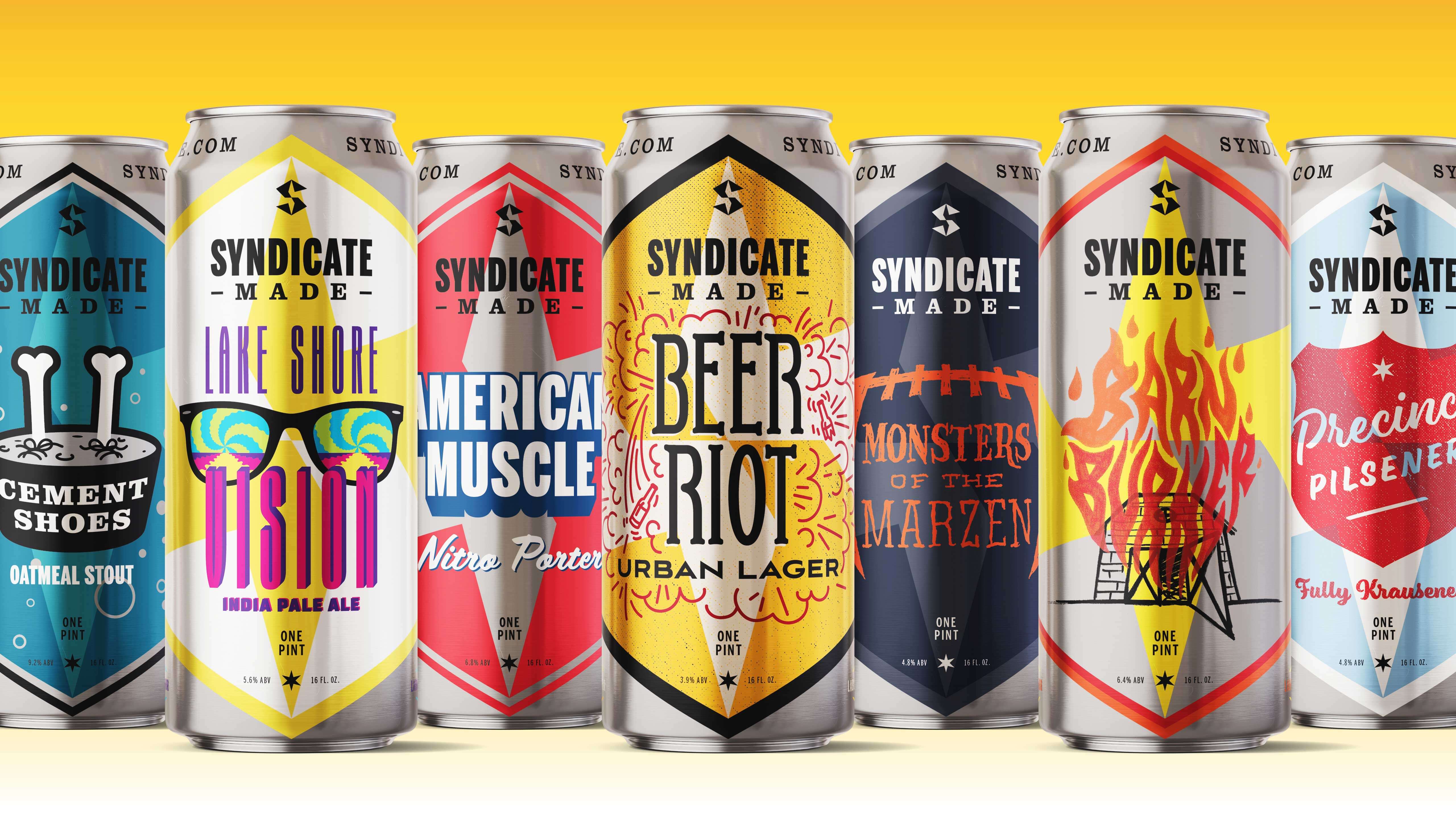
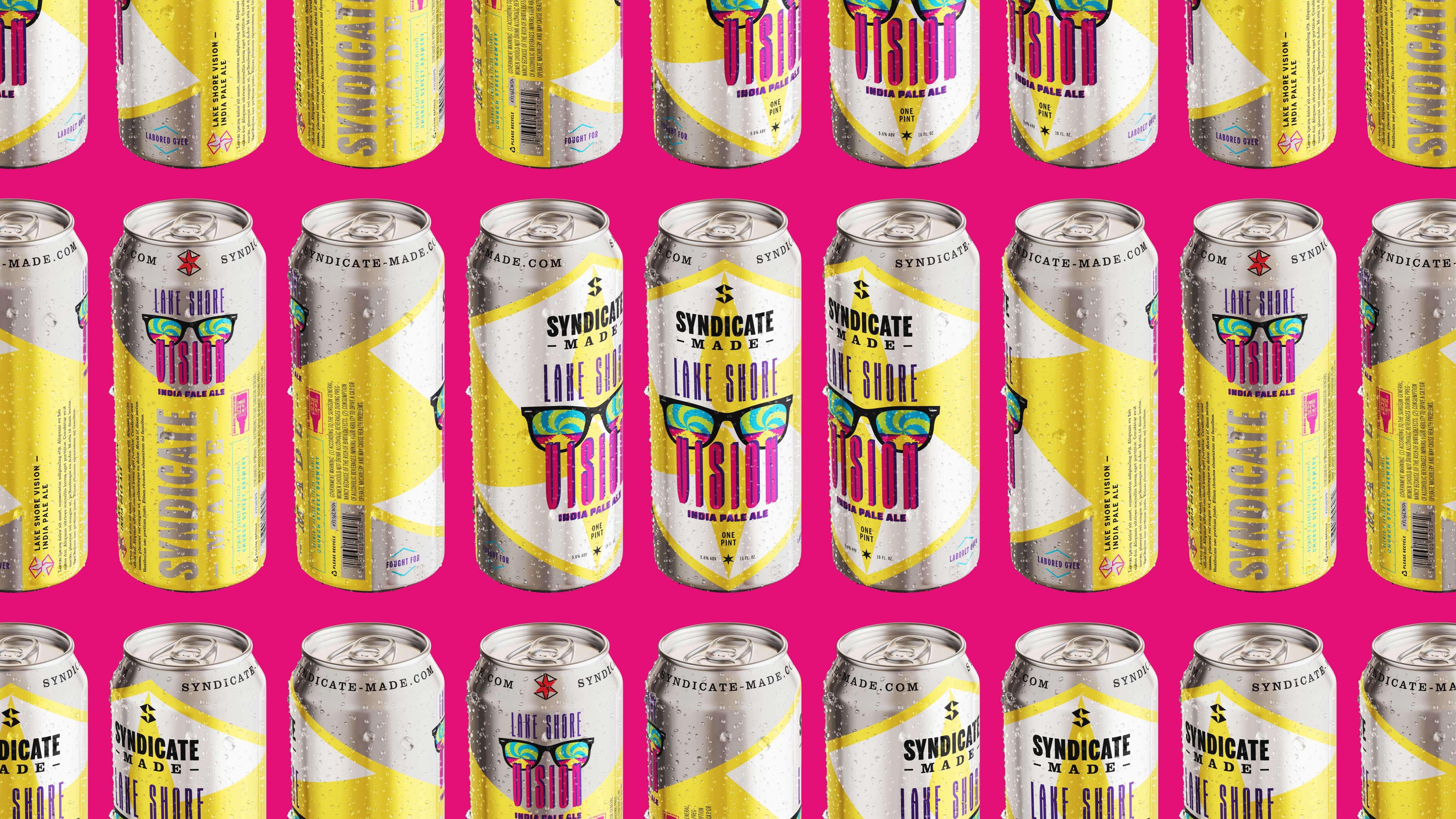
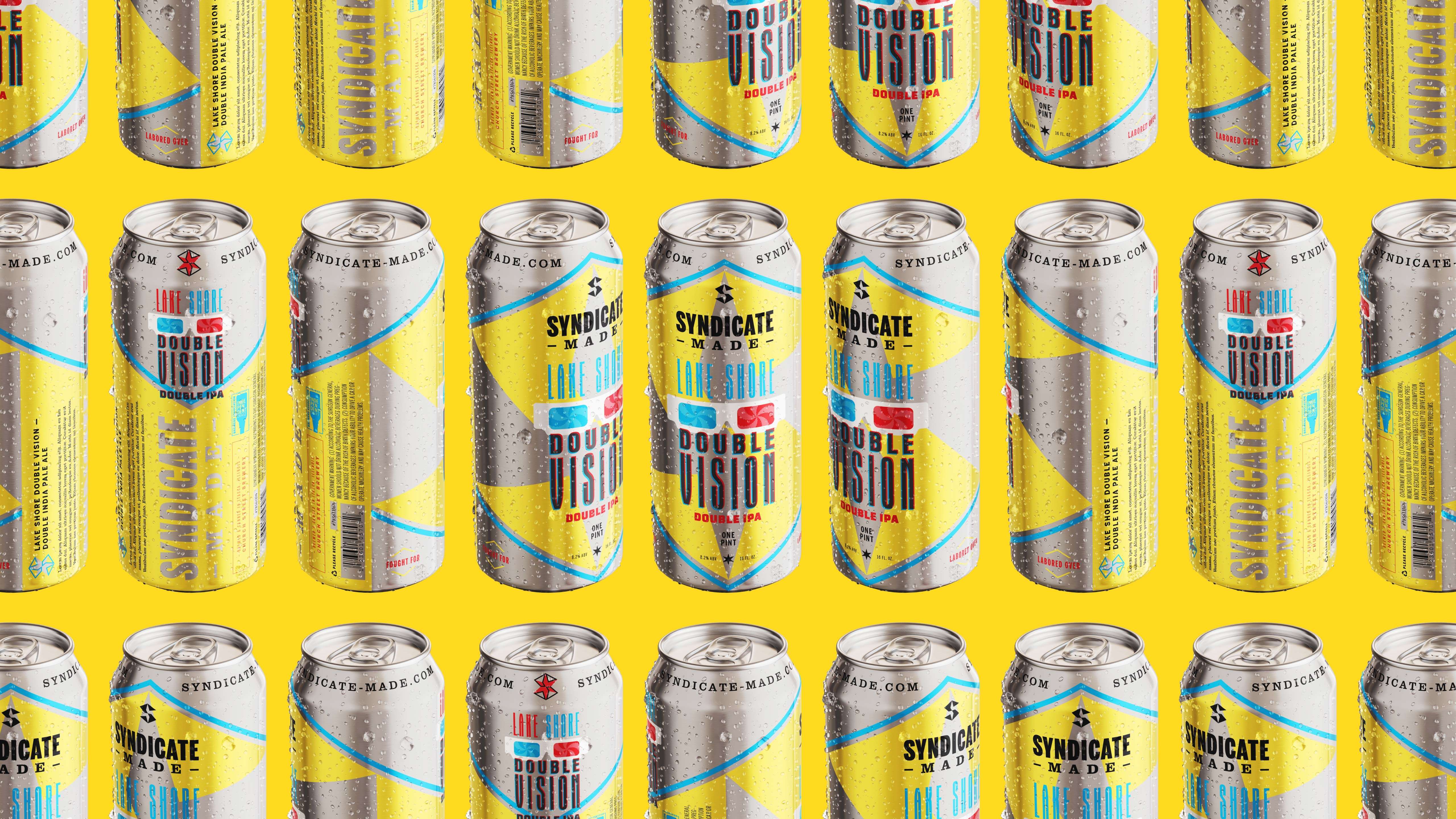
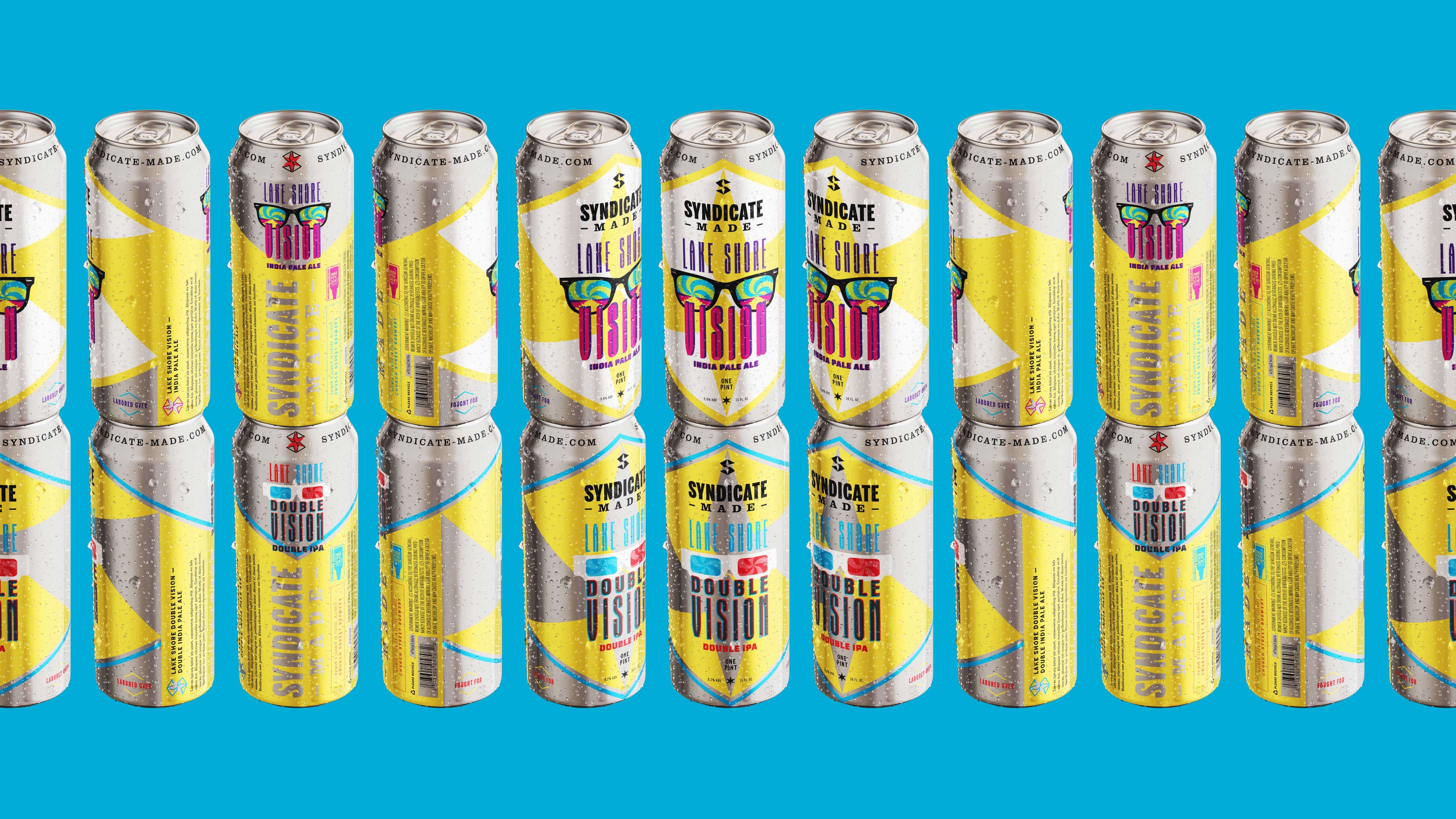
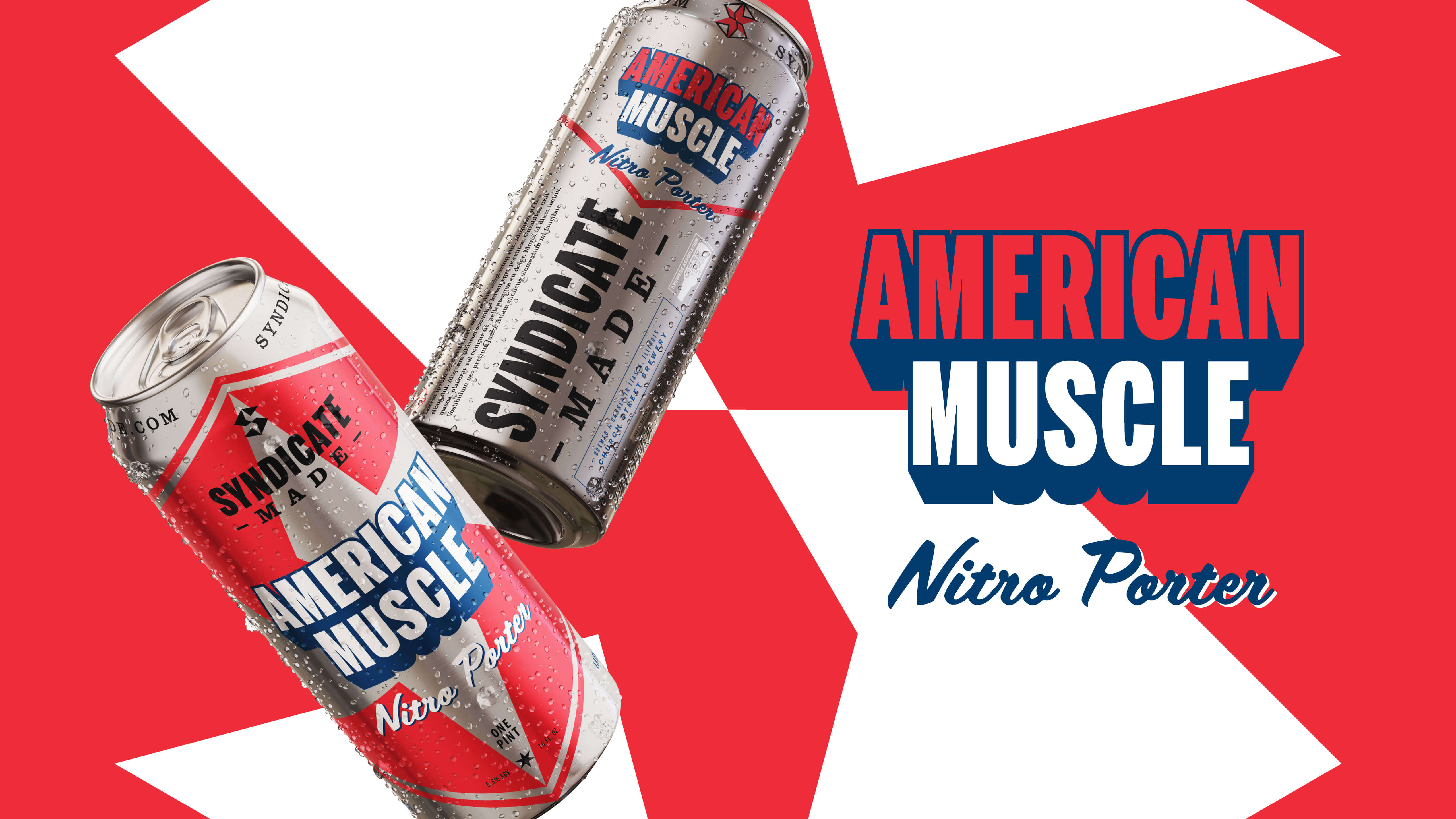
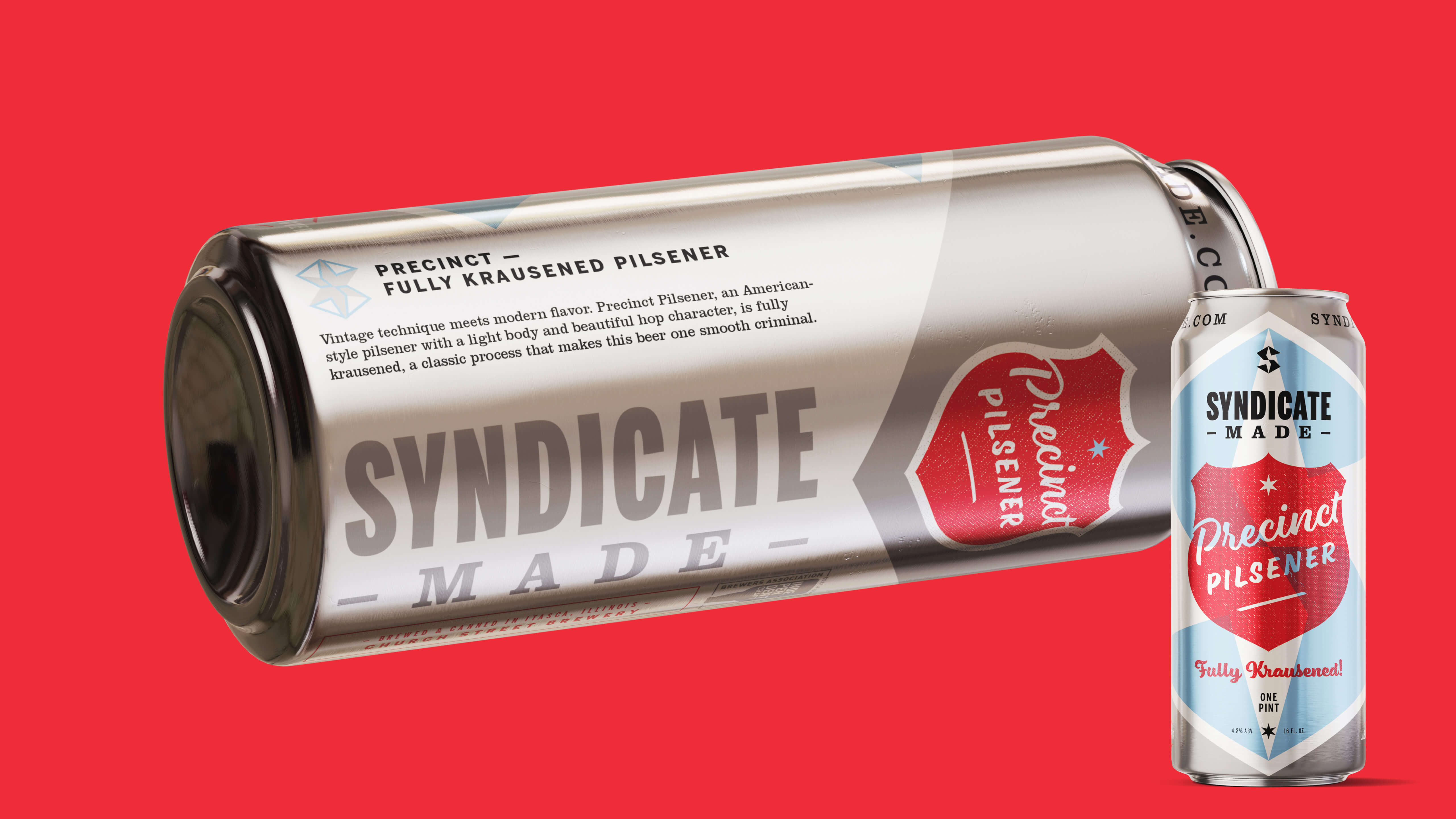
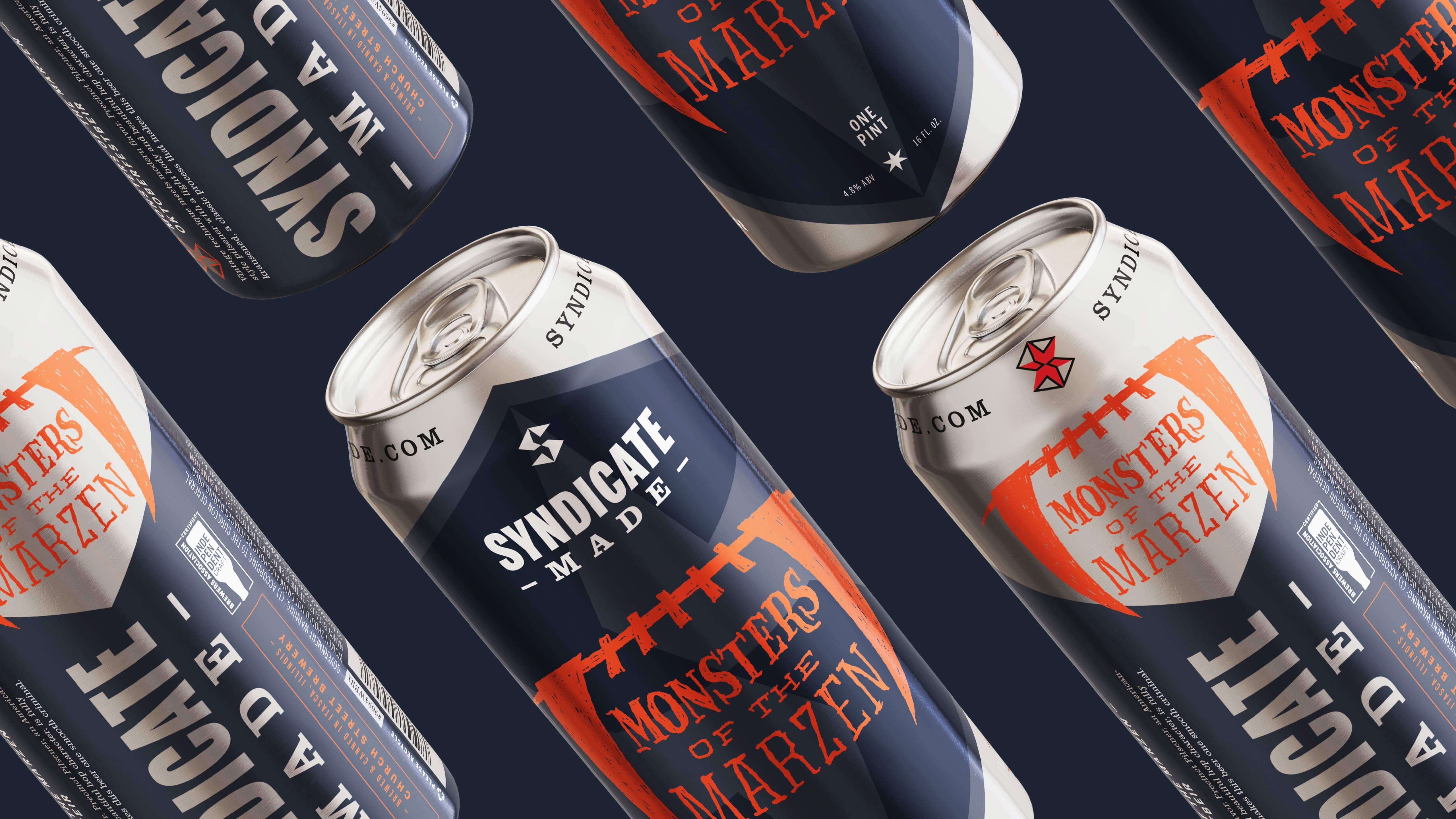
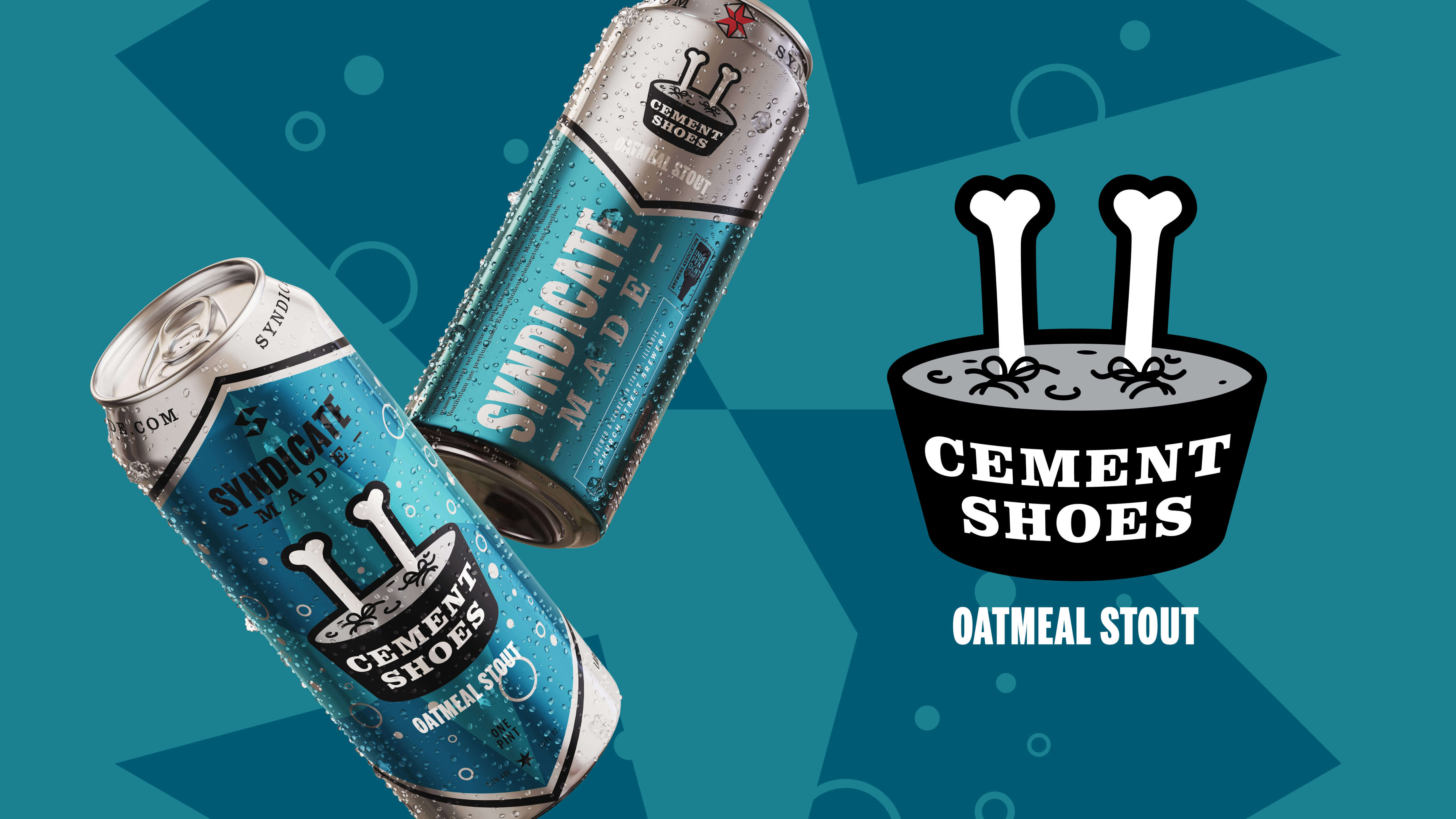
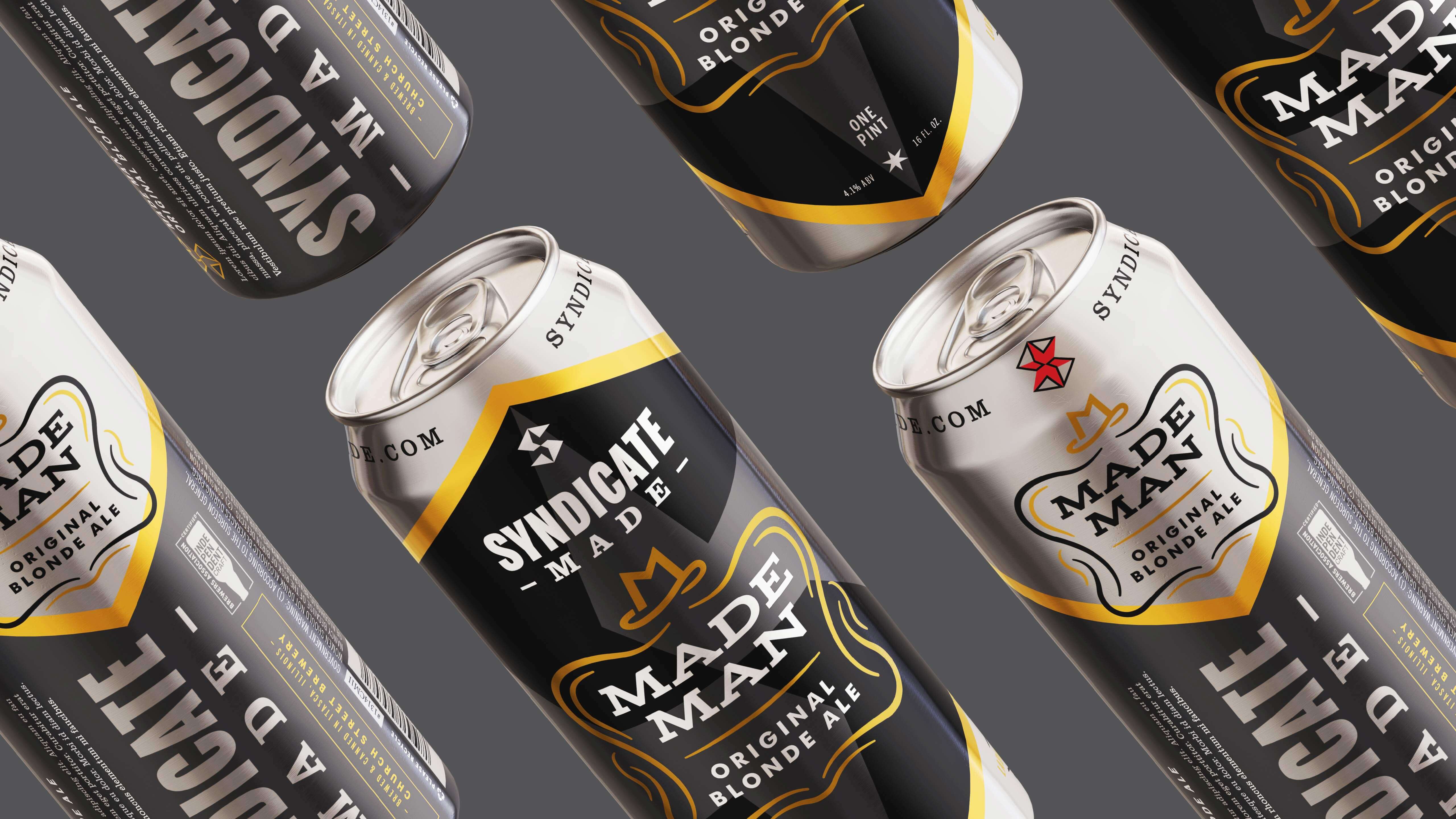
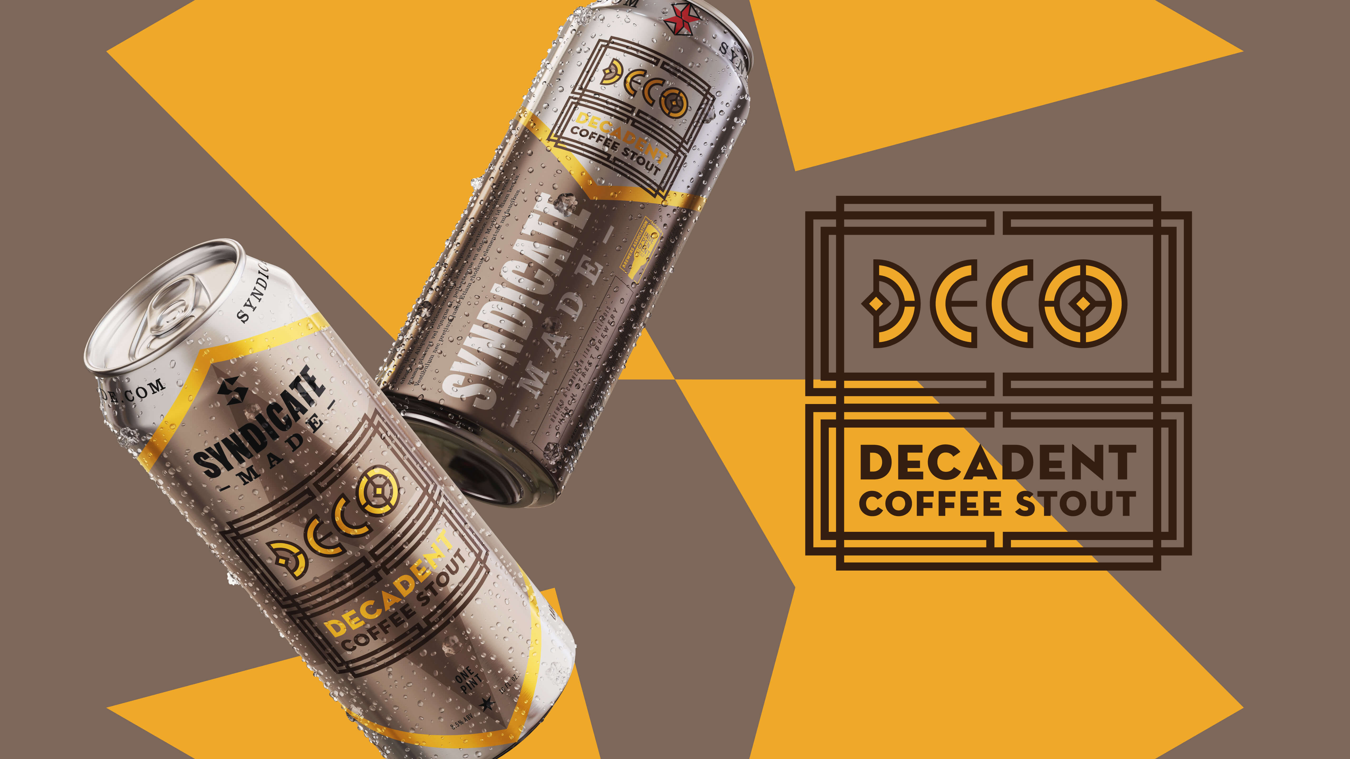
Knowing this, we designed our labels to work together so that they stand out amongst the competition. All cans use the same template where the S logo is surrounded by raw aluminum from the can, creating a unique triangle shape at the top and bottom of the labels. This provides consistency throughout all of our products, all while still allowing each brew the ability to be unique. When seen on a store shelf, the consistency in the labels group them together, making the products appear to occupy more self space than they actually do.
The process of creating the right brand for our client and their customers was a lengthy one. Unfortunately, all of this hard work was halted when the pandemic came into the world and forced the company to make the tough decision of discontinuing development of the brewery. Tougher still, the client had already purchased equipment, selected a location with construction underway, and hired a notable head brewer who was working on beer profiles while MW honed in the creative. This made the decision especially difficult to all parties involved as everyone was excited to see our creations come to life, and of course, drink the beer.

Syndicate-Made
Branding & Packaging
—Syndicate-Made
Branding & Packaging
Filed Under
-
Branding, Advertising & Marketing, Print
Scope of Project
- Advertising & Marketing
- Logo
- New Identity
- Graphic Design
- Umbrella Brand
- Packaging
- Copy Writing
In 2018, MW was tasked with creating a new craft brewery and beer brand serving Chicago and the Midwest, including branding, naming and visual identity strategies, packaging design, product concepts, messaging, and more.
For generations, Chicago has had a profound relationship with beer. To many, its more than just a drink, it is a direct cultural tie to their community. These beer drinkers have embraced craft beer brands and identify with their rebellious spirit of going up against the big guys.
This was a dream project for McKenzie Wagner because of the all-encompassing nature of the work. Branding, packaging, naming, copywriting, product development, messaging, attitude, and booze — a match made in Hefeweizen. The market-research was pretty fun too.


The quest to create a memorable brand experience with our audience was always our main priority, especially considering the over-saturation of the craft beer market in Chicago and the Midwest. Over 100 new breweries were opened in Chicago alone from 2013 to 2018. For this new venture, there was a commanding need to stand out in a vast sea of competitors.


With a large focus on the Chicago market, the client initially requested mob and prohibition-era themes to be present in the brewery and product branding. In an effort to walk the line between wants and needs, we broadened the scope of “Chicago” themes we were to pull from. Instead of focusing on mobsters and bootleggers, we focused on the attitude and character they share with current Midwesterners. In doing this, we added long-term flexibility to the branding by giving it room to grow rather than be stuck in a specific niche or gimmick.
This meant less mobsters and bootleggers and more broad-shoulders and hard work — things that would be better embraced by the residents of Chicago and the greater Midwest.


There is always a fight for shelf space in retail.
Knowing this, we designed our labels to work together so that they stand out amongst the competition. All cans use the same template where the S logo is surrounded by raw aluminum from the can, creating a unique triangle shape at the top and bottom of the labels. This provides consistency throughout all of our products, all while still allowing each brew the ability to be unique. When seen on a store shelf, the consistency in the labels group them together, making the products appear to occupy more self space than they actually do.


The process of creating the right brand for our client and their customers was a lengthy one. Unfortunately, all of this hard work was halted when the pandemic came into the world and forced the company to make the tough decision of discontinuing development of the brewery. Tougher still, the client had already purchased equipment, selected a location with construction underway, and hired a notable head brewer who was working on beer profiles while MW honed in the creative. This made the decision especially difficult to all parties involved as everyone was excited to see our creations come to life, and of course, drink the beer.
