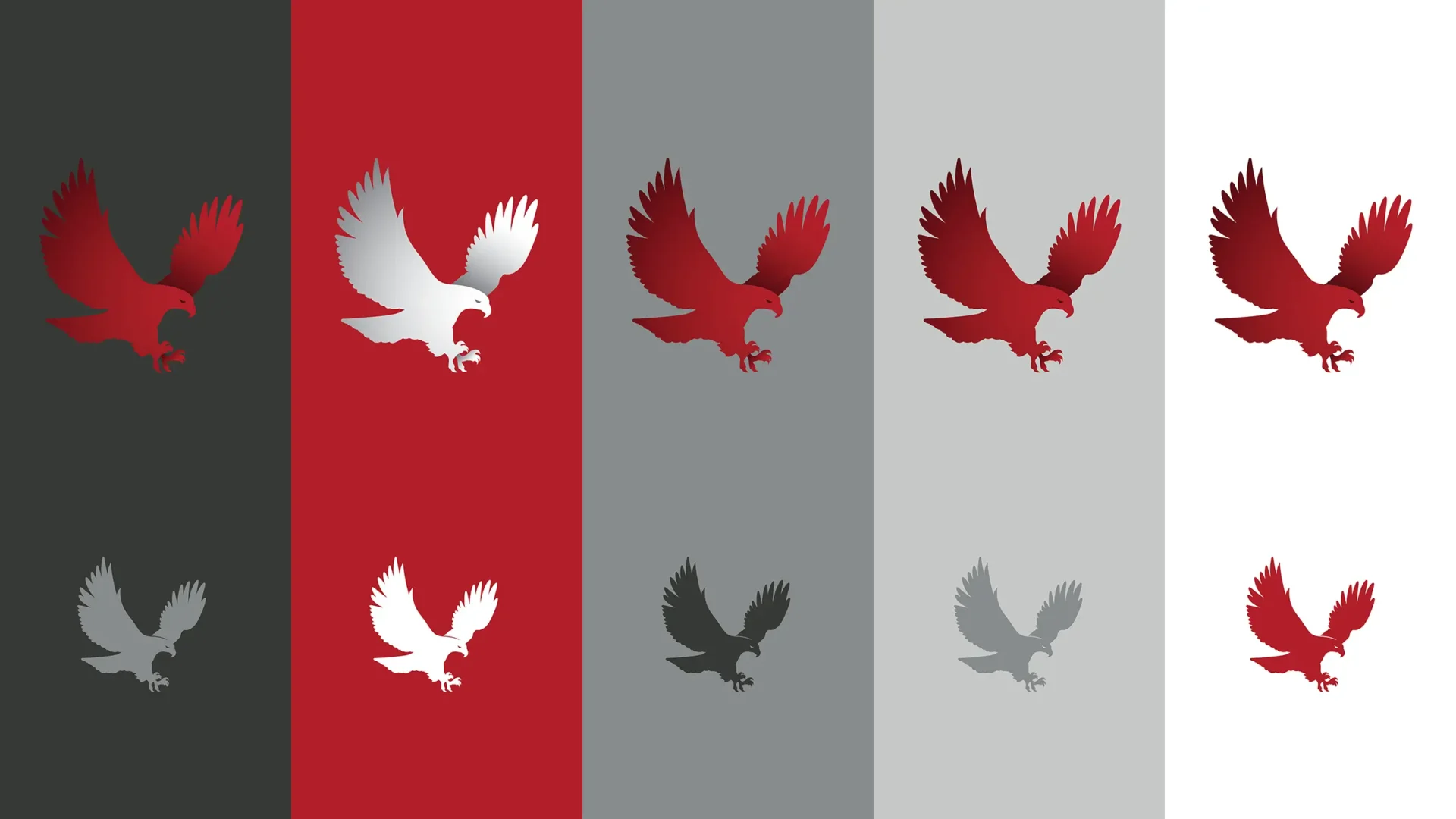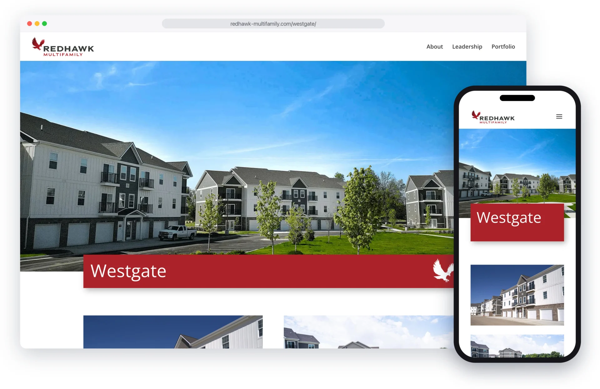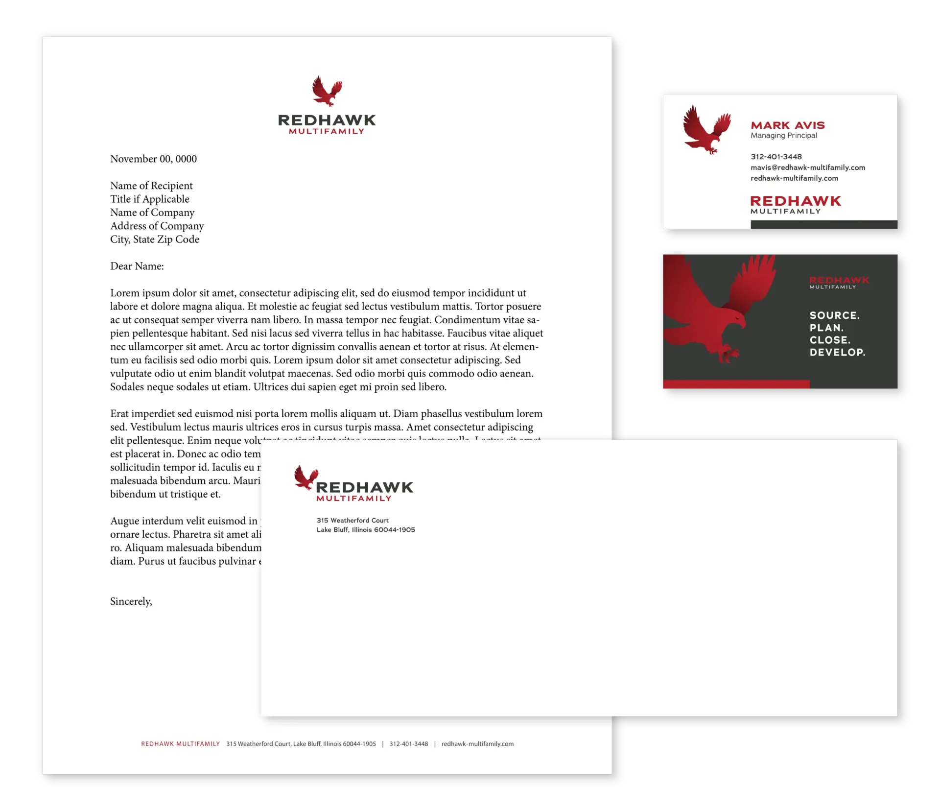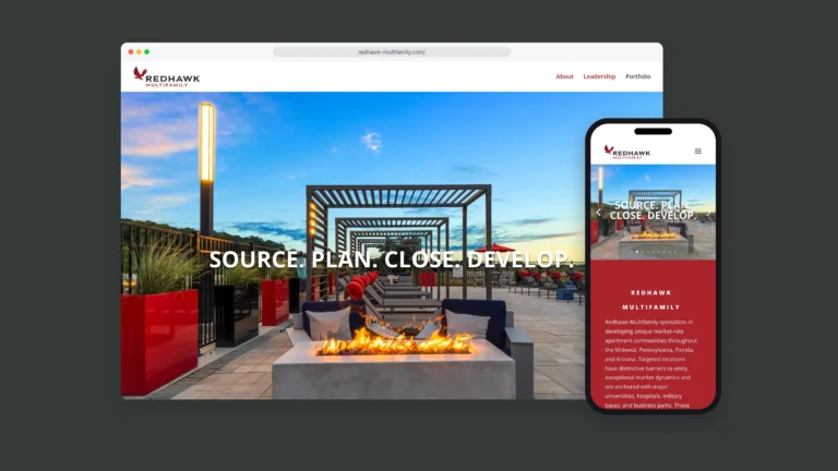

Redhawk Multifamily came to MW with a name and a desire to incorporate a bird icon into its visual identity. We brought these elements together with bold, straightforward typography to create a logo that conveys strength and professionalism. The resulting identity gives Redhawk a distinctive look, with a strong visual mark that works alongside the company name across its brand materials.