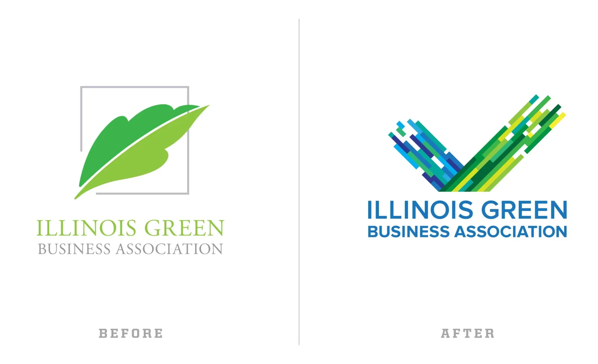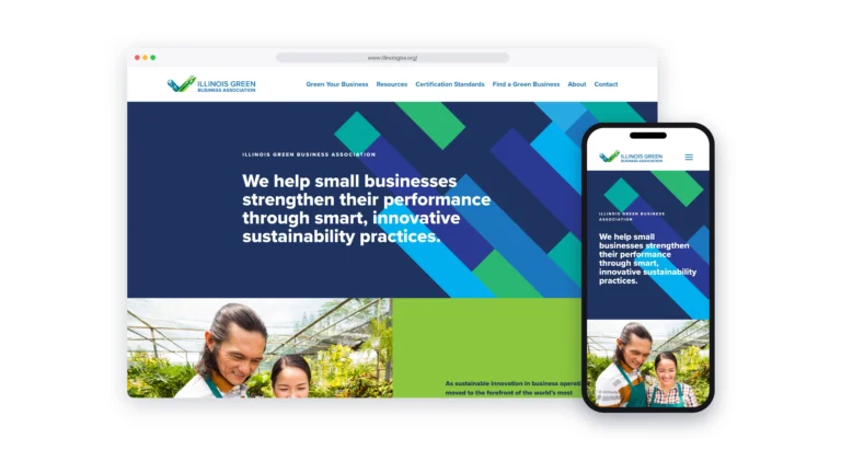

The Illinois Green Business Association needed an identity that reflected both sides of its mission: environmental responsibility and business performance. The previous logo relied on a traditional leaf symbol, placing the emphasis primarily on the environmental side of the organization.
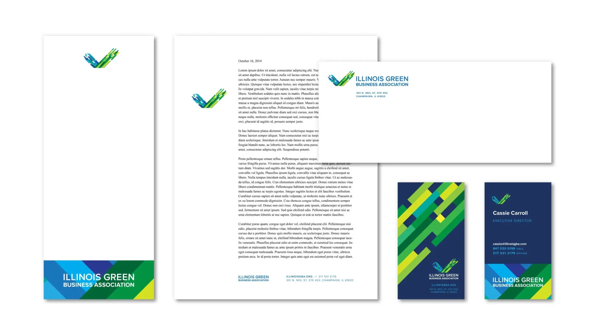
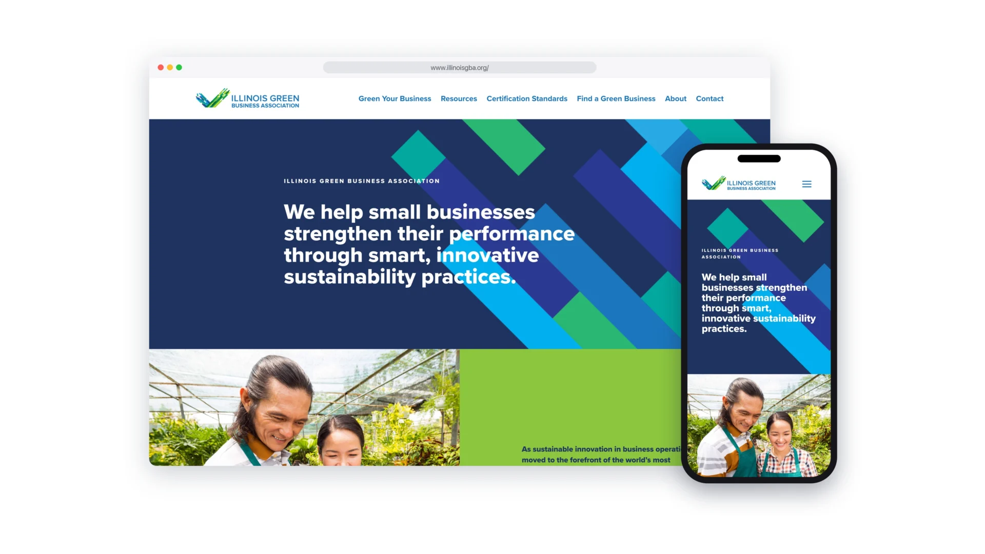
MW developed a new identity that brings the two ideas together. Green and blue represent the intersection of environment and business, while the check mark and subtle upward movement of the green element suggest progress, positive results, and the idea that going green is good business.