
YMCA of the USA

General Assembly 2026

Every three years, YMCA of the USA (YUSA), the national organization serving YMCAs across the country, brings together more than 3,500 staff members, volunteers, and YMCA leaders for its General Assembly.

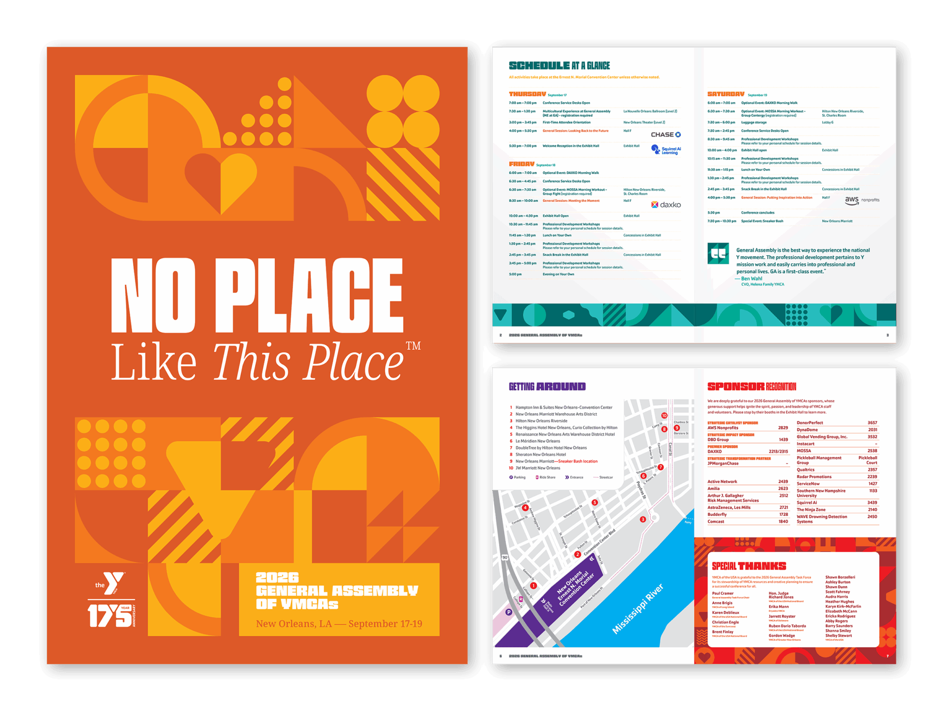
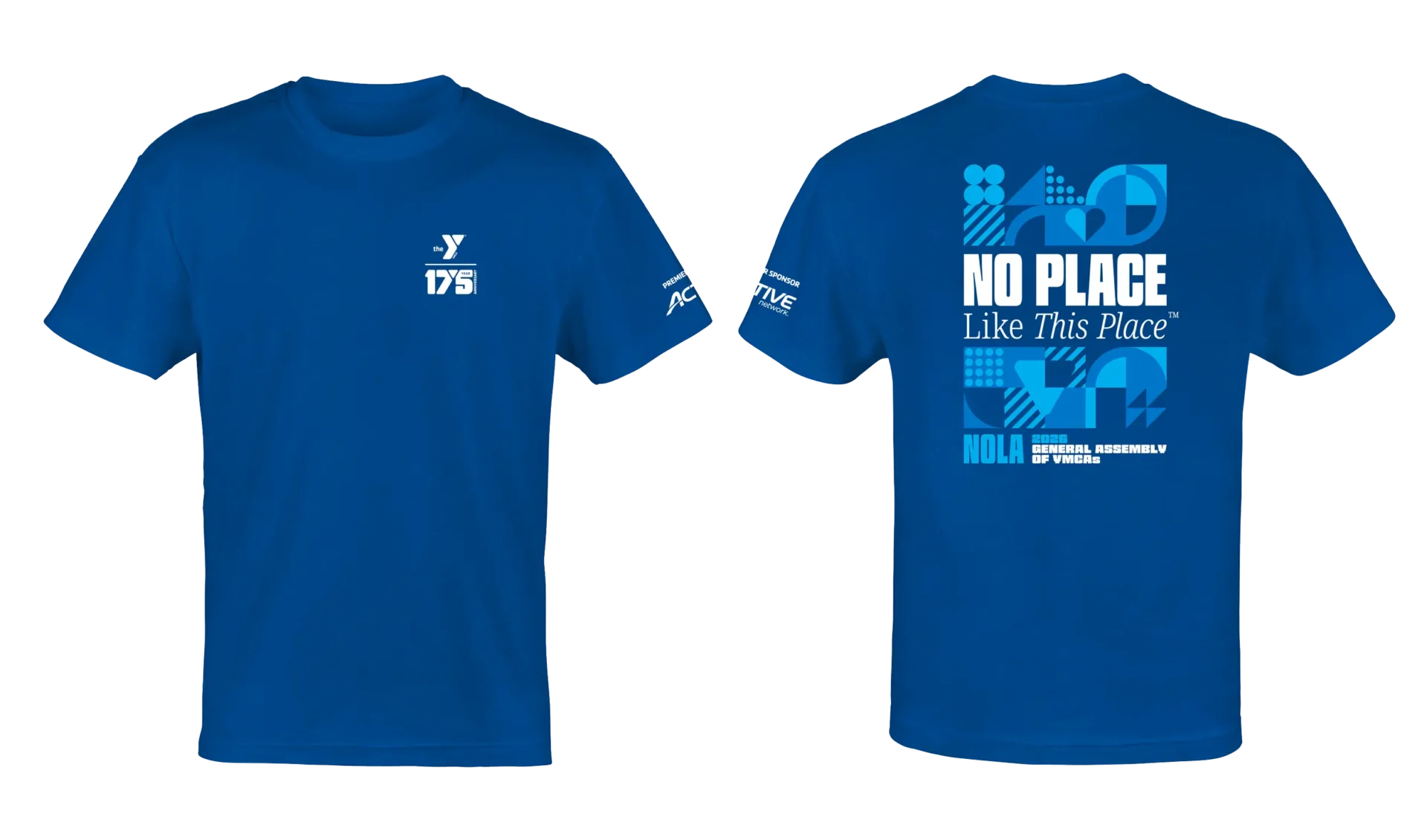
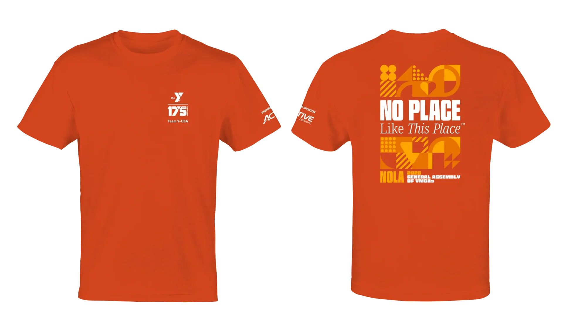
Continuing our longstanding collaboration, MW developed the visual strategy for the 2026 General Assembly, providing the concept, creative direction, and implementation strategies for event communications and promotional materials. Deliverables included design assets, wearables, program guide, conference signage concepts, and a General Assembly microsite.


Filed Under:
Branding Advertising & Marketing Print Collateral Apparel Web Design Web Development

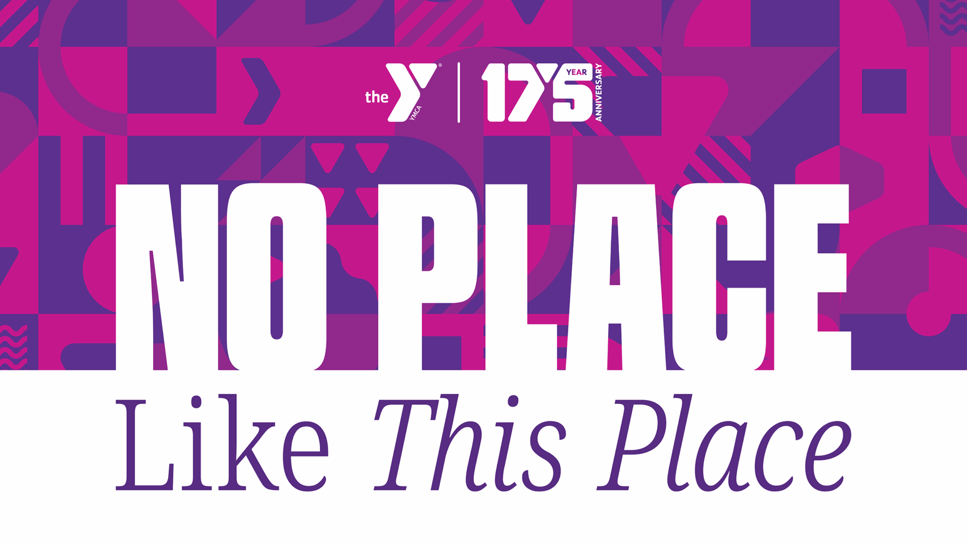
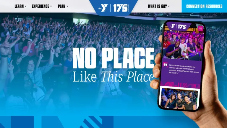
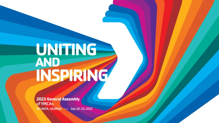
This year’s work incorporated the YMCA’s 175th anniversary and the introduction of a new theme and identity for the Y’s nationwide There’s No Place Like This Place™ campaign. We integrated both of these provided assets into the event’s visual identity and extended their presence throughout the conference experience.

Patterns to Connection

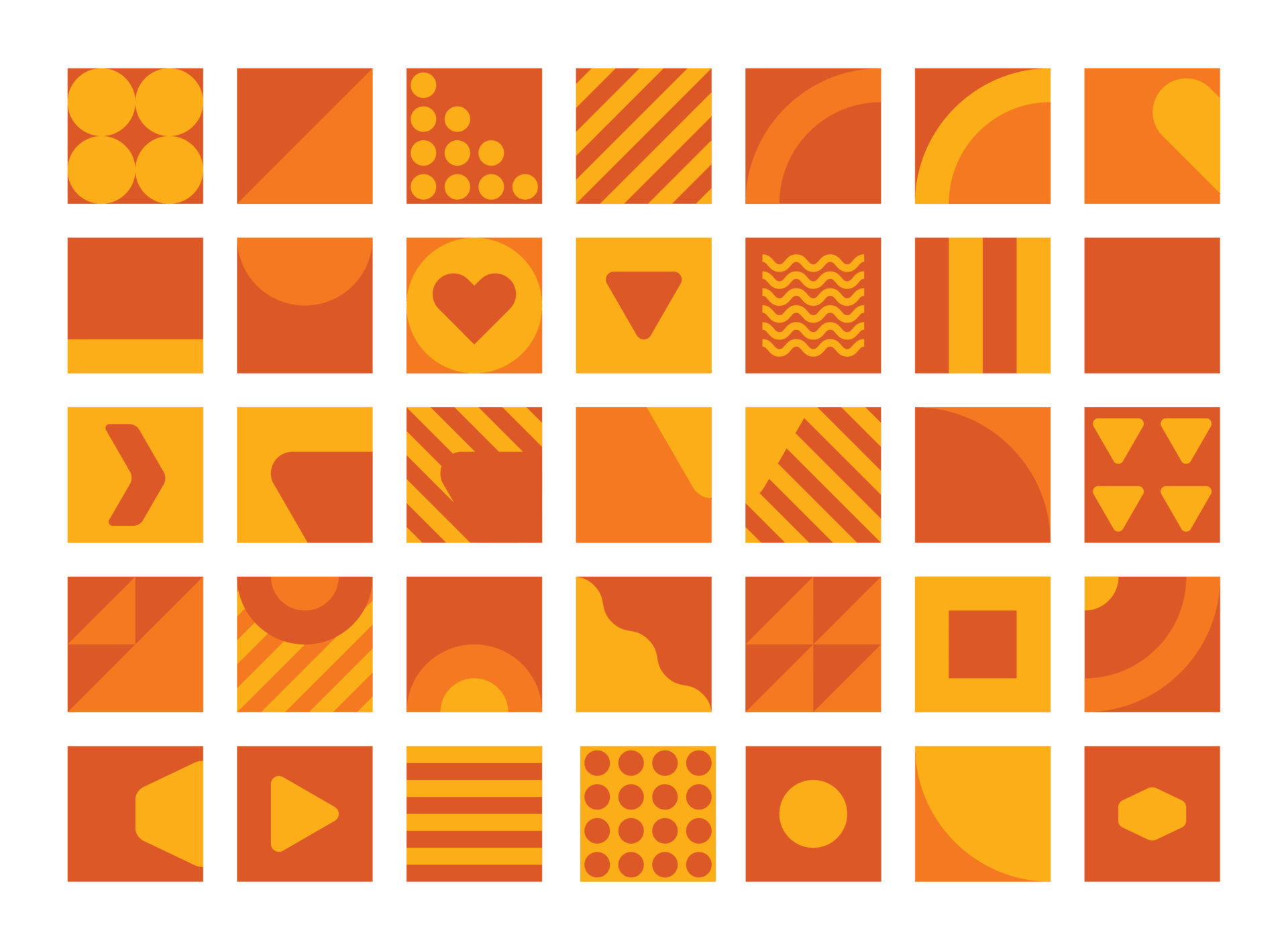
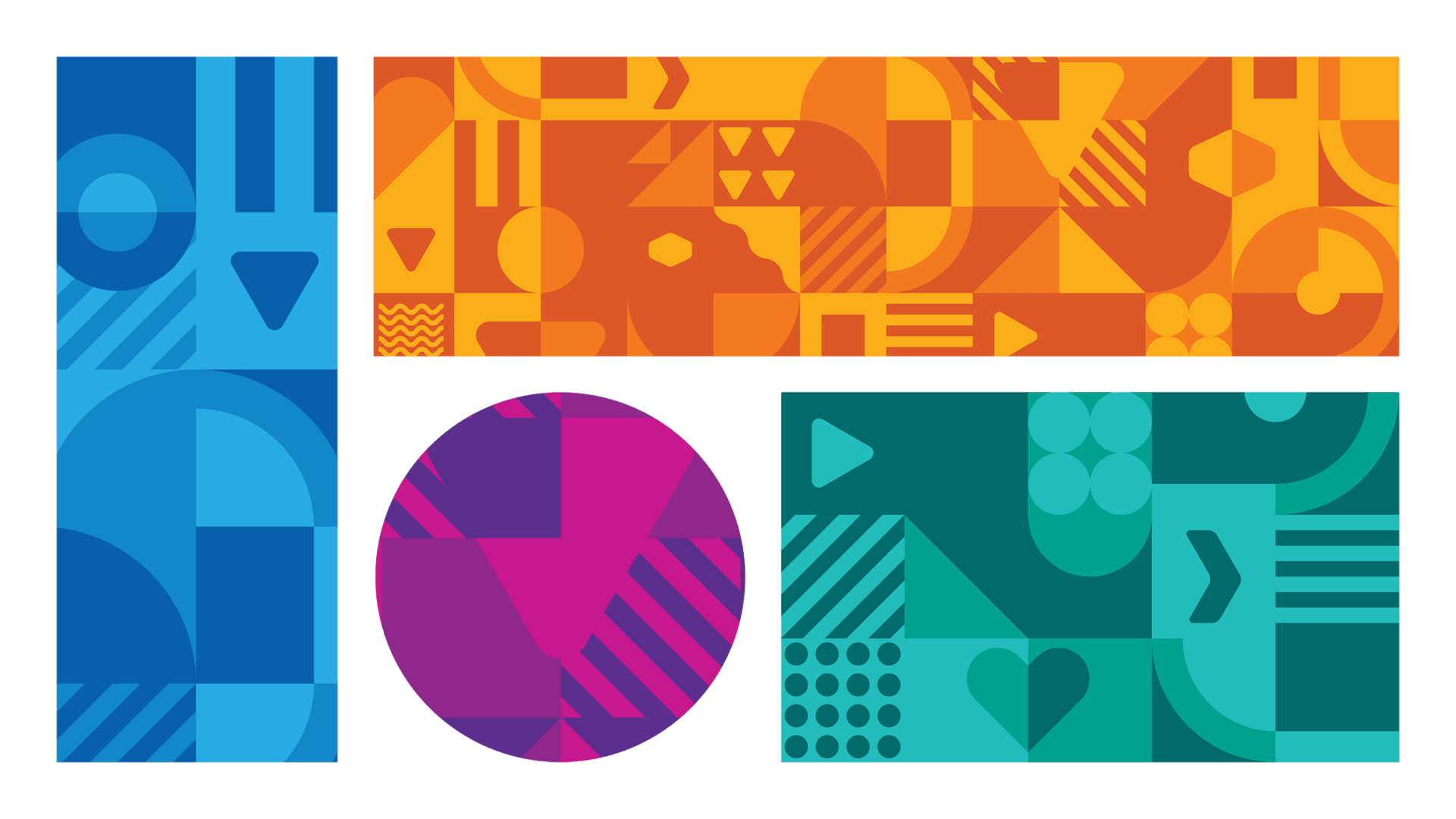
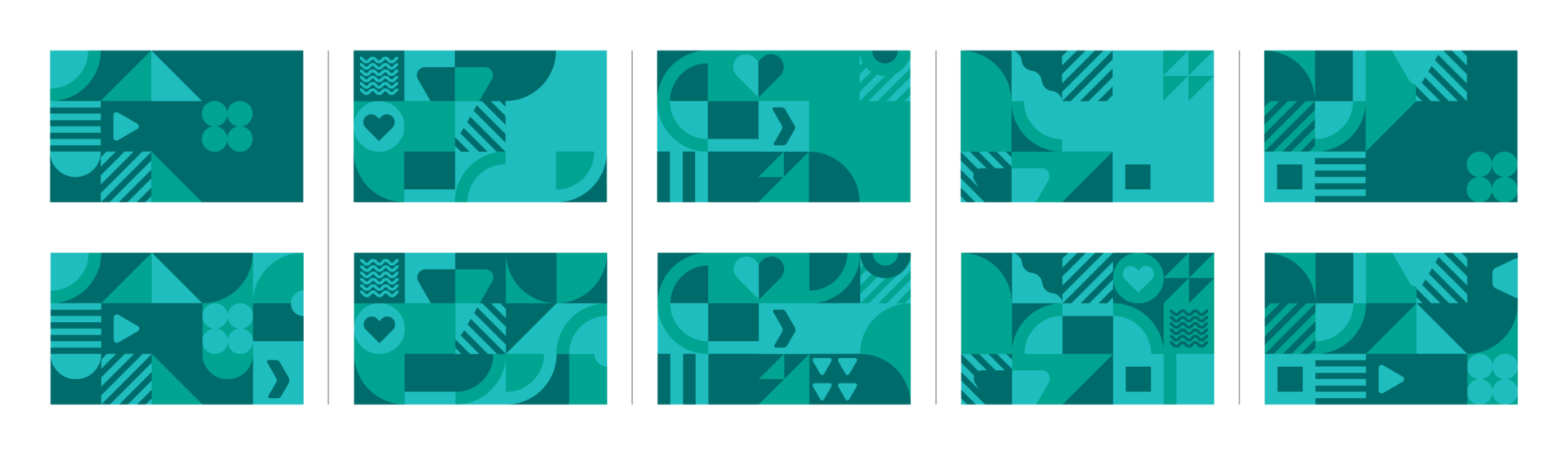
The visual concept began with a simple idea and a desire to articulate “creating connected communities” visually. Every person brings something unique, but together, we create something greater. A collection of geometric shapes, patterns, and interlocking forms brought that idea to life, with individual elements combining to create a larger, more dynamic whole. The result was a flexible visual system that reflected the power of connection and the beauty of communities built on individuals.

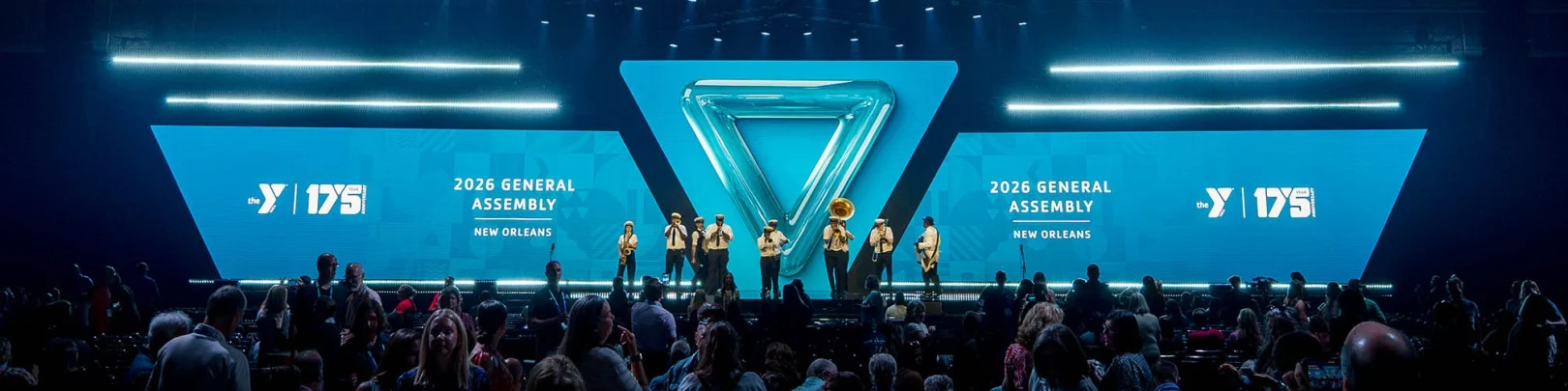
The recap video above brings to life our visual system for the General Assembly. While the YMCA team executed the event deliverables, the graphics and applications reflect the creative direction and vision we shared during development. Seeing those ideas carried through so faithfully is a rewarding example of how a strong visual concept can extend across an entire event experience.

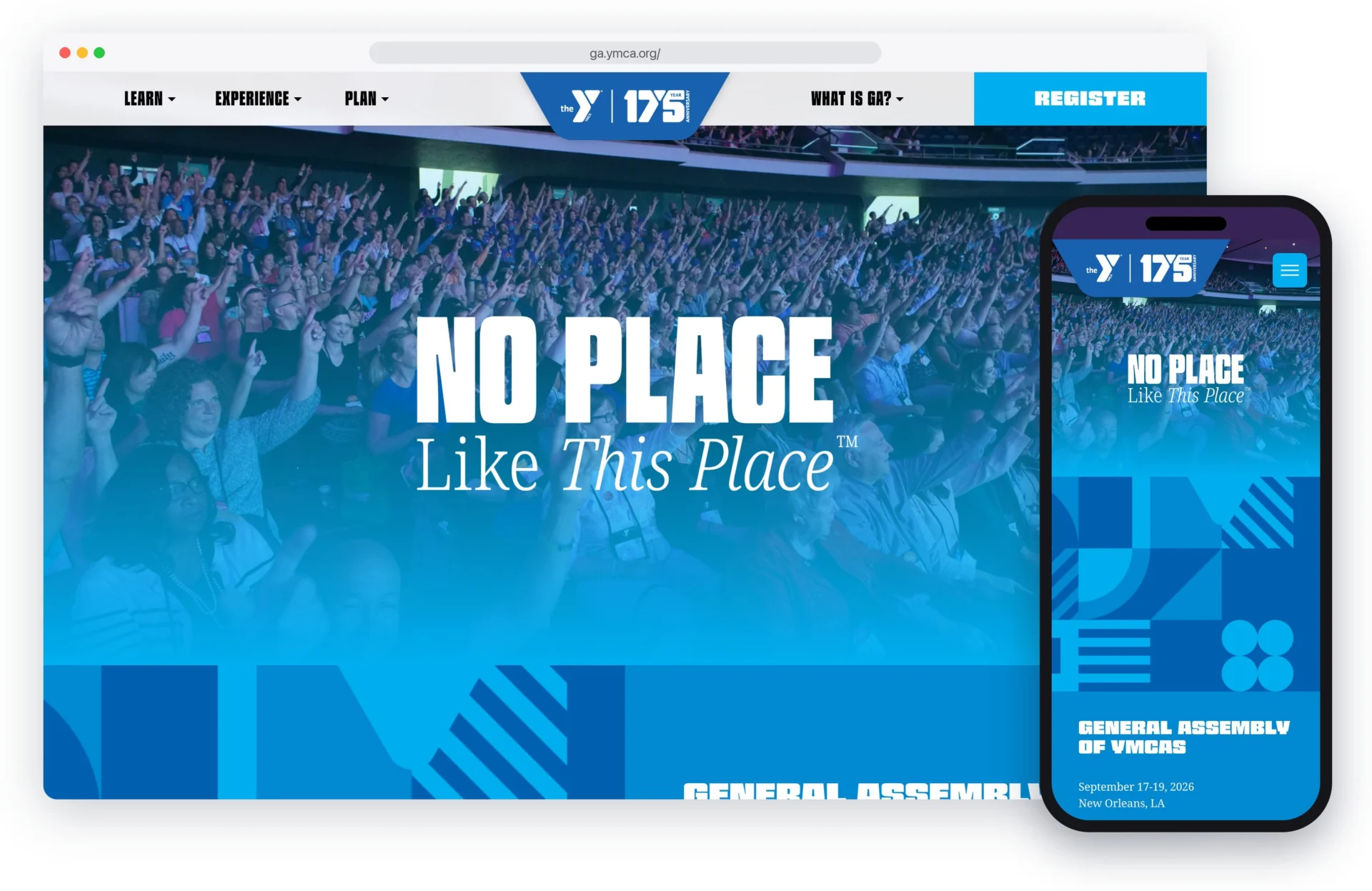
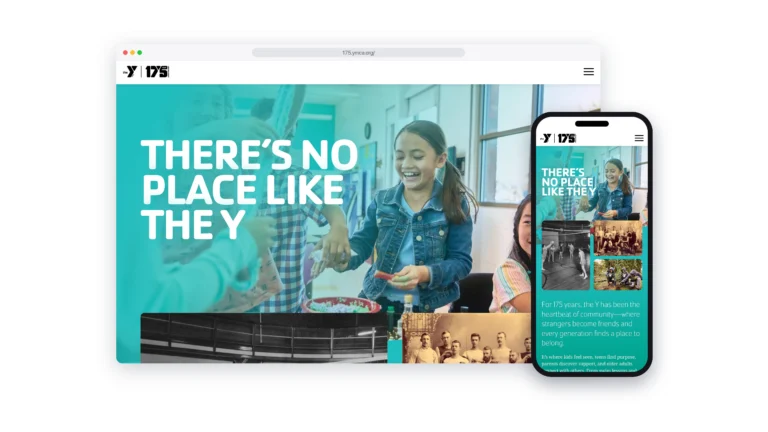
Home page on desktop and mobile

A flexible system.

To make the visual system work across a range of applications, MW developed patterns at different densities. More open compositions offered simplicity, clarity, and more white space for text, while denser arrangements introduced greater visual complexity and interest. This flexibility allowed the pattern to adapt to different formats and scales, maintaining its impact whether viewed from a distance or explored up close.