
The Great Pumpkin Patch

Cadwell Pizza Branding

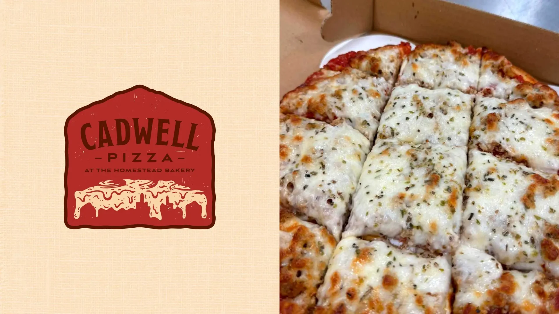
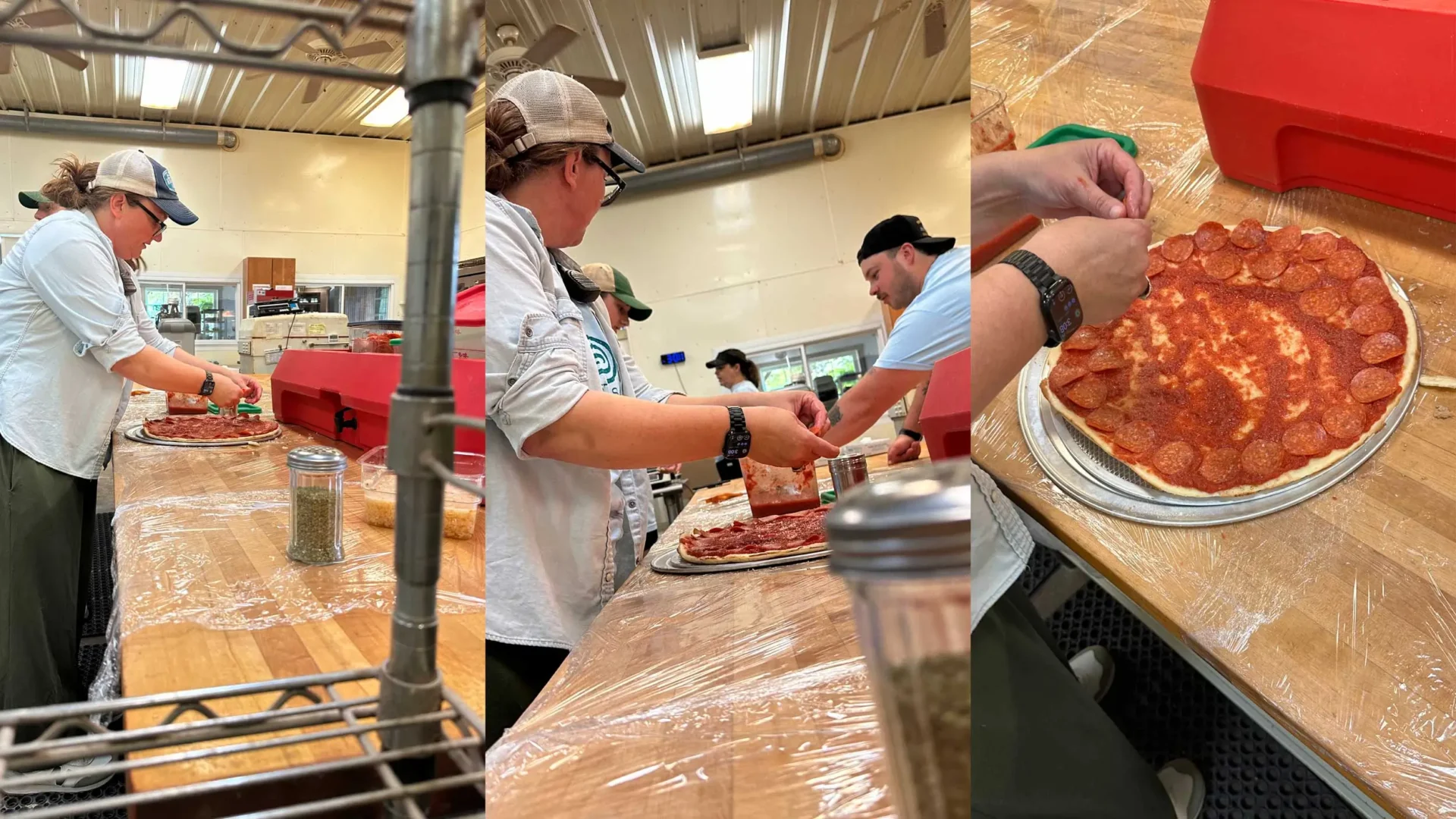
Where’s a better place to get a pie than an Amish bakery?

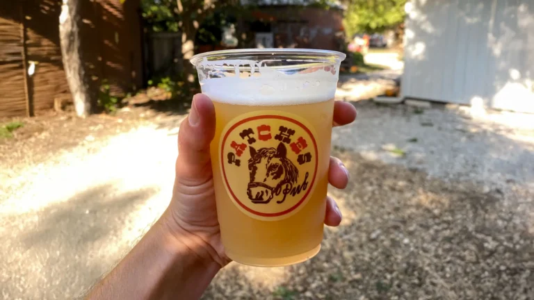
The Condill Family is no stranger to taking on new challenges. When the owners of a childhood-favorite pizza parlor were ready to retire and close up shop, the 200 Acres jumped at the opportunity and purchased the beloved recipe, ensuring it would live on in all of its cheesy, pizza glory. Come grab a Cadwell Pizza and a cold one from Patches Pub at the 200 Acres.
 

Filed Under:
Branding Graphic Design Logo New Identity

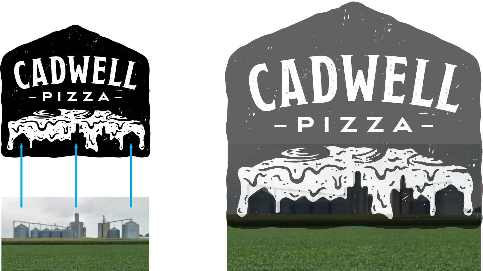
The 200 Acres requested for the logo to feature the Cadwell grain elevator skyline — the view from the 200 Acres looking westward.

“While we’re on the outskirts of Cadwell, the skyline has a special place in our hearts, from sunset views to the perfect backdrop for all our favorite memories.”

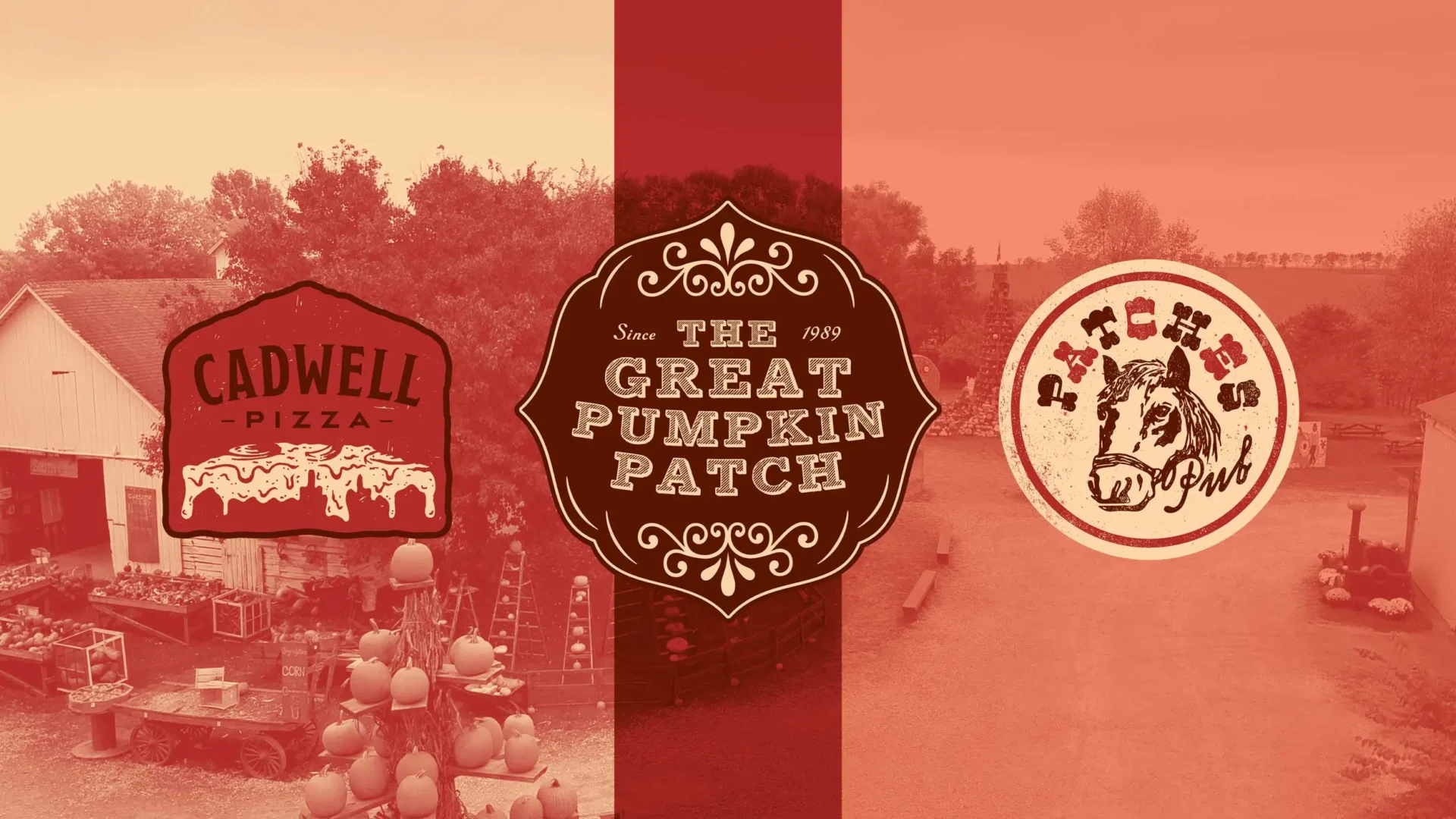
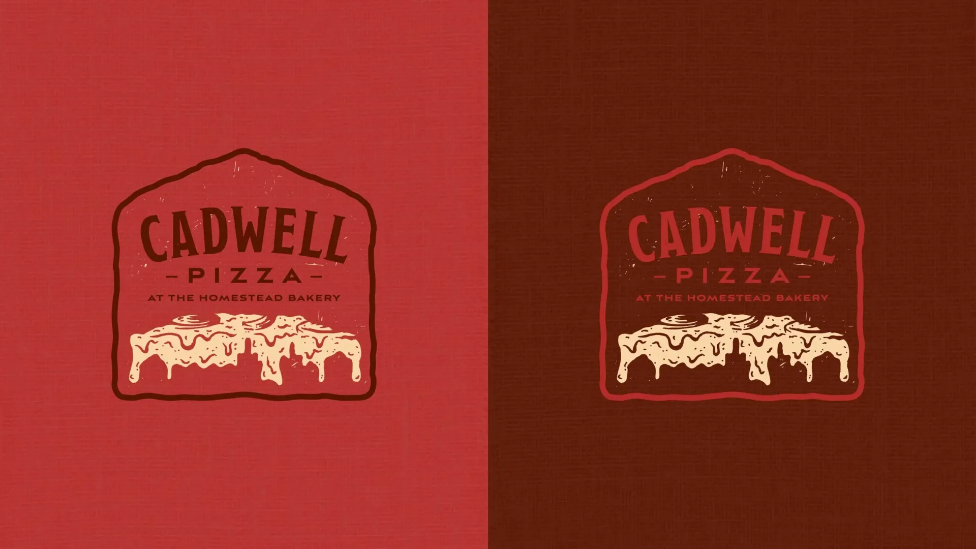
Our solution to this was to use a grain elevator for the basic containing shape and to hide the Cadwell skyline in the melting cheese from a pizza slice. Cheesy? Yes. Delicious? Also, yes.


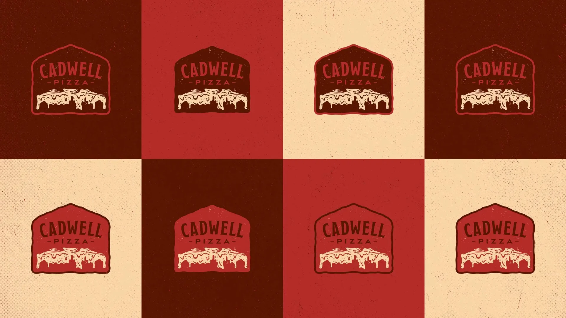
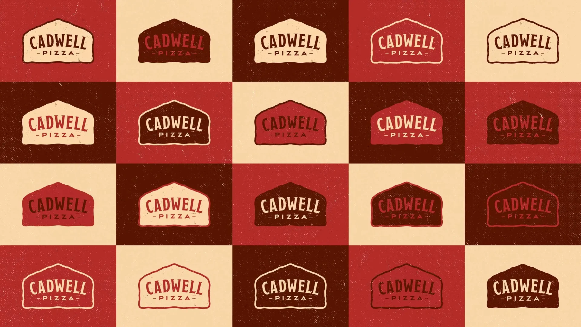
The 200 Acres is already home to many sub-brands, Patches Pub being one of them. Knowing that the ultimate goal is to have Cadwell Pizza and Patches Pub open for business at the same time, we created a consistent color palette that is used for both brands. The Cadwell Pizza color palette features the maroon used in the Great Pumpkin Patch logo, as well as a red and a tan, while Patches Pub uses these three colors with the addition of a salmon/pink color. This allows the brands to have some slight differentiation, but ensures they stay close to each other and close to the 200 Acres brand as a whole.


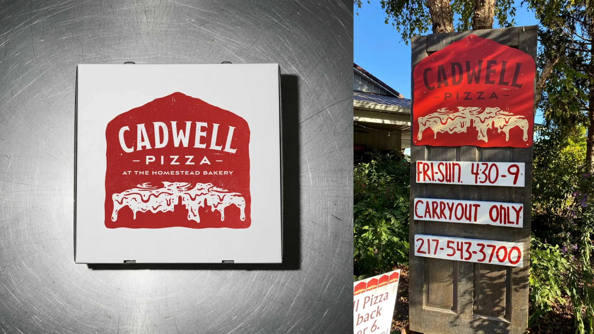
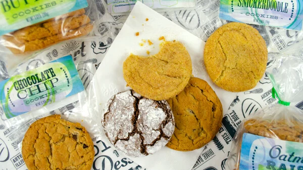
Pizza and beer are so good that you’ll forget there are cookies and cinnamon rolls too.