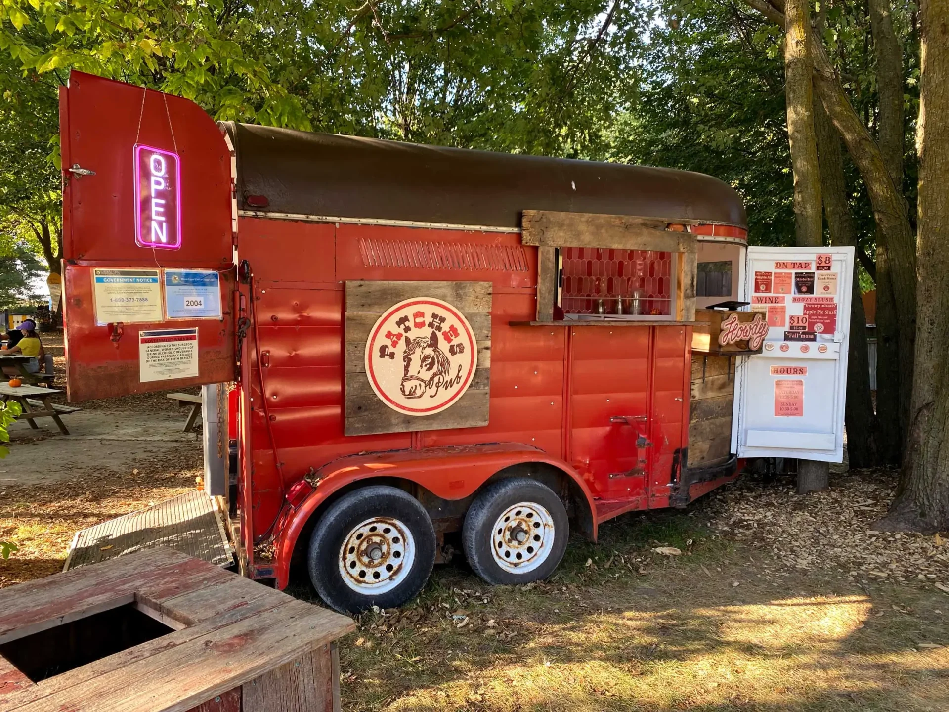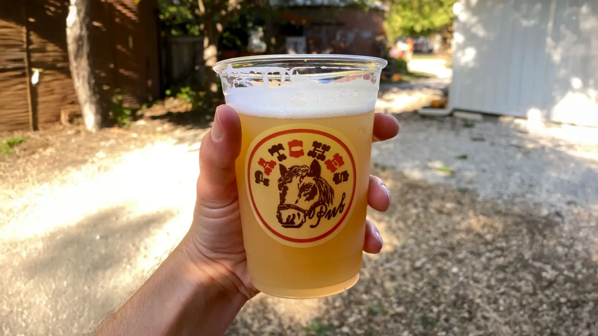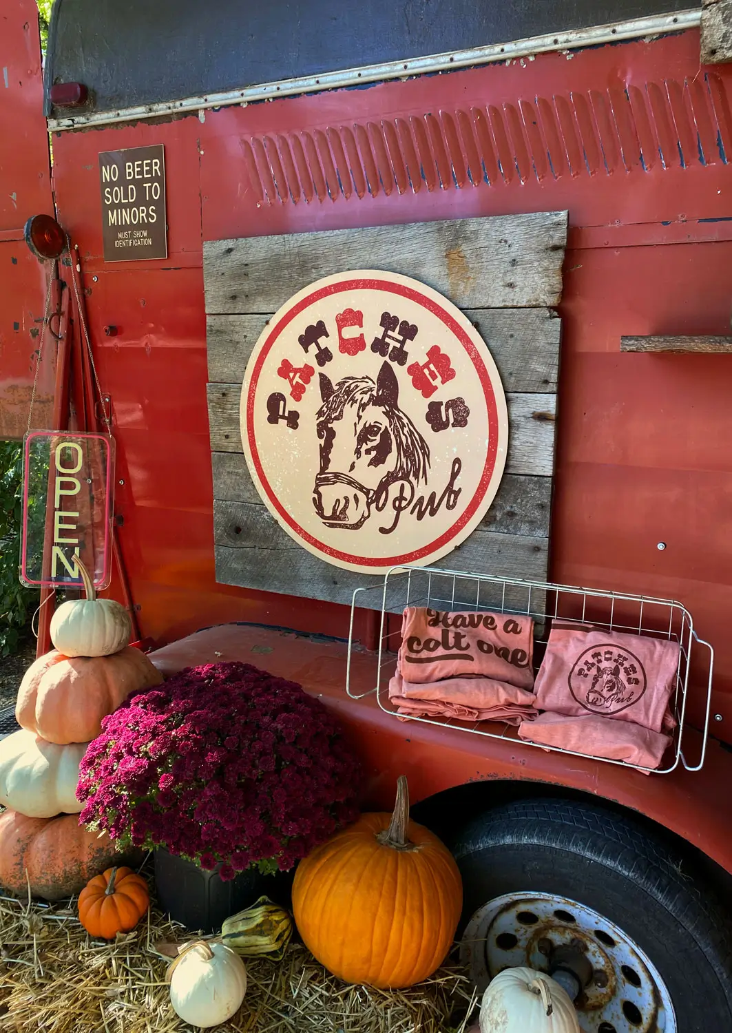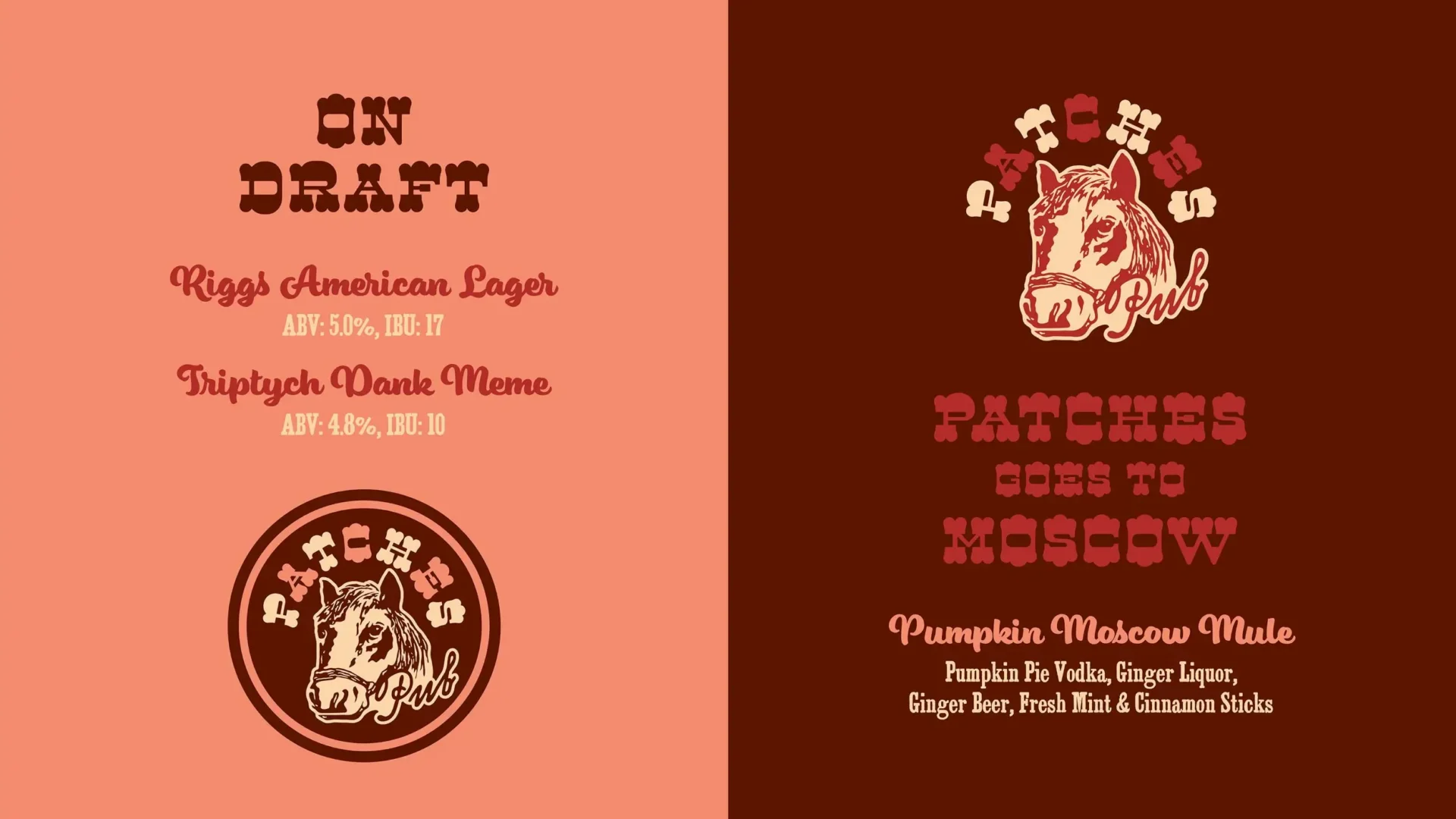

As a way to help encourage visitors to the 200 Acres outside of the regular Patch season, The Great Pumpkin Patch approached us with the idea to retro-fit an old horse trailer into a fully-functional mobile bar. The idea was to use the bar and their existing stage to create a family-friendly hangout spot at the farm complete with live music, yard games and, of course, some thirst-quenching refreshments. Because the bar is mobile, Patches Pub is also now a mainstay of the Great Pumpkin Patch during the season as well, providing visitors with a variety of ice-cold libations.
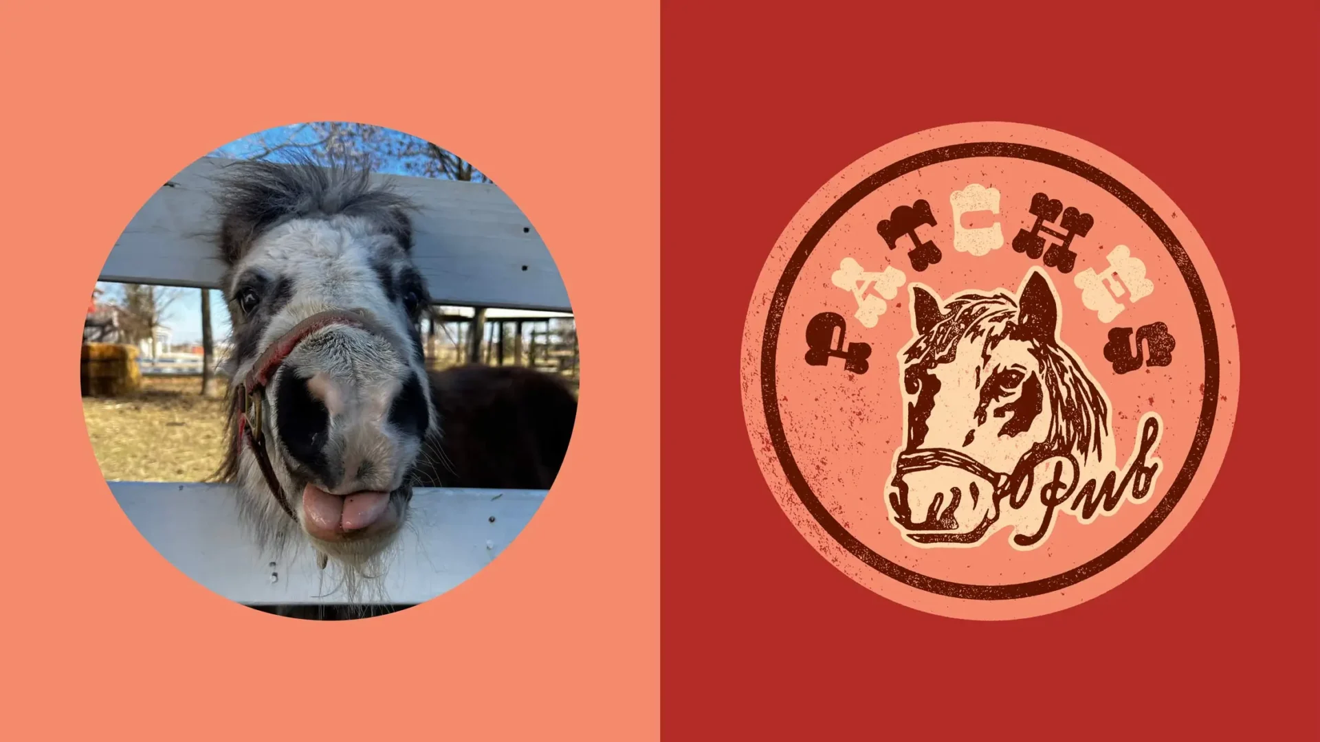
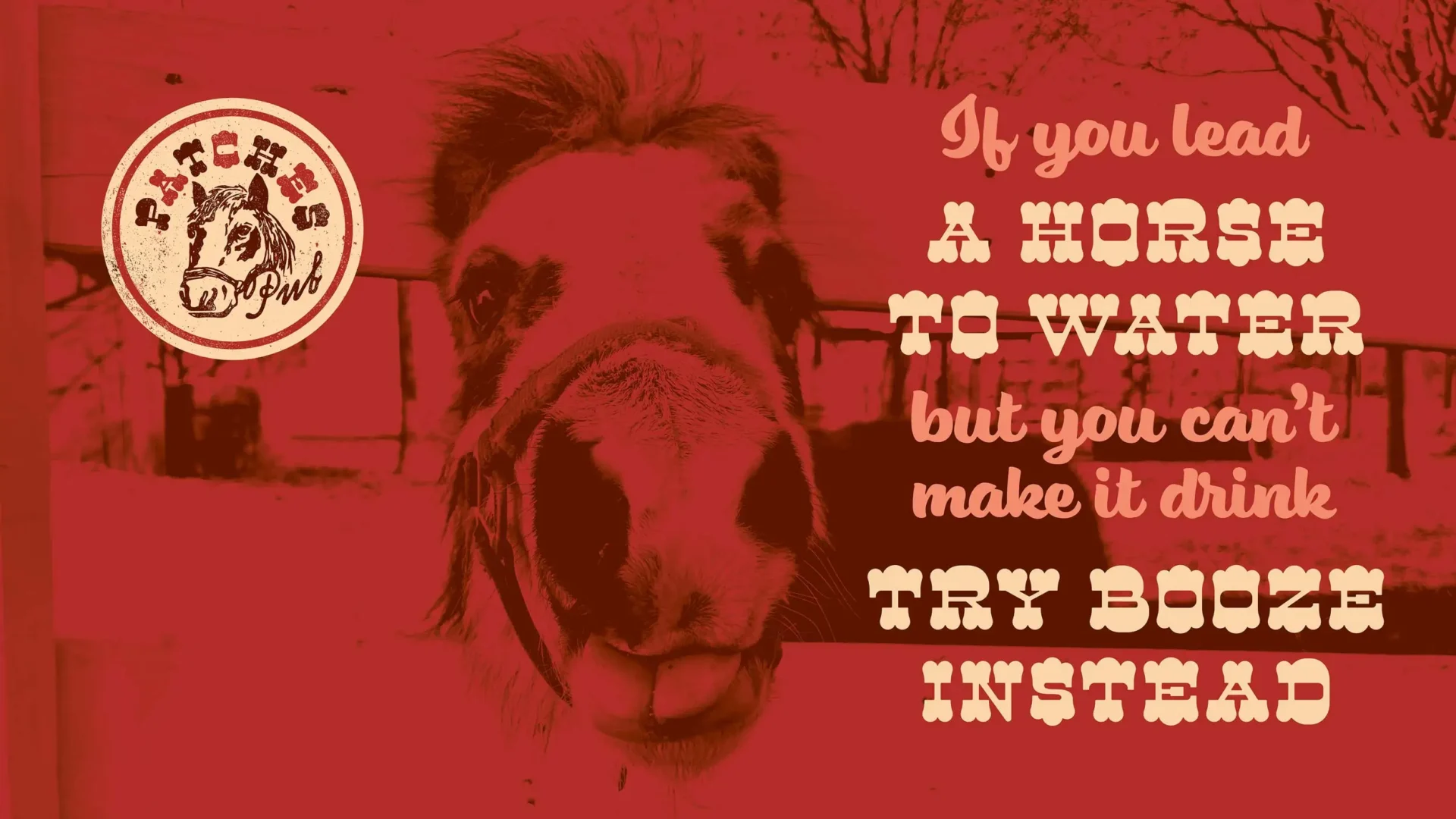
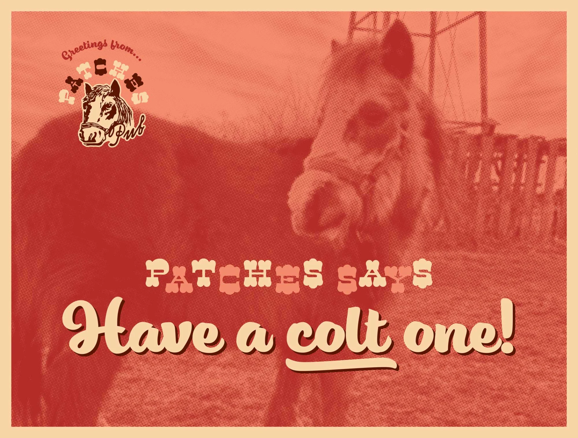
So, who is Patches? Patches is a mini-horse that the folks at the 200 Acres had recently acquired as an addition to their already diverse barnyard of animals. What better way to honor the addition of a mini-horse than to name the new horse-trailer bar after it?
Follow the 200 Acres on Instagram to see when you can grab a “colt” one from Patches Pub.